A few days ago, my sister forwarded me an obituary. Poster designer David Lance Goines died on February 19th after a stroke ten days before. I looked at the red envelope that stood propped on my desk. I always save his Lunar New Year’s card to open as a little present from him on a difficult day. This was that day. I opened it to find a chiseled rabbit looking back at me, and “Happy New Year 2023” in his fine italic hand.
“People who run for buses will never make calligraphers,” Goines once told me sedately, as I blew into work, windblown. But I think he heard that bus coming when he signed those last cards. The pen was moving fast.

Obituaries are funny things. They make a nice package of a life so that we can feel we understand that life and tuck it away, complete. But the outside things about David Goines, his fame as a quirky person, a poster designer, typographer, and calligrapher, didn’t do justice to the formidable mind and work ethic and “tears for things” held in the man.
I met David Goines in 1977 after getting tossed out of my first college. On my last day, my type teacher, James Hutchinson, pressed an envelope into my hand as I was leaving class. The envelope was sealed and addressed to Goines. I carried it to Berkeley.
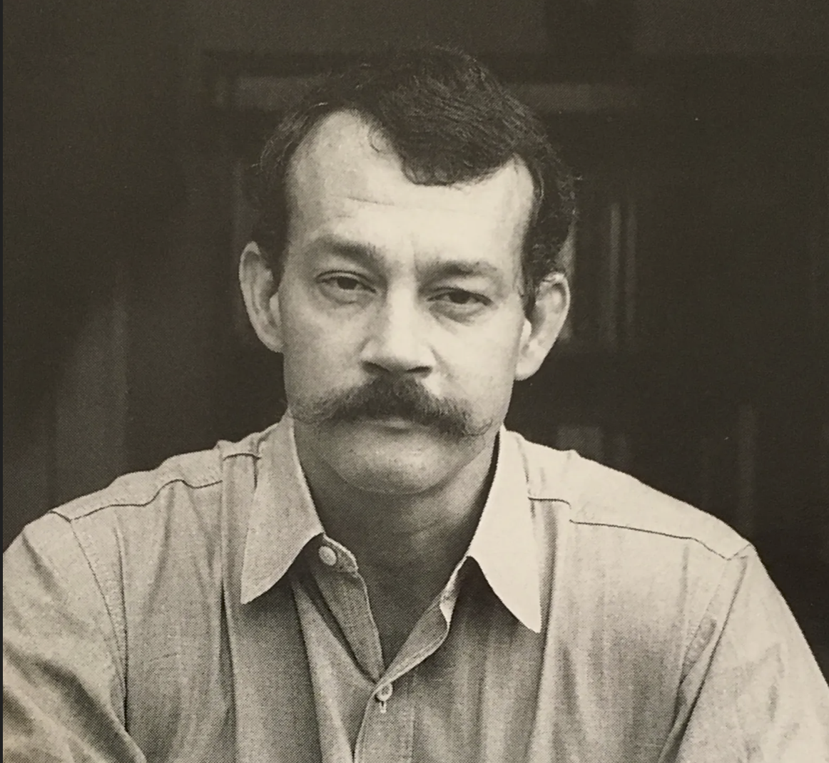
In those days, as a young person, I thought of Goines as a demigod of design and was terrified of his quiet and his certainty. He was 31. I considered him middle-aged. He was a big deal in the California design-world. He’d been thrown out of UC Berkeley in the ’60s for printing pamphlets for the SDS. I think that shock contributed to his becoming a hugely educated person and an autodidact in design.
When I met him, California was piecing itself back together after the confusion of the early 1970s, when the hippies and flowers and dreams of universal love faded into drug addiction and kidnappings and blown-up buildings and death and terror cells. Goines’ methodical creation of poster after poster for all kinds of Berkeley businesses and good causes threw a fine net of visual order over the city. His posters served to create cohesion— his personal routines championed the value of work, of unlocking the shop door every morning, of locking it every night.
I remember opening that jingling storefront door that first morning, carrying the letter in my little box portfolio, and seeing the calligraphed sign, “Sorry, We’re Open.” (And the reverse, “Yes! We’re Closed.”) He loved an ironic opposition.

Goines greeted me with the formality of someone from the 1890s, and I answered in kind, having been brought up by Edwardians myself. Today, you’d think steampunk. Vest and watch chain. Waxed moustache. We both had hair. It was a long time ago. He handed me a mug of Peet’s, read the letter, and gave me a job.
I shrink-wrapped piles of cards and cut up negatives for stripping. But mostly I watched Goines make things. I had worked for a commercial printer, but I had never seen someone run a letterpress, never seen a Heidelberg windmill or a Chandler and Price actually printing, never seen work that was so handmade.
And what a printer he was. Each sheet of Mohawk Superfine went through his Chief 24 one color at a time, often more than 20 times— with perfect registration. He never used halftones. If you see a teal and an aqua on one of his original posters, those are two separate ink colors— two separate passes through the press. He ran that press dry as a bleached bone.


He’d sit down across from me and doodle a perfect group of italic letters— upside down and backwards, so I could read them. He’d take painstaking care to show me the reasons for the geometry of a constructed alphabet. One time, he decided to prove to me that color was not discernible in the dark. He revved up his old Volkswagen Beetle and careened up and down the Berkeley hills, with me clutching the dash, searching for the Berkeley Rose Garden. We eventually got there. His lighter flared, lighting rose after rose. He was right: no color. Once, upstairs at Chez Panisse, flushed with the victory of his own win, he tried to coax me into arm wrestling Alice Waters. I sized her up— she looked small but tough; I wasn’t that foolish.
I didn’t know anything about the arts and crafts movement. I didn’t know he was “stealing with both hands,” as he would say, from Ludwig Holwein. I didn’t see the Jugenstil in him because I didn’t know what the Jugenstil was. What did I know of tertiary complements? Of the black line of Ukiyo-e? How would I have known that Morris’s designer-socialism marked a trail for Goines’ designer-radicalism? David Goines was good to me and to many, many other people who needed a helping hand. Only later did I learn to name the layers of his living.
Natalia Ilyin is Professor of Design, Design History, and Criticism at Cornish College of the Arts in Seattle.
