English version [scroll down to read it in Spanish]:
The amnesiac blind mammoth
Reading an article in a Mexican newspaper during this very cruel month of April, I learned that a candidate to public office boasted about the low cost of the logotype for the new Felipe Ángeles International Airport (known as AIFA for its acronym in Spanish), currently under construction north of Mexico City. The fee for the registration of the symbol was three thousand pesos (about 150 US dollars). The note doesn’t mention anything about the call for proposals and the prizes for the first and second places (a trip to Peking and to a destination in Mexico). It’s inferred that—from the point of view of whoever makes decisions about the communication strategies for the airport—it is preferable to have those who voluntarily submit design proposals to work for free and to invest in a long and politically delicate bidding process. This is owed to the belief that anyone with a computer and access to the internet can design a logotype.
Yes, anyone can design a logotype, but designing it well is a different matter, once we realize that a logotype is about everything except for the logo itself.
The commentators on social media attacked the symbol, criticizing its lack of “design principles.” What are those principles and who do they belong to, coming from a profession that systematically prides itself for “breaking the rules” and, especially, in a country where both rules (and logotypes) change every six years? I suppose they refer to the guidelines inherited from the Modern movement and the International Style, namely that:
a) a logotype should represent a single idea, decisive and clear;
b) that it should be easy to interpret, in order to be memorable (although the one we are speaking about is already unforgettable);
and
c) that it should be reproducible in any scale and platform (analog or digital), so that all copies remain platonically true to the original, for the opposite would be a waste of resources.
***
Assessed under the criteria of these dusty, yet reliable “principles,” (three canonical ones amongst a larger pool), this logotype is a failure, due to its indifference to first-rate professional practices that have surrounded us with tidy and familiar symbols, those celebrities of consumerism that, with a pinch of acquisitive cachet, guarantee identical products and experiences in any part of the world.
Yet, if we consider that we live in a historical moment when hosts of progressive designers strive to challenge and abolish the paradigms of capitalism and the tyranny of industrial production, may the AIFA logotype not acquire, suddenly, a laudable anti-colonial and cutting-edge texture?
But beware of oversimplifying things—the expertise accumulated by a craft can be used and abused by agents of greed (perhaps the materialistic, transnational, patriarchal, or everything our reader may deem relevant), but to disdain such expertise as if it were an embarrassment is an inquisitorial folly and risks amplifying the very deficiencies being denounced. In other words: craft and dexterity can be used for good or for bad, and should be questioned, challenged, and surpassed, but leaving behind collectively inherited knowledge only makes us collectively all the more ignorant.
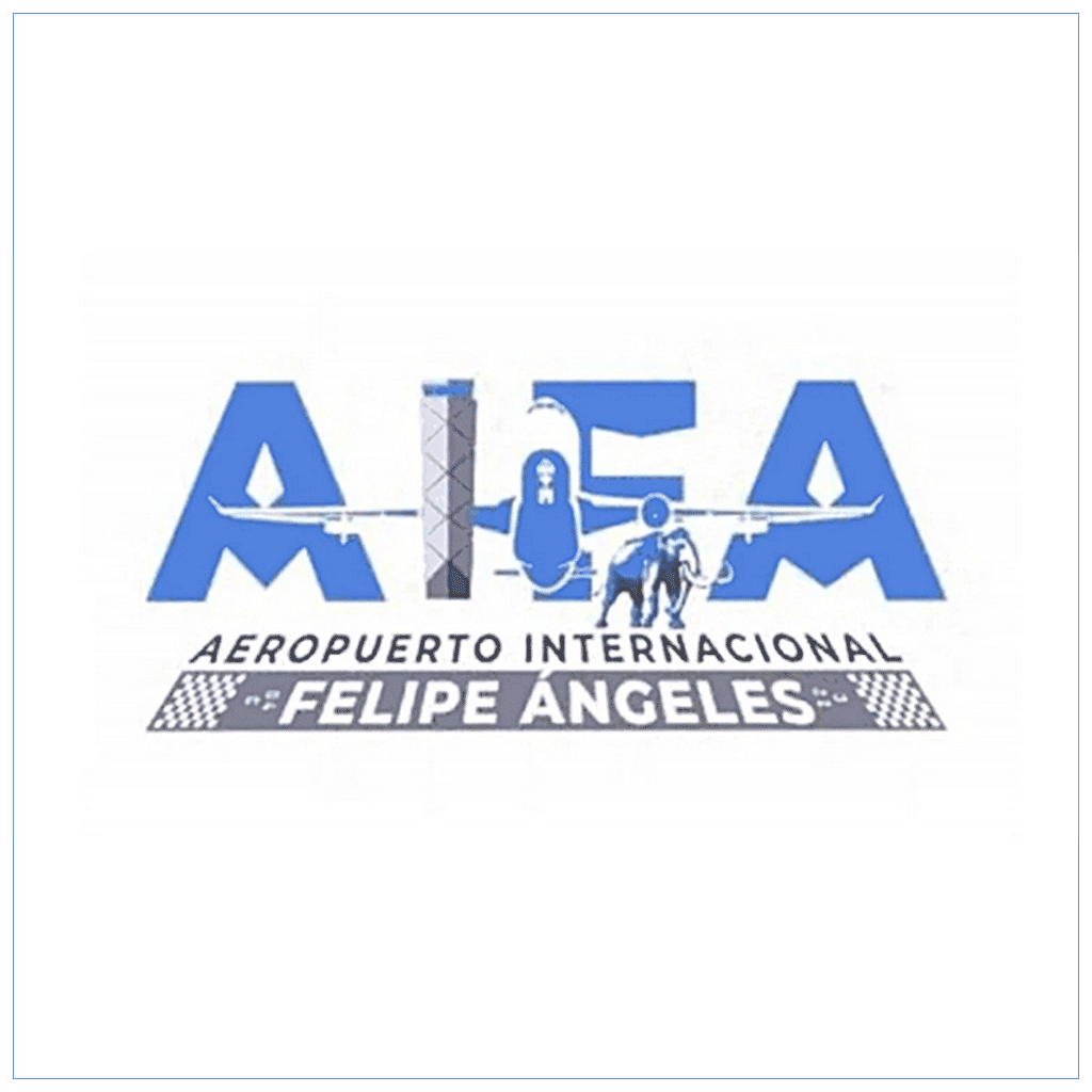
However, let’s not disqualify the AIFA logotype without first pondering the miscellaneous fascination it has produced, with its redundant pictograph of a plane that both ascends and descends, devoid of any landing gear; its only turbine about to crash through the control tower, the intriguing silhouettes on each wing (perhaps bombs, perhaps propellers?), or the two -M characters, hidden under each “A” (acronyms of Andrés Manuel, name of the current Mexican president, as speculated in social media, perhaps an ominous sign of the direction of the country?). What an abundance of opportunities for imaginative readings, well-documented by the predictable torrent of memes that have since taken flight…
As a whole, the logo accumulates elements that end up canceling one another in a clatter similar to the one produced by the innumerable sensory stimuli of everyday life, akin to the cacophonous background of Mexico City.
Perhaps the most genuinely interesting element is the mammoth, integrated into this ambitious aeronautical mosaic due to the discovery some skeletons during excavations on the airport’s construction site. I imagine that this is the kind of situation that captivated the Surrealists in Mexico: the gigantic animal heavily wanders along the take-off (or landing) runway, rescued from its millenary grave: its very presence suggests telluric depths and everything opposite to actually, well, taking flight. It represents a sort of historic—or prehistoric, at least preHispanic—subconscious, loaded with semiotic irony (so dear to designers), if we consider the relevant age of the current president and many of his officials, veterans of the hegemonic “Party of the Mexican Revolution”—known as PRI for one of its title iterations (1930–2000). If the animal remains had been those of a dinosaur instead of a mammoth, the logotype would have been paradoxically premonitory…
The design of logotypes is the stereotypical work of a designer. It can often be an asphyxiating job, especially when it is designers that perpetuate said myth. The development of a logotype is difficult due to the virtually impossible expectation of coming up with the “ideal” concept, and afterward executing it with impeccable precision. Discussions about logotypes frequently default to their aesthetic qualities and can be alarmingly circumstantial. If the undertaking consisted of simply making a drawing for a building facade or souvenir hats, either a painter or an illustrator could be asked to make it, as it would be preferable to mimicking a designer’s work.
The success of a logotype doesn’t necessarily manifest through celebrity, but rather depends on how well it works as a system within itself, and in relationship to the larger system that it signifies. Just as with any good employee, it is not crucial for a logotype to be handsome (at least, not for every taste), but instead efficient in variable contexts. In the case of the international airport of a megalopolis, the system will be inevitably complex, critical, and political, and it will be also connected with numerous other subsystems.
Depending in how well a graphic identity can synthesize the nature of this complexity, the public will gain access to identifying themselves within it. The intention of design, after all, is to function as a service for users. As designer Aaron Winey told me recently: “Design does not create meaning; it creates an environment for meaning to be possible.”
Ironically, the AIFA logotype meets its communication goal: its lack of functionality is not in the image or the type, but in that it showcases the shortcomings of the systems it is supposed to service and represent.
The real problem is not the logotype, but the fact that the profession of Graphic Design has already been practiced for a long time in Mexico, nourished by the history of not only the country but the world and, even so, it remains reduced to a blind spot where only a few people can appreciate the totality of its repercussions. Graphic Design in Mexico is a public profession that remains a secret. In the meanwhile, the decision-makers choose their logos as if they were picking a mere new pair of shoes, and persist in the representation of a vernacular Mexico in contexts that seems to have lost all charm. It is a way of doing things wrong that is no longer adorably surrealist, but instead pathetically dysfunctional.
The new AIFA logotype neither evokes the excitement of the imminent trip and arrival, nor suggests speed and aerial efficiency, nor the threshold to adventure and cultural exchanges. Instead, it reminds me of the current government—a regime that is both the cause and ultimately responsible for this new airport—that wants to rewrite history, but can’t quite do so… because, as another principle, this one semiological in nature, goes: “you can’t see what you don’t know.”

Versión en español:
El amnésico mamut ciego
Leo en un periódico mexicano de este cruel abril que un aspirante a un cargo público se jacta de lo barato que fue hacer el logotipo para el nuevo Aeropuerto Internacional Felipe Ángeles que se construye al norte de la Ciudad de México: tres mil pesos por el registro del emblema (unos 150 dólares). La nota no dice nada sobre la convocatoria y los premios para el primer y segundo lugar (un viaje a Pekín y otro al interior del país). Se infiere que, desde el punto de vista de quienes toman las decisiones sobre las estrategias de comunicación del aeropuerto, es preferible que trabajen gratis quienes responden a la convocatoria que invertir en una licitación extensa y políticamente delicada. Esto gracias a la idea que se tiene de que, con internet y una computadora, un logotipo lo diseña cualquiera.
Sí, un logotipo lo diseña quien sea, pero diseñarlo bien ya es otra cosa, si se entiende que un logotipo se trata de todo, menos del logotipo mismo.
Los comentarios en las redes lanzaron diatribas criticando la ausencia de “principios del diseño”. ¿Cuáles son esos principios, o a quién le pertenecen, cuando diseñar es una actividad que sistemáticamente se ufana de liberarse de las reglas, sobre todo en un país en el que las reglas (y los logotipos) cambian cada seis años? Supongo que los comentarios se refieren a preceptos heredados del movimiento modernista y —en lo que se refiere al diseño— el estilo internacional, a saber: a) que un logotipo debe representar una sola idea, rotunda y clara; b) que debe ser fácil de interpretar para que sea memorable (el que hoy nos ocupa es además inolvidable); y c) que un logotipo debe de ser reproducible a cualquier escala y en todas las plataformas (análogas o digitales), con la finalidad de que toda copia sea platónicamente fiel al original, pues de lo contrario habría desperdicio de recursos. Medido bajo el criterio de estos “principios”, empolvados pero confiables (tres canónicos entre varios más), el logotipo del aeropuerto es fallido, ajeno a la práctica profesional que nos ha rodeado de emblemas nítidos y familiares, esas celebridades icónicas del consumismo que, con una pizca de cachet adquisitivo, garantizan productos y experiencias idénticas en cualquier parte del mundo.
Sin embargo, si consideramos que vivimos un momento en el que huestes de diseñadores progresistas se esmeran en desafiar y abolir los paradigmas del consumo y la tiranía de la producción industrial ¿acaso el logotipo del AIFA no adquiere, de pronto, una encomiable textura anticolonial y de vanguardia?
Pero cuidado con simplificar demasiado las cosas. Si la destreza acumulada por un oficio puede ser explotada por los agentes de la codicia (materialista, transnacional, patriarcal y todo lo que el lector, lectora o lectore considere relevante), desdeñarla como si fuese una vergüenza es un desatino inquisitorial, uno que amenaza extremar la misma carencia que denuncia. En otras palabras: el oficio y la destreza pueden ser usados para bien o para mal, y ameritan ser cuestionados, desafiados y superados, pero renunciar al conocimiento colectivo heredado y enarbolar la pérdida como si fuese un triunfo, es un oxímoron. Para alguien que creció en México (o en cualquiera de los países designados como “en vías de desarrollo”) las tendencias anticolonialistas del diseño suelen presentar el dilema de estar plagadas de referencias a la pobreza y carencia de recursos.
Aún así, no descalifiquemos el logotipo del AIFA sin antes reparar en la fascinación miscelánea que produce, con su redundante avión que asciende pero al mismo tiempo aterriza y además desprovisto de tren de aterrizaje; la turbina única a punto de derribar la torre de control, las intrigantes siluetas en cada ala (¿bombas, alerones?), o las letras -M escondidas bajo cada -A (¿acrónimos de Andrés Manuel, nombre del presidente, como especularon las redes, o señales fatídicas del rumbo que lleva el país?). Abundan las lecturas imaginativas, bien documentadas por el predecible torrente de memes que alzaron el vuelo…
En conjunto, el logo acumula elementos que terminan por anularse unos a otros, con un estrépito similar al que producen los innumerables estímulos sensoriales de la vida diaria, la cacofonía ambiente de la Ciudad de México.
El objeto realmente interesante del logo es el mamut, integrado al ambicioso mosaico aeroportuario a raíz del hallazgo de algunas osamentas durante las excavaciones de la zona en construcción. Imagino que este es el tipo de situación que cautivaba a los surrealistas en México: el gigantesco animal deambula pesadamente a lo largo de la pista de despegue (o aterrizaje), rescatado de su sepulcro milenario. Su presencia alude a una profundidad telúrica que se opone a todo lo que procure levantar el vuelo. Representa una suerte de subconsciente histórico —o prehistórico, o al menos prehispánico— que se carga de ironía semiótica, tan cara a los diseñadores, cuando se toma en cuenta la importante edad del actual presidente y muchos de sus funcionarios, veteranos de los hegemónicos Partidos de la Revolución Mexicana (1930–2000). Si en lugar de encontrar los restos de un mamut, hubieran encontrado los de un dinosaurio, el logotipo habría sido paradójicamente premonitorio…
Diseñar logotipos es el quehacer estereotípico del diseñador. Es un trabajo en ocasiones asfixiante, especialmente cuando son los diseñadores mismos quienes perpetúan ese mito. Diseñar un logotipo es difícil debido a la expectativa, prácticamente imposible de cumplir, de encontrar un concepto ideal y después representarlo con exactitud. Las discusiones sobre logotipos, alarmantemente circunstanciales, suelen concentrarse en sus cualidades estéticas. Si se tratara de elaborar un dibujo para decorar fachadas y vender gorras, podríamos pedirle que hicieran el emblema a un artista plástico o a un ilustrador. Sería preferible a la pantomima de hacer un verdadero trabajo de diseño.
El éxito de un logotipo —que no necesariamente se manifiesta por su celebridad— depende de qué tan bien funciona como sistema en sí mismo y en relación con el sistema al que significa. Como si se tratara de un buen empleado, no es indispensable que el logo sea bien parecido (al menos no para todos los gustos), pero sí eficiente en contextos variables. En el caso del aeropuerto internacional de una megalópolis, el sistema es uno muy complejo, crítico y político, y está vinculado a otros innumerables subsistemas. En la medida en que la identidad gráfica logre sintetizar la naturaleza de esa complejidad, el público accede a identificarse y a orientarse dentro de ella. La intención del diseño, a fin de cuentas, es convertirse en un servicio para los usuarios. Como me dijo hace poco mi colega, el diseñador Aaron Winey: “el diseño no crea significado; crea un ambiente en el que el significado es posible”.
Irónicamente, el logotipo del AIFA cumple con esa labor de comunicación. Su disfuncionalidad no radica en la imagen o la tipografía, sino en la forma en que refleja las fallas de esos sistemas a los que da servicio y representa. El verdadero problema no es el logotipo, sino que el diseño gráfico, en tanto que profesión, lleva mucho tiempo desarrollándose en México, alimentado por la historia del país y del mundo y, sin embargo, sigue reducido a un punto ciego en el que poca gente aprecia la totalidad de sus repercusiones como instrumento de identidad y orientación. El diseño en México es una profesión pública que permanece en secreto. Mientras tanto, los encargados tomar decisiones como si estuvieran escogiendo un par de zapatos y persisten en la representación de un México vernáculo en contextos en los que eso ya agotó su gracia; un hacer mal las cosas que ya no es algo conmovedoramente surrealista, sino patéticamente disfuncional.
El nuevo logotipo del AIFA no evoca las emociones que suscita la inminencia de partir o de llegar; no sugiere ni velocidad ni eficiencia ni es un umbral a la aventura o al intercambio cultural o comercial. Me recuerda en cambio al gobierno —al régimen que es a la vez la causa y responsable de ese nuevo aeropuerto— y su tan publicitada determinación de volver a escribir la Historia y rediseñar la identidad Mexicana a su imagen y semejanza. Pero no lo consigue porque, como dice otro principio, ahora del orden semiológico: “nadie puede ver lo que no sabe”.
