An essay and project by VCFA faculty member Lorena Howard-Sheridan
Craft is a peculiar kind of wealth in that, the more you spend it, the more you make from it. We are talking about Craft with an upper case and in the widest sense of the word, which can be associated with different meanings—ranging from the grace with which you cut, glue and fold materials (think holiday ornament), to your approach to developing, for example, an immersive design experience (think world-fair interactive installation involving a provocative message). “Skill in carrying out one’s work,” reads the dictionary: craft is the playground of the grown-up.
Some people assume that Craft doesn’t involve a lot of thinking (a hint that they might not be thinking much themselves). In fact, the part of Craft where ‘making’ gets mixed with thinking is my favorite. But that is a discussion for another day.
If we think, there are words, and where there are words there can be writing. With the Alphabet.
Ah… the Alphabet: that collective good that pervasively enters our lives. Streets and screens are crowded with messages and we can’t avoid reading short sentences or lose words once they are within our field of vision; literates must endure the curse of having uninvited thoughts pushed into our minds (a fact well-known and used in the field of advertisement).
And yet for all that comprehension power, most readers lack any concern for the features of alphabetic characters, acknowledging only that which is not present but by the power of words invoked, just like magic (or, actually, by Magic). And that is the way it should be.
We recognize -d from -b from -p from -q (unless a bit afflicted by dyslexia), a detail that sets Typography apart from other craft-reliant practices, because, how can we decipher all that is being told, and yet know so little about the light-to-dark transactions that our mind resolves within strings of text? Noticing characters for their millimetric geographies demands getting started in an extensive conversation about strokes and counters, endings and anatomical terms like ‘ear’ and ‘arm’ and ‘shoulder’ (the similarity to parts of the body serves well my belief that, if reading is possible thanks to a generous concession of our biology, then letterforms are as organic and alive as we are at the time that reading happens).
Remaining involved in this long typographic exchange—both with eyes and ears, but also with hands, if we are that lucky—allows for feature-unconsciousness to dilute into clumsy awareness into practical intention and, one fine day, we start noticing (sometimes proudly snubbing) the typeface on the headlines of a local newspaper.
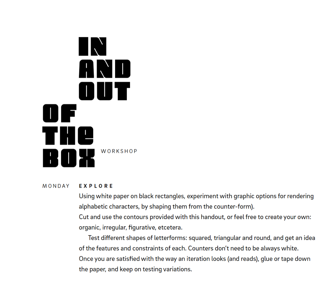
Strictly speaking, letterforms are the expression of a stroke. The lettering workshop we are featuring in this piece involves a slight transgression of the alphabetic character as a result of such stroke: our prompt was to sculpt the forms out of rectangular blocks. The focus on counters as revealers of characters is a chance to explore familiar forms from a fresh perspective that might inform—hopefully build—craft. As we sketch a given arrangement, our minds determine whether the results are readable: that is when thinking and making meet. Reading is, after all, also a skill. Typographic practice is visual, with a side of writing.
There is a system to every script and a gesture to every occurrence of it, whether hand-written or reproduced. But all writing systems will observe a few similarities, like displaying in lines and discernible pockets of meaning. They will all carry a hefty amount of air, or counter space: this mark-to-space relationship is a crucial bond, and as far as subconscious aspects of reading go, negative space is the bottom of the river, the mystery that solves the plot, the key to skill when it comes to letter-forms: there is often a sense of relief as a character gets resolved.
Perhaps because there are so many words, so infinite combinations of them, and unlimited minds and hands to hold on to the conversation, Typography may feel sometimes too wide a field, but I would rather imagine it as an ocean where we are allowed to float (or splash around), hoping not to drown out of intellectual greed like those monks in Umberto Eco’s The Name of the Rose (it is not by coincidence that I mention them, as they were also absorbed in the joys and setbacks that come from thought as expressed on paper). The only caveat of being familiar to the negative space is that sometimes it may take a bit of time to put it to sleep, so that we can enjoy the plot of our preferred reading.
• • •
In and out of the Box: a workshop
The workshop initial prompt:
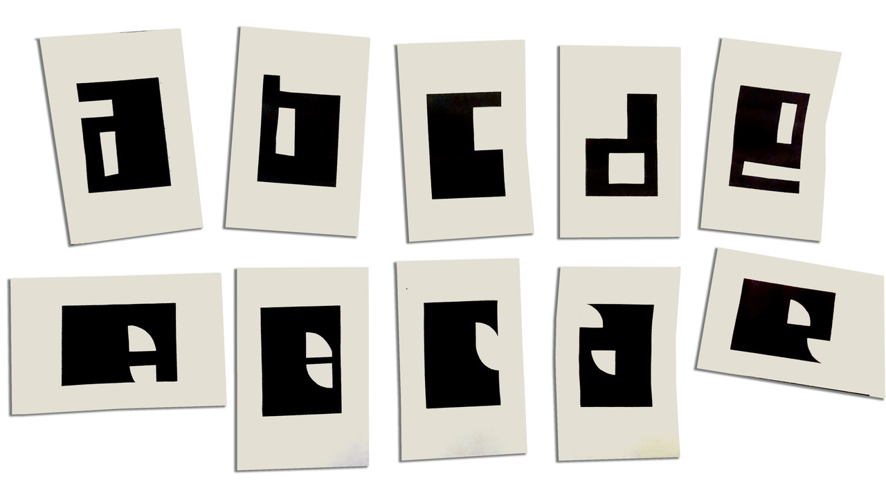
Assorted examples of exploration by the participants of the workshop.

Top row: Matt Monk, lower row: Paulina M. Johnson
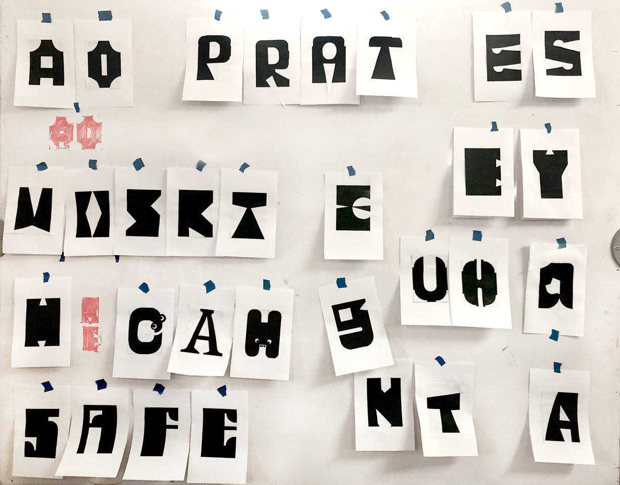
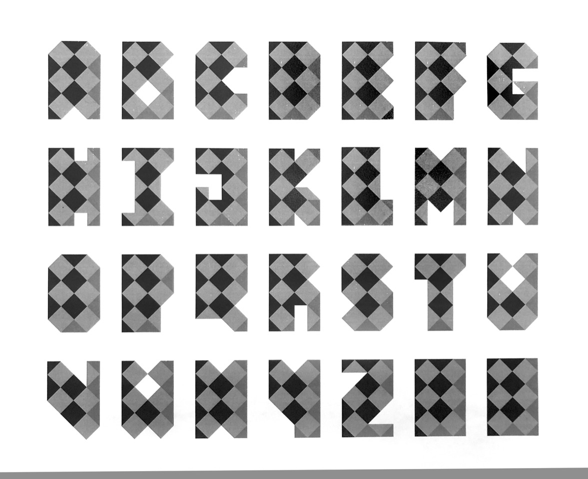
In this example by Danbee Park, the negative space becomes prominent as letterforms are aligned close to one-another.
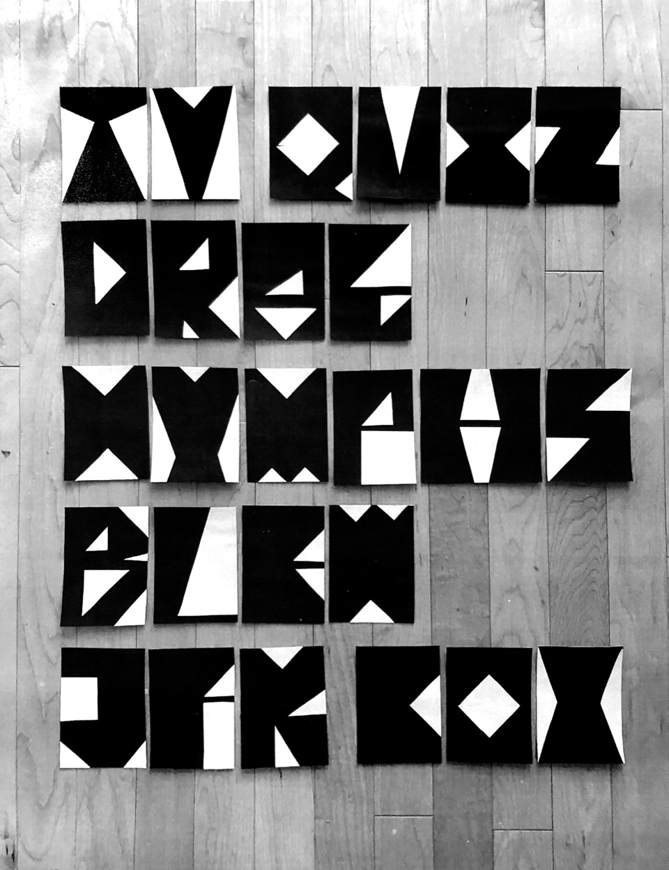
A different approach by Robyn Craxton Lindquist, makes us think of dramatic contrast as an imaginary tool is rotated in imaginary calligraphic gestures.
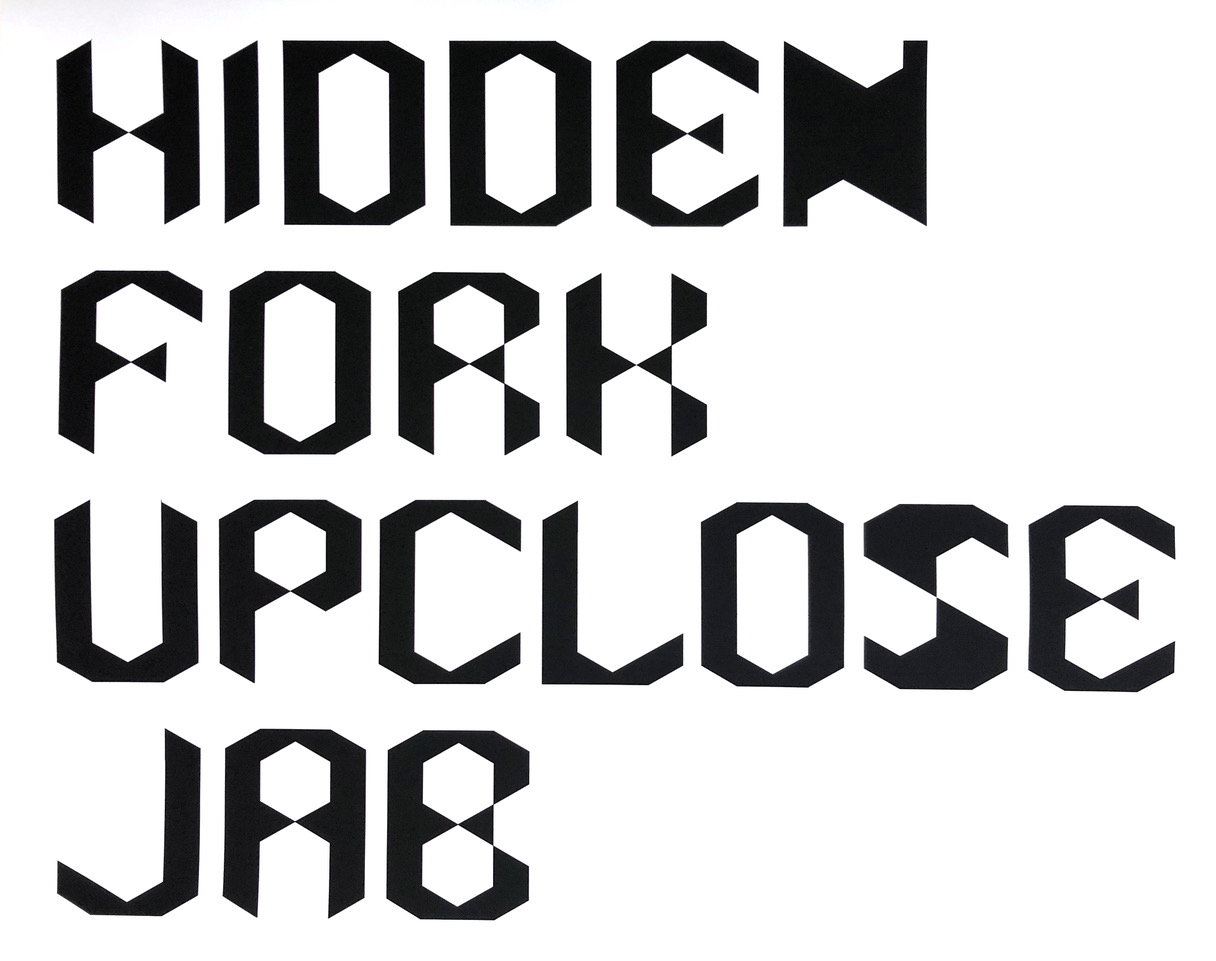
Tasheka Arceneaux-Sutton brought letters to the limit of legibility.
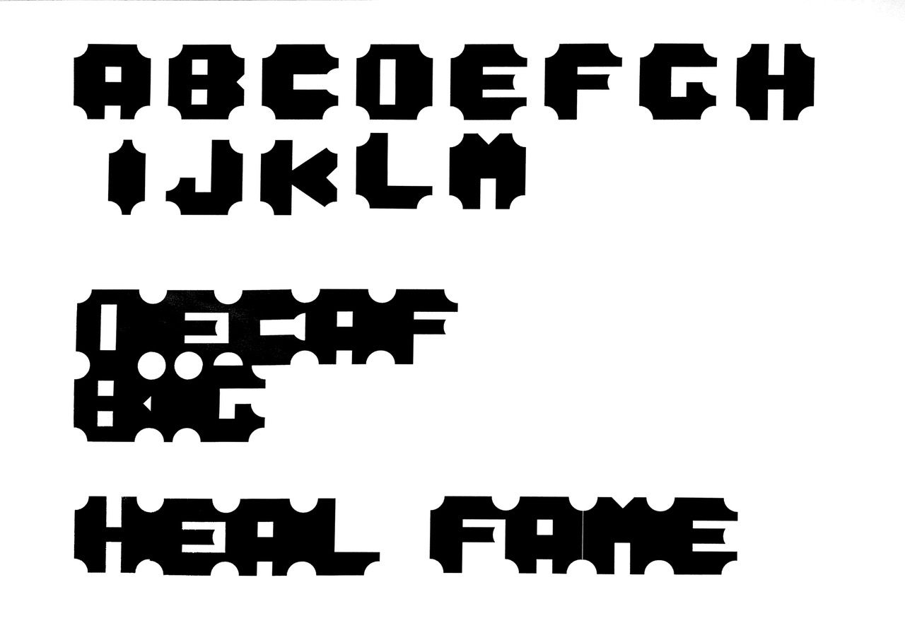
And least but not at all least, Yoon Soo Lee discovered an unsuspected gift and worked on several versions of block-like, decorative custom characters.
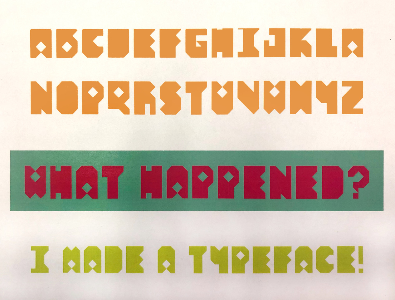
Some of the multiple typefaces designed by Yoon Soo Lee.
Running sports | Women’s Designer Sneakers – Luxury Shopping
