
Questions is a new book from VCFA faculty member Sereina Rothenberger with David Bennewith and her students of the University of Arts and Design in Karlsruhe.
When Rothenberger and Bennewith invited graphic designers to give lectures we noticed that there was a certain hesitation amongst the students to ask questions, so they invited a selection of graphic designers to come to Otl Aicher’s Institut für analoge Studien (Institute for Analog Studies) in Rotis, Germany.
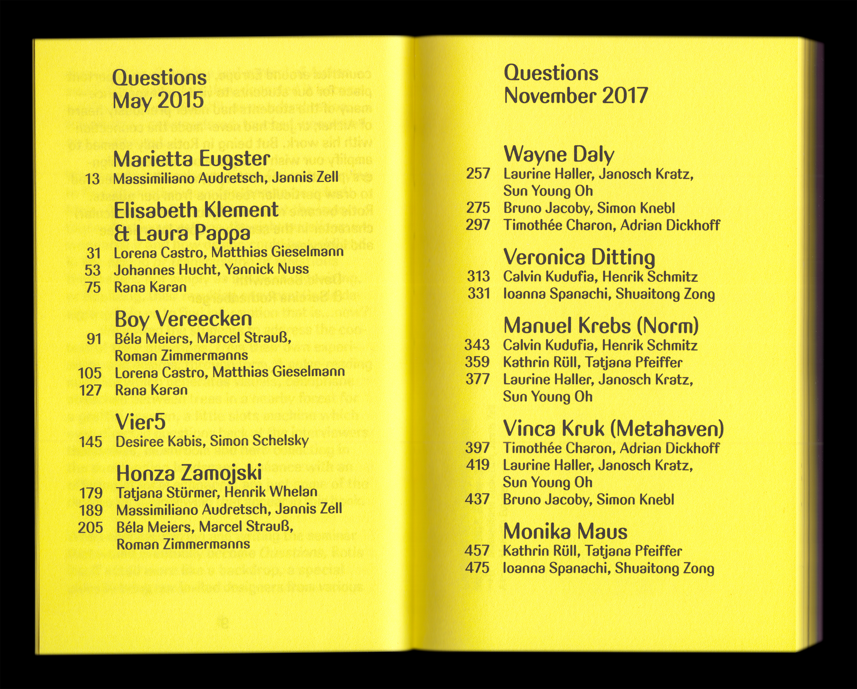
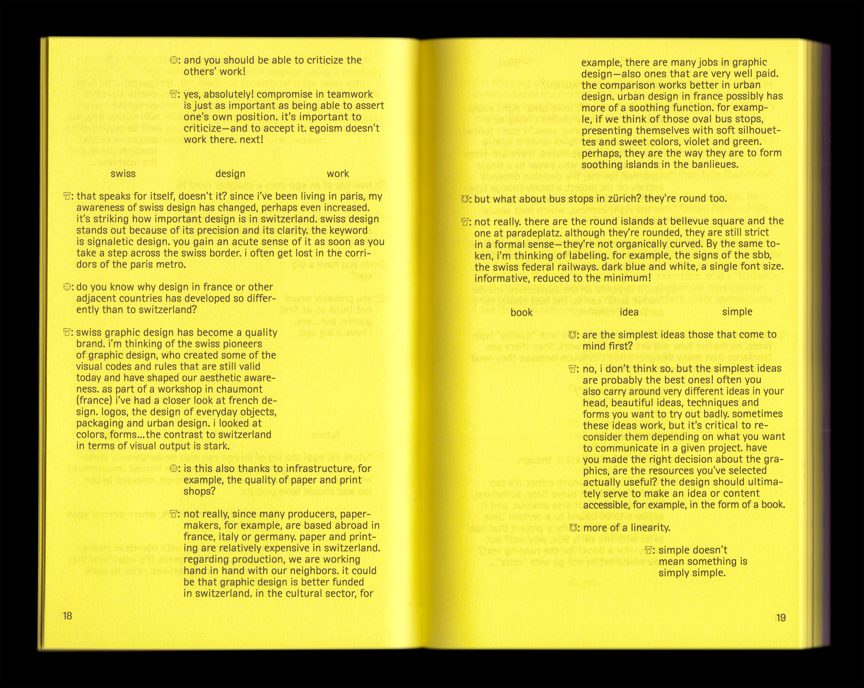
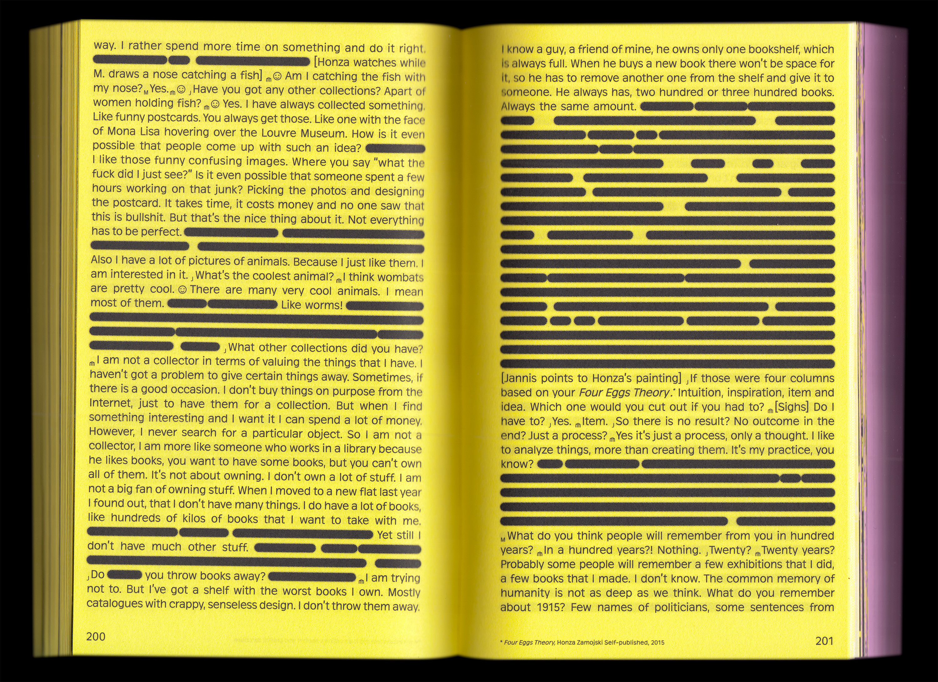
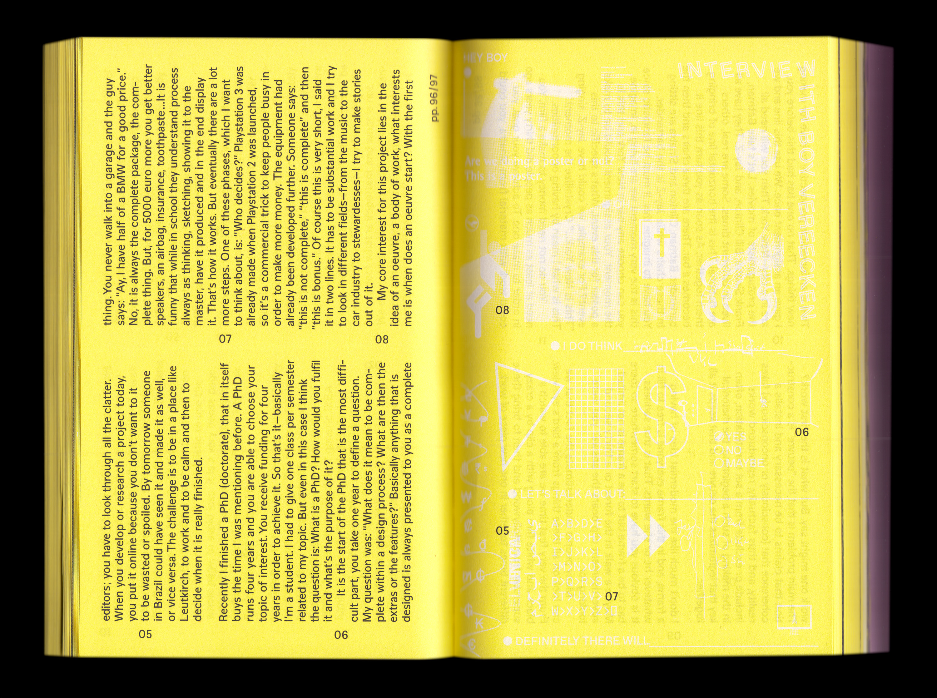
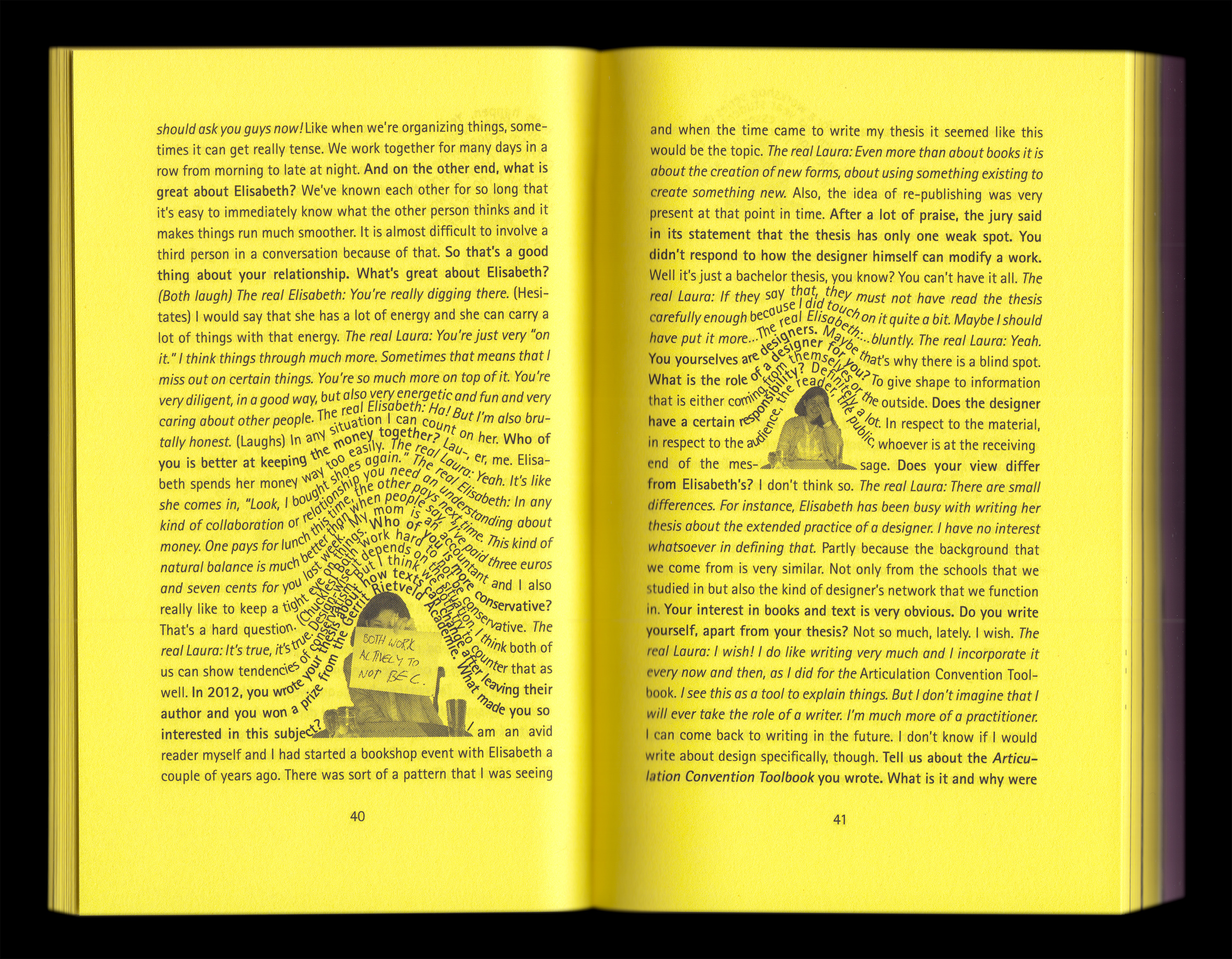
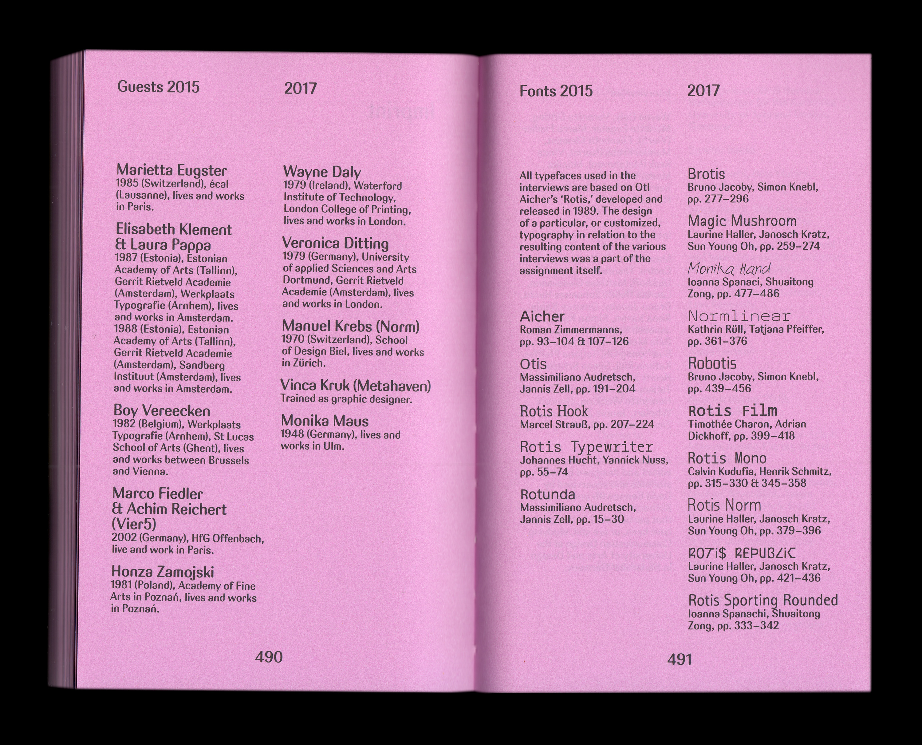
The designers that participated were: Marietta Eugster and Manuel Krebs (Norm) from Switzerland, Wayne Daly and Veronica Ditting (Gentlewoman) from the UK, Elisabeth Klement & Laura Pappa and Vinca Kruk (Metahaven) from the Netherlands, Boy Vereeken from Belgium, Vier 5 from France and Honza Zamojski from Poland.
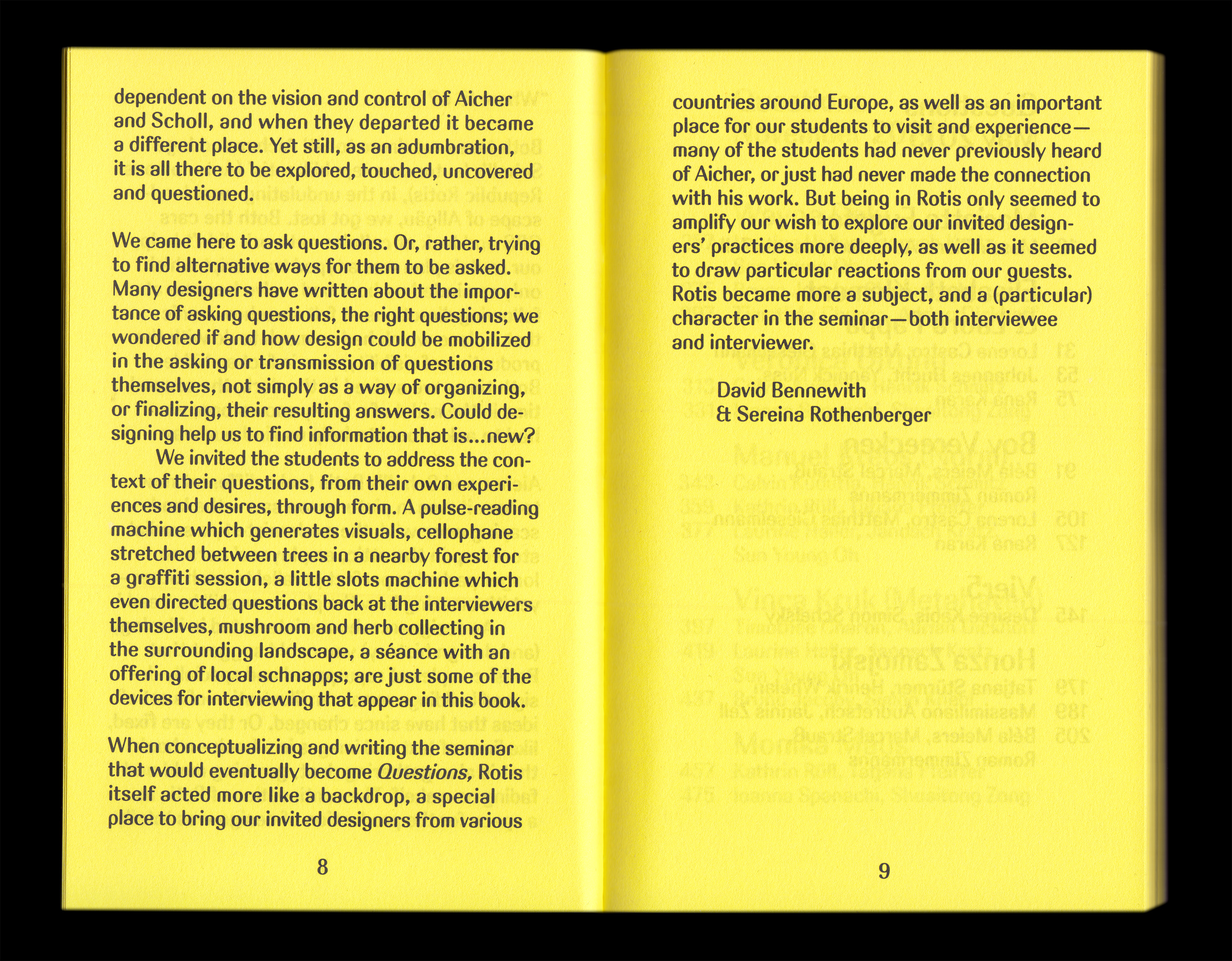
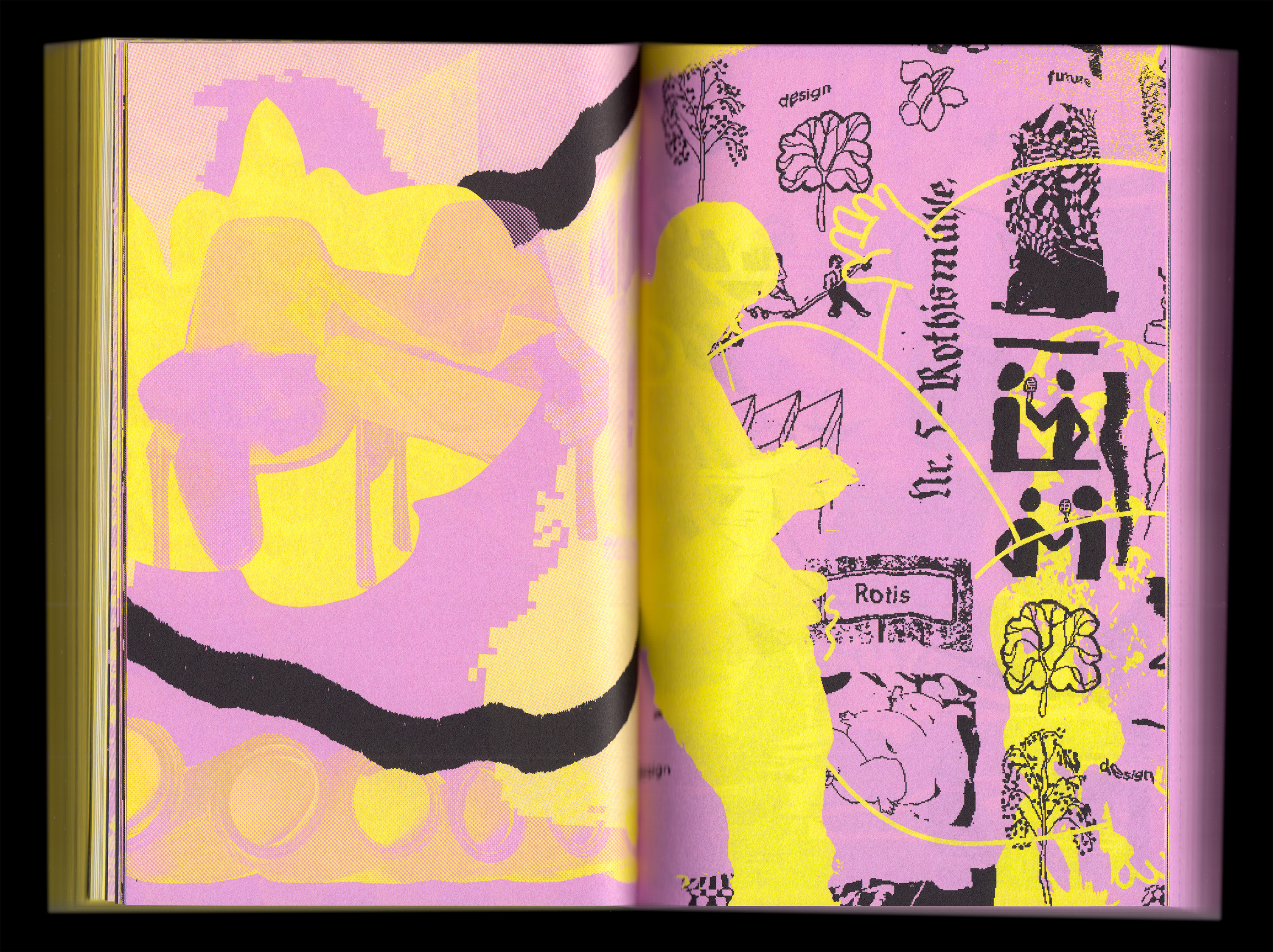
To get a better insight into Otl Aicher’s work in Rotis we decided to invite Monika Maus, a former employee of Otl Aicher, as a special guest for the second interview session in 2017. During the first interview session, the participants all responded strongly to the architecture and physicality of the Rotis complex, the site itself becoming a silent ‘interviewee’. We thought for the second session it was important to bring it more into the foreground and learn more about it when it was functioning as a place where a lot of iconic design work was made, such as the identity for the 1972 Olympics in Munich.
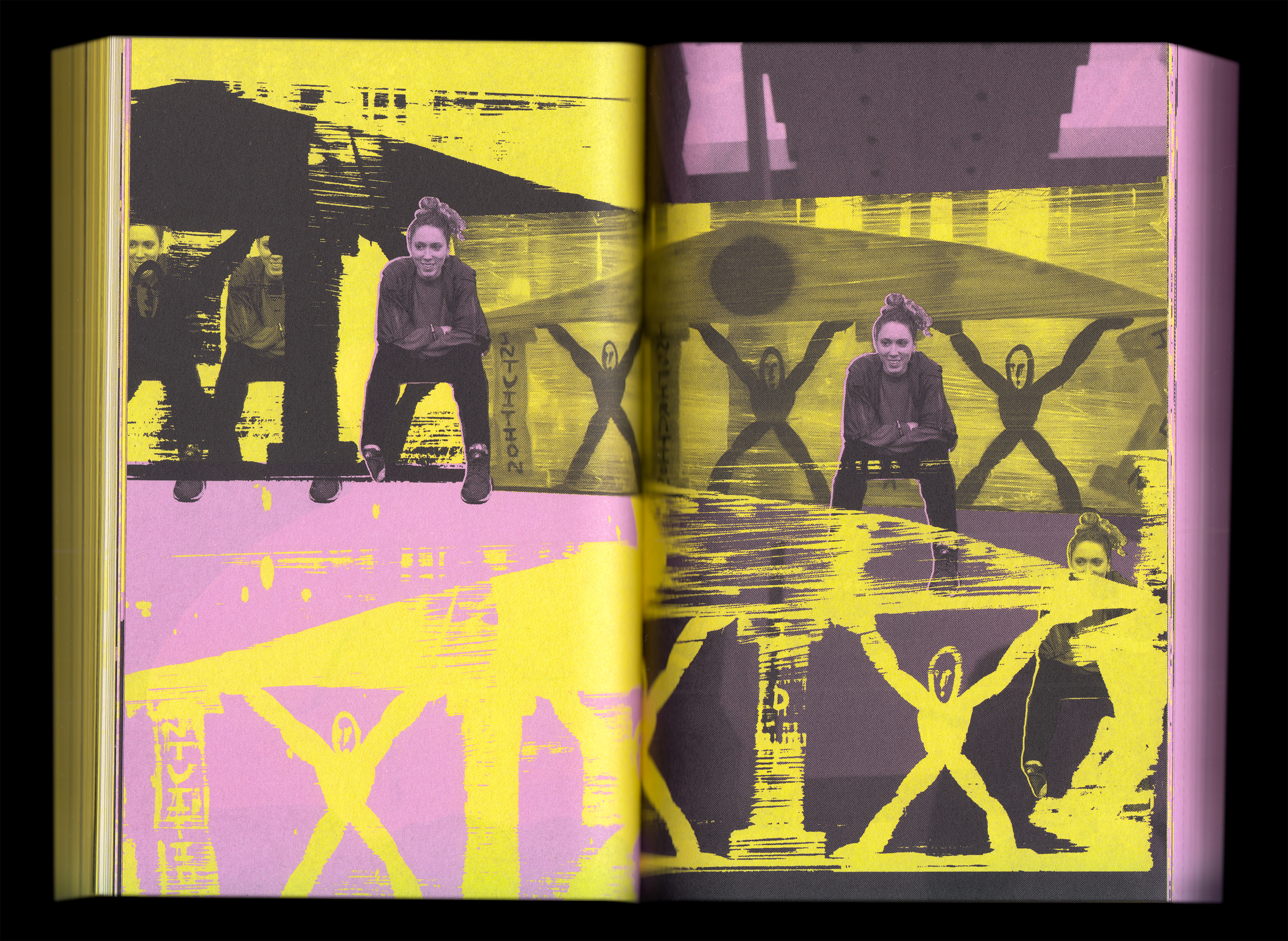
Over two days, the invited designers were interviewed in a myriad of ways by the students, whose assignment it was to learn to conceive, ask, and design questions.
In total there were 28 students that participated across the whole department. Some students had just begun their studies in study graphic design whilst others were in their last semester of school. This lead to an interesting mix of perspectives from the students themselves.
Do your parents understand what you’re doing?
Or your grandmother?
How does a regular day in your studio start?
Did you learn more from your fellow students than from your teachers?
What are you afraid of?
In general, the students were interested to find out what to expect once they might start their own practices. Leading up to the trip to Rotis the students investigated the invited designers and conceptualized their respective interview strategies.
The students devised interview techniques – part of the assignment was to come up with an own approach for each interview and guest – which led to surprisingly honest answers. It was amazing how generous most of the designers were in giving insights into their everyday practice, maybe as a result of the preparation work the students put into their interviews before going to Rotis, many students were able to find out quite personal obsessions or interests from the invited designers from which they designed their interview techniques.
Some memorable interviewing techniques included a fishing trip, a gambling-style slot machine that either produced questions or made the participants drink a shot of local schnapps, a trip to the local library of Rotis, a device that read the collective heartbeats of interviewer and interviewee, designing stamps with the interviewee, or simply baking bread while asking questions, etc. A seance also occurred…
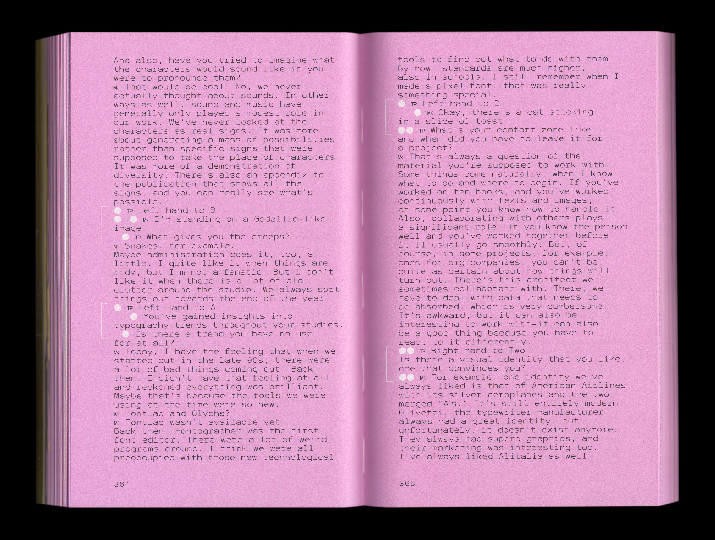
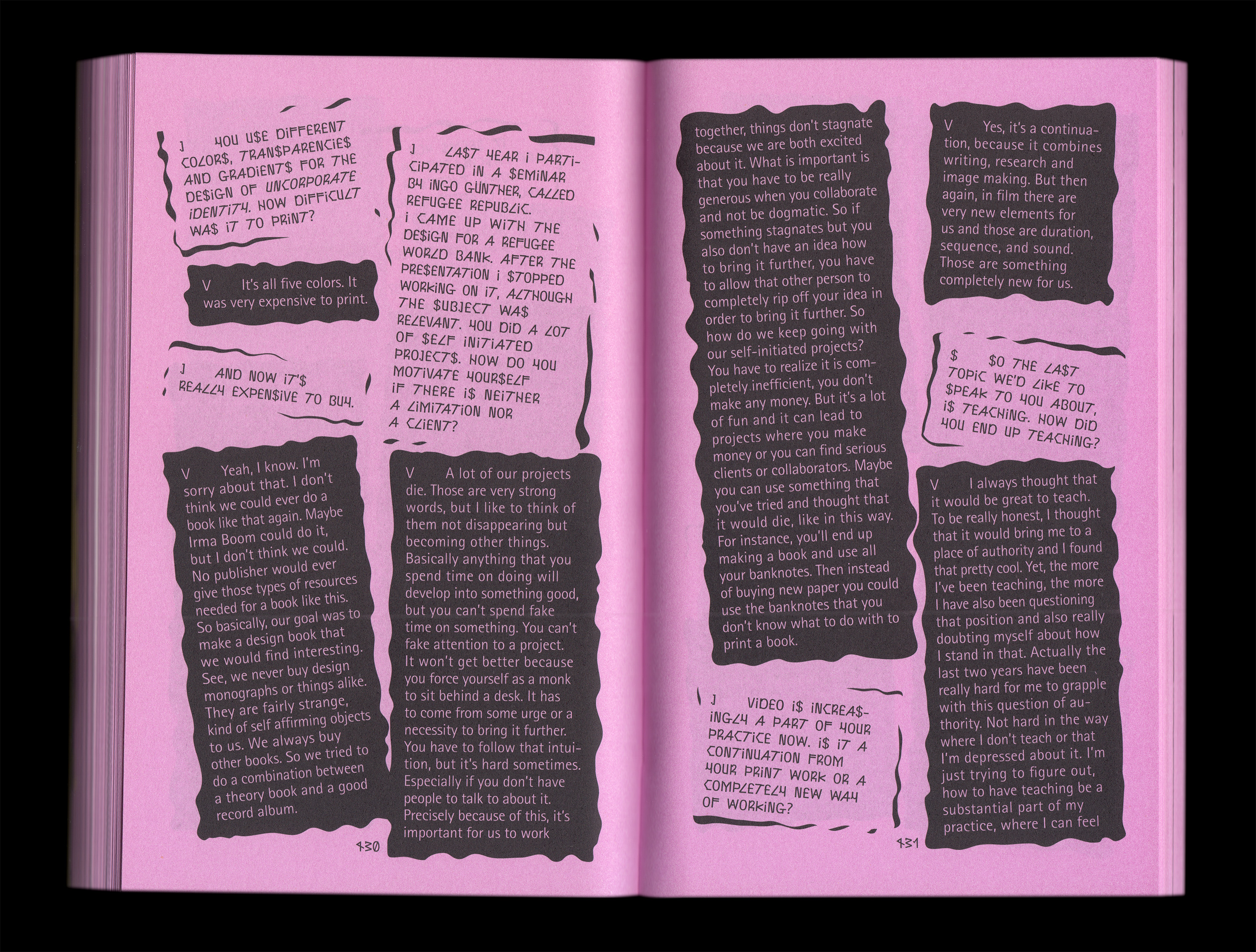
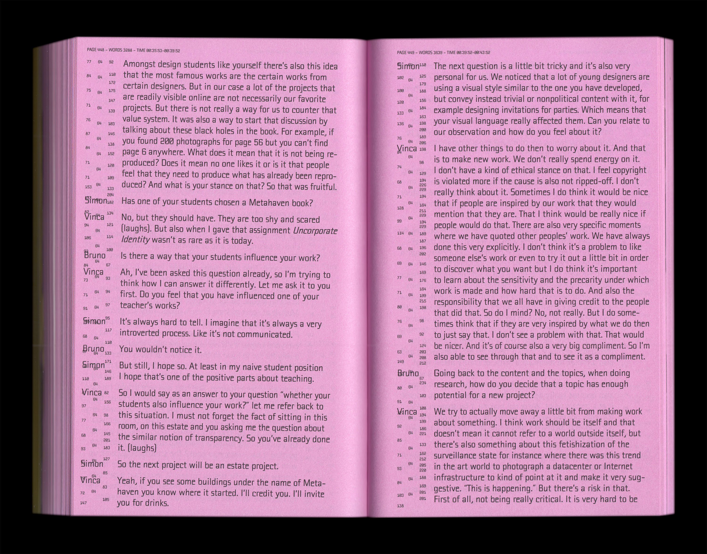
Part of the assignment was that the students had to design a typeface for each interview which was based on the typeface ‘Rotis’ that Otl Aicher released in 1989. Rotis is a universal typeface that is somehow stuck in its time. Each interview in the book is designed by the students that conducted the interviews. This leads to a perhaps crude mix of aesthetics that are influenced by the students perspective on the work, and the interview subjects they researched.
So, in a way, the book is a representation of the different personal approaches of the students, but in response to the content from the invited designers. Some of the designs may be more elaborate than others. But it was important to have an honest representation of the students work, rather than something too polished.
The work produced by young students is maybe the most contemporary insight you can have in graphic design in a school since the work reflects their momentary curiosity.
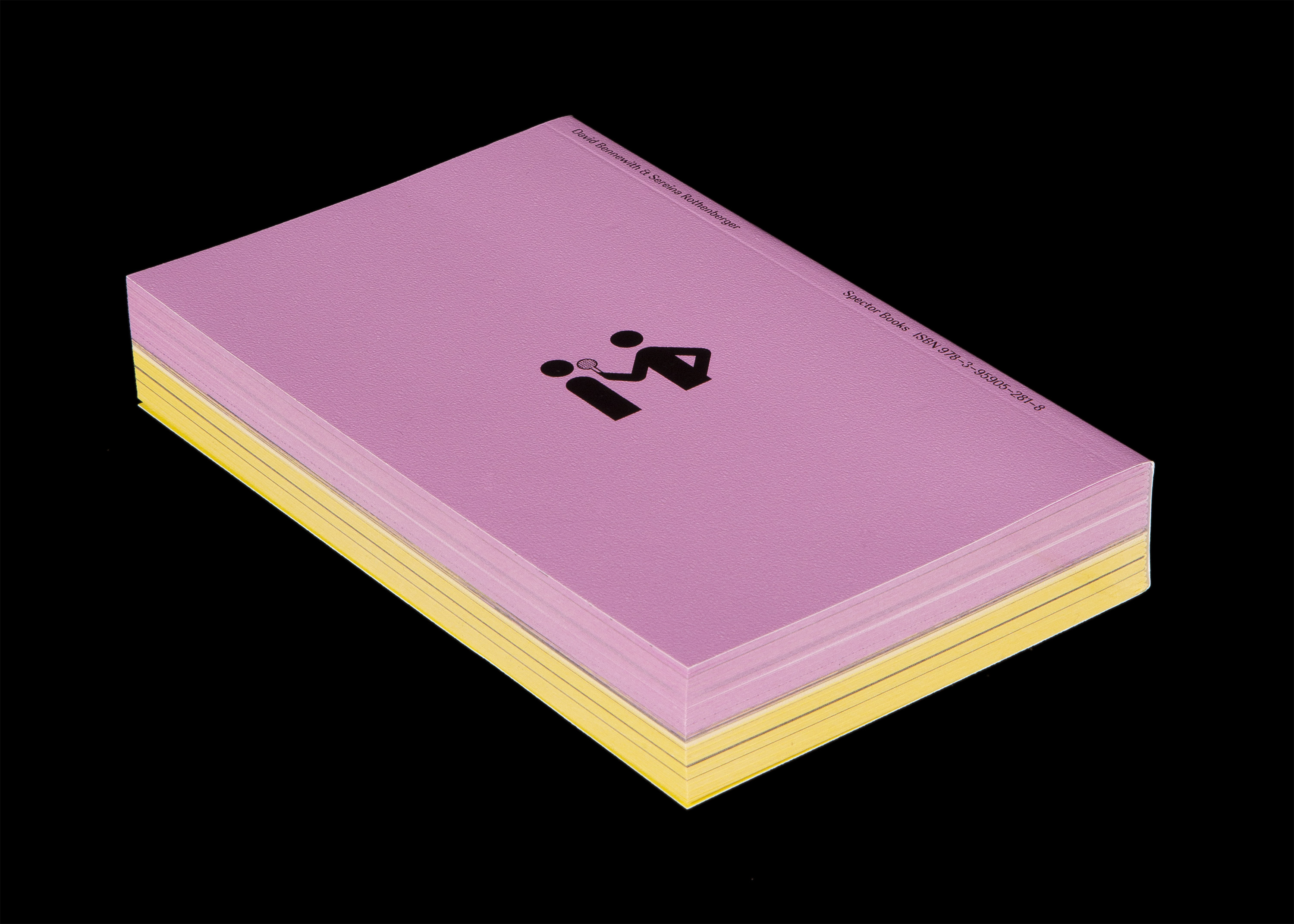
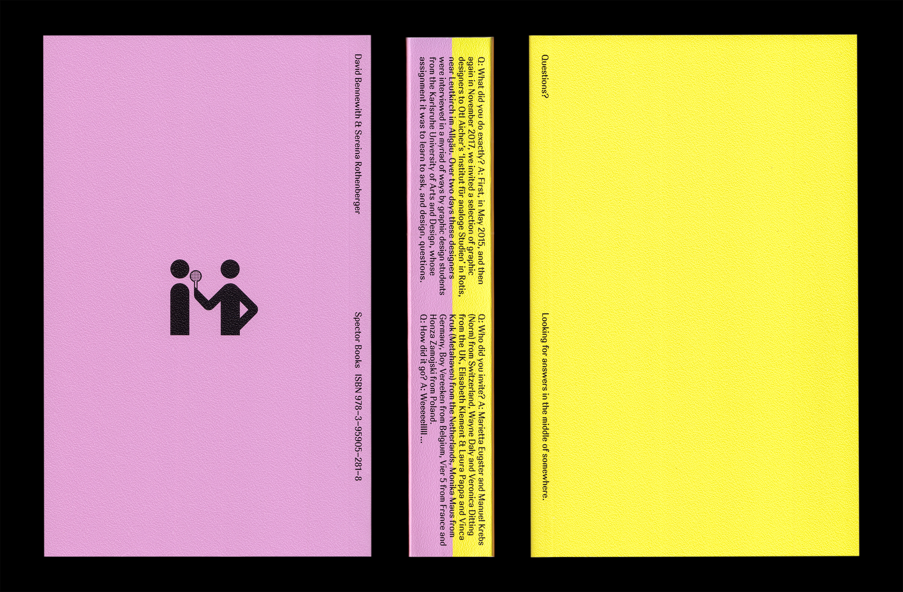
A team of three students – Frederike Spielmannleitner, Simon Knebl, and Béla Meiers designed the book using their font ‘Aach’ which is based on typographic sketches for the 1972 Summer Olympics they found in Aicher’s old studio complex. The varied content of the interviews is conspicuously structured into two sections, one for each visit to Rotis.
Rotis is located in a beautiful landscape, being there once in winter and once in spring Sereina and David wanted the colors of the book to represent the different seasonal atmospheres. The winter-purple and spring-yellow are also a homage to the color tones they found in Aicher’s work for the 1972 Munich Olympics, which Aicher intended to reflect the landscape surrounding Munich.
Check out Questions here: http://spectorbooks.com/questions
 Running sport media | 【国内4月発売予定】プレイステーション5 × ナイキ PG5 PS EP 全2色 – スニーカーウォーズ
