VCFA Graphic Design faculty member Lorena Howard-Sheridan and VCFA MFA candidate Heather Snyder Quinn win the STA 100 design competition! The STA, formerly a rogue chapter of the AIGA based in Chicago, holds the United States’ only good graphic design competition at the present moment.
(This is not hyperbole — the STA 100 may be the only graphic design competition in America at present which is not run by a corporation or for-profit organization.)
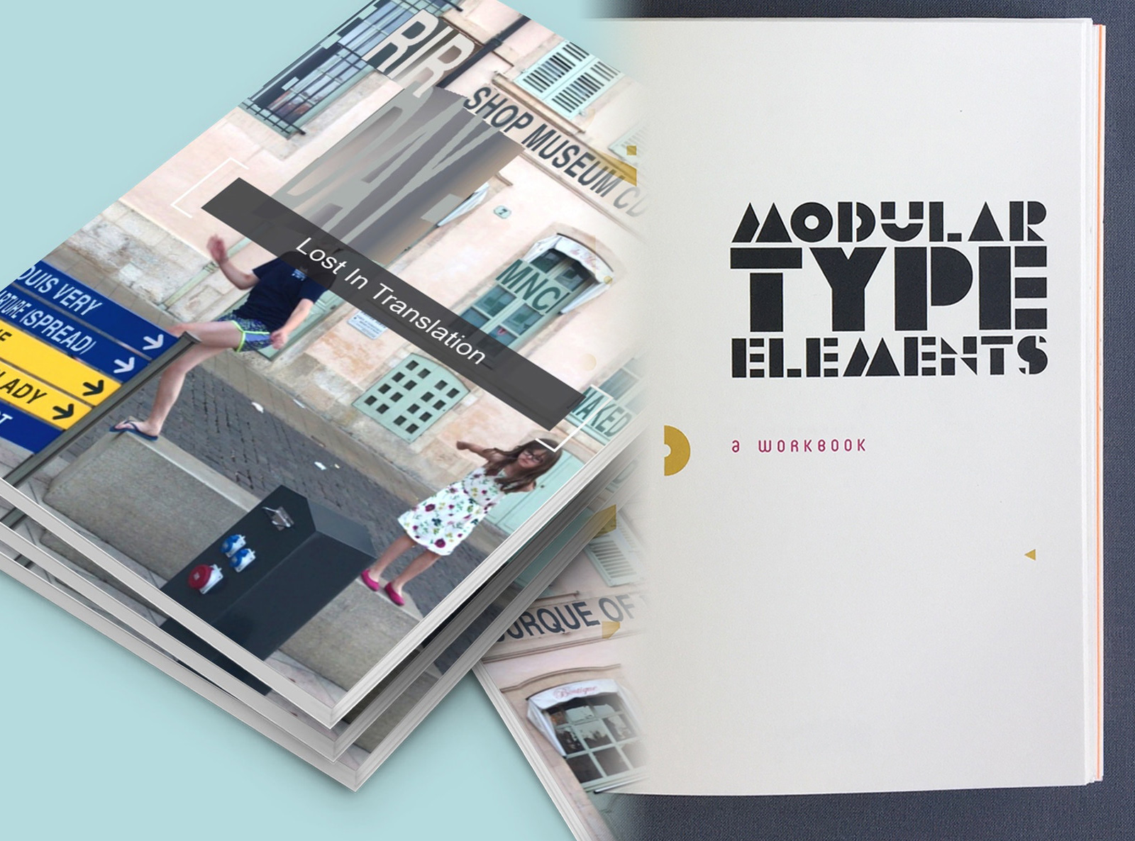
Heather Snyder Quinn: Lost in Translation
“Lost in Translation” is an experimental publication documenting a family’s trip through Europe via Google Translate as part of an arts residency at Frans Masereel Centrum in Kasterlee, Belgium.
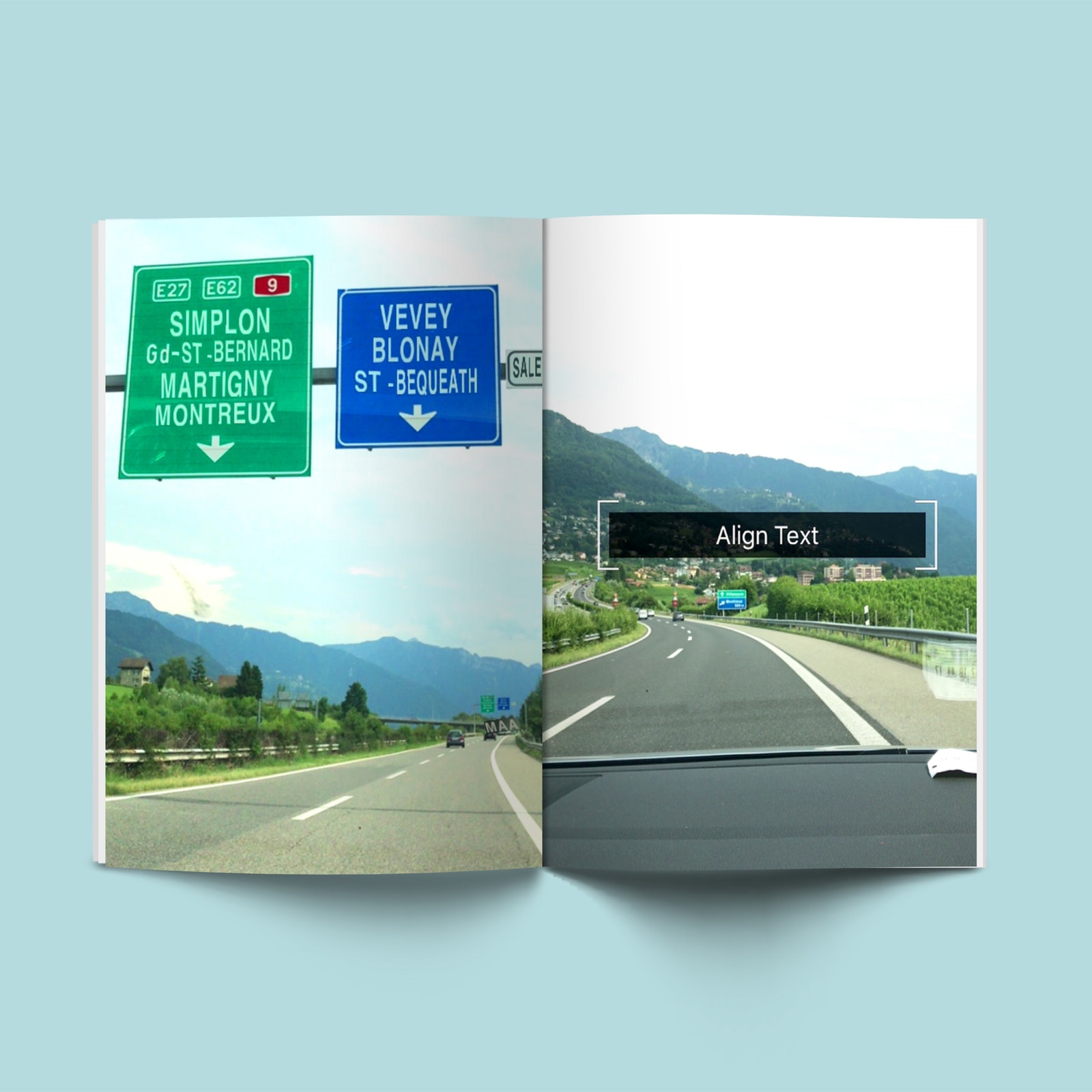
The smartphone application of Google Translate uses augmented reality via the camera, therefore translating the family’s experiences in real-time by overlaying the original text with translations into English. Both the technology (AR) and the tool (Google Translate) are still relatively new and therefore prone to irregularity and breaking. Several of the publication pages display multiple attempts at capturing the translations and the resulting iterations. These so-called irregularities create experimental, floating typography that captures the essence of time and place.
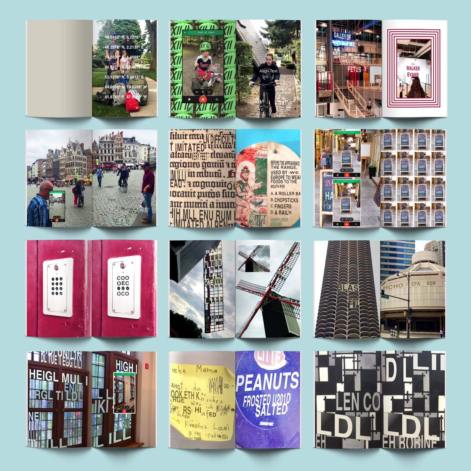
The experiments were taken over five weeks and included over 2000 smartphone camera screenshots. Translations include:
– German to English and French to English in Switzerland
– French to English in France
– Dutch to English in the Netherlands and Belgium
– Icelandic to English in Iceland
– English to various languages (upon returning to the States)
Google Translate assisted the family with everything from the mundane to the spectacular—including, grocery store purchases, ATM withdrawals, automated coffee/beer vending machines, museum trips, works of art, bike rentals, wayfinding through beaches and parks, and many tourist sites. The experiments showcase Google’s translation not only of words, but also objects and spaces that reference the shape of letterforms. These experiments create abstract, collaged, typography, augmented over buildings, faces, works of art, landscapes and even the texture of cobblestone roads. Many of these studies have reoccurring nonsense words like naked, fetus, email, slut, sin, venture capitalist, ultraviolet, and bra—questioning the nature of the algorithm behind the tool itself.
Lorena Howard-Sheridan: Modular Type Elements, A Workbook
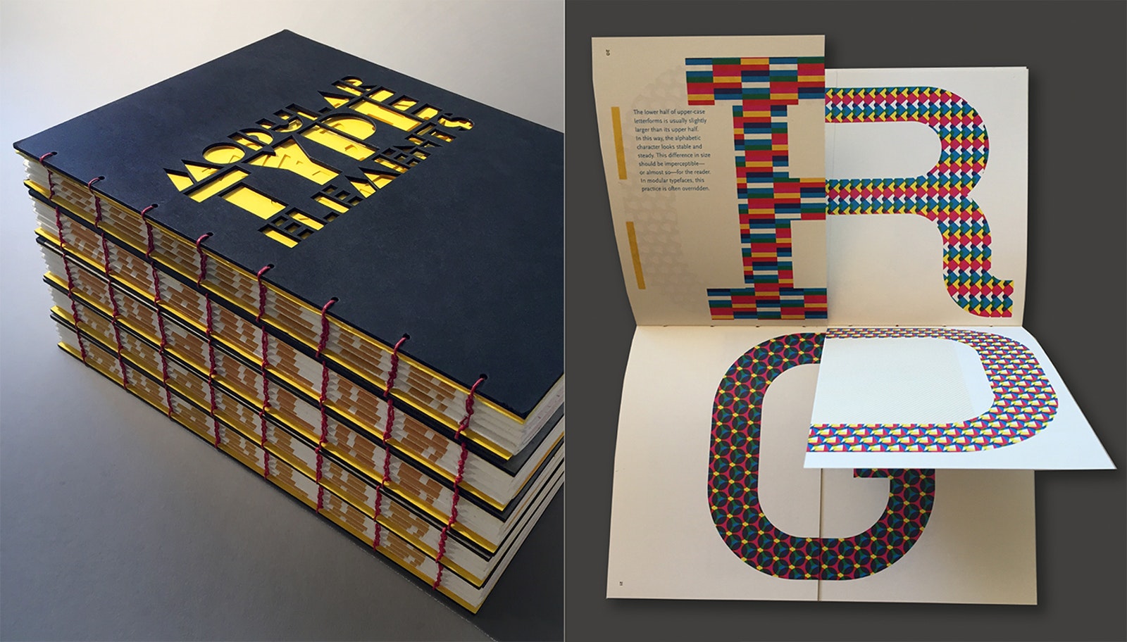
Modular Type Elements, a workbook, contains a brief introduction to drawing letterforms in general—with a modular approach in particular. Together with illustrations, prompts, and samples, it includes an acrylic stencil with geometric shapes and adhesive stickers to build characters from the outside in. Among other surprises, the set consists of an assortment of paper printed with different grids.
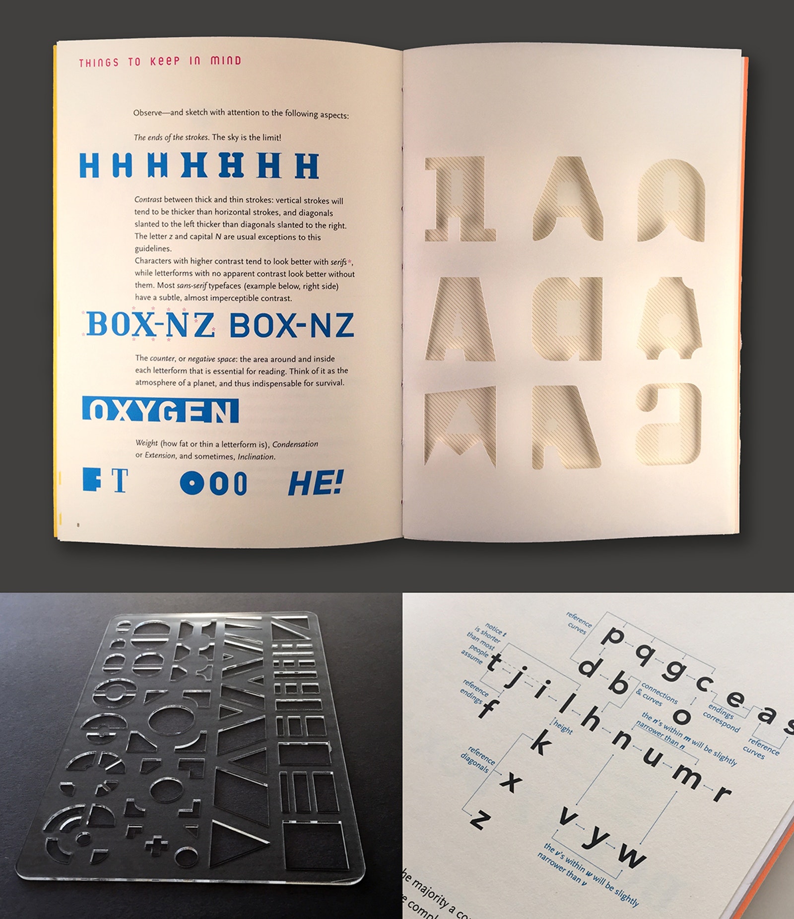
Composed of various digital technologies and mechanical as well as manual work, the design process involved hands-on experimentation, workshops, and a prior edition. For its assembly, we used laser engraving and perforation along with accurate methods and relief printing that produce contrast between—say—the sharpness of vector graphics and the tactile tension of wood printing. Consequently, each work is a bit different from the others. Its pages are not precious but confirm an unfinished object, meant to be completed by its owner.
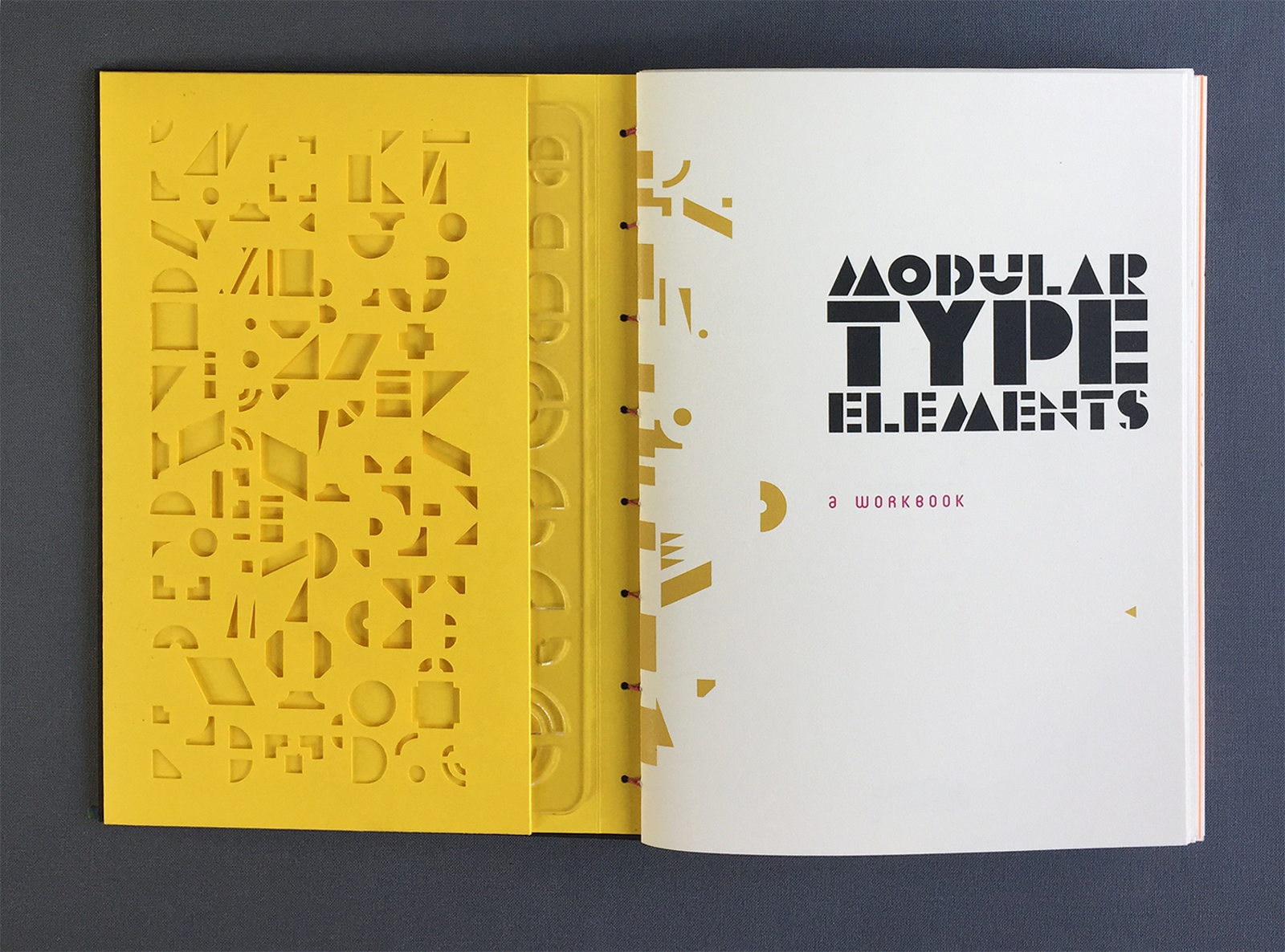
Modular Type Elements fill the work with cyphered messages and open endings. A collaborative work since its conception, the back cover invites users to share the samples of their work on social media, with the hope that in the future, we might be able to pull examples from people across the world and turn them into a multiple-authored specimen publication.
Congratulations to both Lorena and Heather. We are very, very proud of you.Sports News | Autres
