by Cameron Finch
Laura Rossi García is a multidisciplinary designer, researcher and writer living in New Jersey. Using language, image, and typography, she explores the intersection of design, culture, anthropology, and feminism. In addition to producing original retail fonts, she has published critical writing in various books, zines, posters, and exhibitions. Originally from Puerto Rico, she has an MFA in Graphic Design from Vermont College of Fine Arts. Her work was recently selected as part of STA100 2016 by the Society of Typographic Arts and presented at the AIGA Fresh Grads 2016 student showcase.
Currently, she is continuing the work of her graduate thesis on her Irene typeface—which pays homage to the artist and designer, Irene Delano—and is a new mother of a three-month-old girl. What follows is a conversation about the inspiration and development of the Irene design, as well as García’s fascination with the beauty of letters.
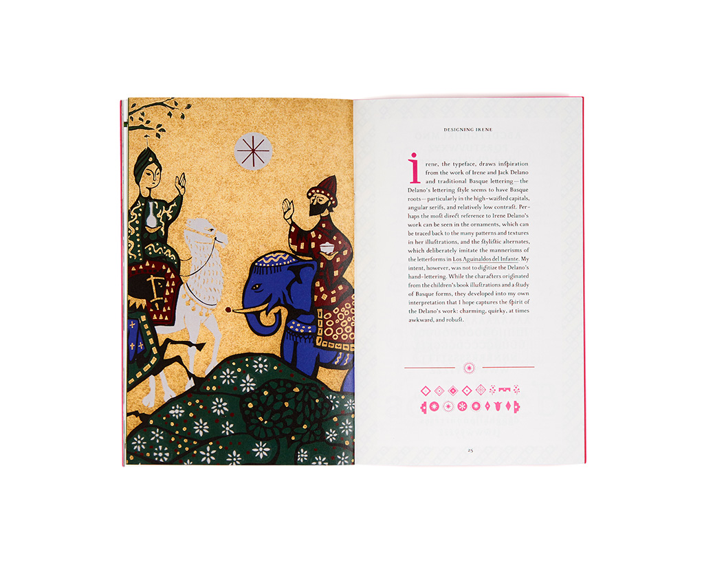
One of the spreads from the Irene type specimen book (photo: Kennon Photography, 2016)
Let’s start from the beginning! What were some of your passions when you were a child? What did you want to be “when you grew up”?
I’m afraid my childhood ambitions never had anything to do with design or typography. The earliest I can remember, my life’s desires centered around being a princess, a mermaid, or a fairy. If I could have been a fairy mermaid princess, that would have been the ultimate achievement. I was one of those girls obsessed with glitter and pink. I still am! I love 100 percent magenta and own an overwhelming amount of gold glitter sneakers.
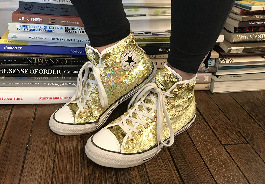
Laura’s current MOST favorite pair of gold glitter shoes!
I’ve always loved to read. That was probably my favorite pastime until I discovered ballet. I read everything from Agatha Christie to The Chronicles of Narnia, via Austen and Brontë, and was especially fond of whodunit mysteries.
At around 9-10 years old, I asked for ballet lessons, and that was it for me for a good while. The word “passionate” gets thrown around a lot these days, but I can say with certainty that I was truly passionate about ballet. It was everything I wanted and loved until I decided at 18 years old that it was no longer the path for me. At that time, I was living on my own in NYC attending the Joffrey Ballet School. That’s when I made the decision to re-apply to college. I was pretty lucky to have parents who both encouraged and supported me to pursue my ambitions, whatever shape they took.
You are an alum of the MFA in Graphic Design here at VCFA. What was post-VCFA life like for you?
I don’t think post-VCFA life is finite. The program can be life altering. You go in with certain ideas about yourself and leave with a completely different set of parameters and understanding about what makes you, you. At first, I thought I was simply getting a graphic design education…
To be honest, I was exhausted when the program was over. It took me a while to get settled and begin working again, and part of that was due to a lot of changes in my personal life. My husband and I moved from Houston to New Jersey, and shortly after the move, we found out we were expecting. In fact, I’m answering these questions while my sweet 3-month old daughter naps on my lap!
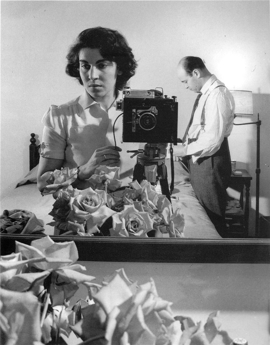
Irene Delano, self-portrait with Jack Delano in a hotel room in Chicago, 1943 (photo: Irene Delano)
Your typeface design, Irene, is an homage to illustrator and designer, Irene Delano. Can you tell us about this incredible woman and her influence on you?
Irene Delano was an artist, designer, and educator. She was born in 1919 in Detroit, Michigan, and studied painting at the Pennsylvania Academy of Fine Arts. In 1940, she married Jack Delano, a renowned photographer. At the time, Jack was traveling as a photographer for the US Farm Security Administration. Irene joined him on the field, assisting with lighting and set-up, and became the unofficial liaison between Jack and his subjects. This marked the beginning of a life of creative collaboration. Irene and Jack were not only life partners, but had a close, collaborative, and mutually beneficial working relationship that spanned both of their artistic careers.
In 1940, Jack was assigned to photograph Puerto Rico. They fell in love with the culture and the landscape, and in 1946 decided to make it their permanent home. Both Jack and Irene were recruited to form part of the Division of Community Education, the Puerto Rican equivalent to the New Deal Program. Irene, already working as a publications designer for the governmental offices in San Juan, designed and printed posters as important forms of advertising for public health, education, and development programs. She also organized and directed the first screen-printing and graphic arts workshop for the Public Parks and Recreations Division. Today, the screen-printed poster is considered a major component of Puerto Rican contemporary art; a tradition that can be traced to Irene’s educational efforts during her tenure.
In sum, she had an amazing career and was incredibly influential in a time when women were not as accepted in the professional world. I began researching Irene’s life and work after receiving a children’s book she illustrated, Los Aguinaldos del Infante written by Tomás Blanco. My initial attraction to this children’s book initially lay in its craft: a blending of image, word, and sound [the story is accompanied by a musical script by Jack Delano], characteristic illustrations [in the spirit of traditional woodblock prints and reminiscent of Puerto Rican wooden Three King sculptures], the use of ornament and pattern, and the idiosyncratic nature of the lettering. In the end, it was Irene’s life and work that really hooked me.
The Delanos were such a successful duo of art making and activism! Why did you ultimately decide to name your project solely Irene and not something that incorporates both of their influences, such as Delano?
It’s hard to separate Irene’s work from that of her husband’s, due to the collaborative nature of their process. However, I feel that Irene has too often been left out of the limelight. I mentioned that she was working during a time period when women were not as valued as their male counterparts, or because her husband had acquired more acclaim as a photographer. I wanted Irene, the typeface, to pay tribute to her life and work: a woman who not only defied the glass-ceiling limitations of her time, but also played a significant role in the development of art and design education and the contemporary art movement of Puerto Rico.
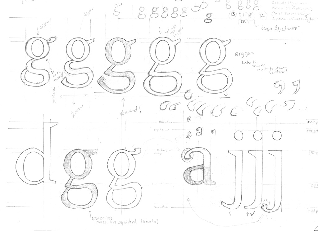
Sketch for Irene
How has the typeface changed through the course of making it? What is its evolution?
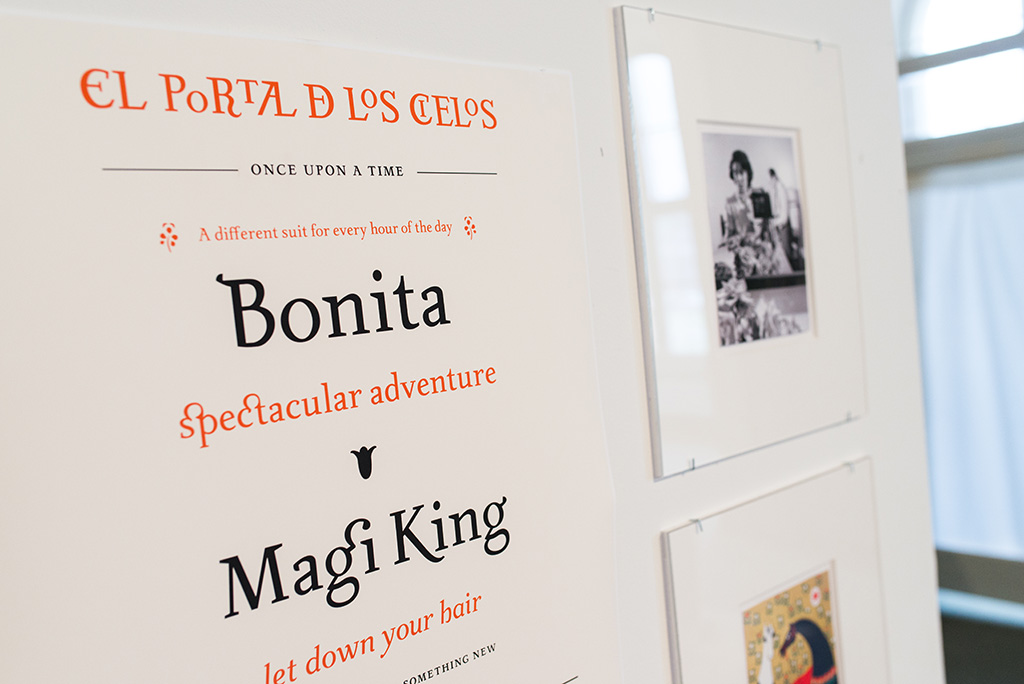
I began by strictly imitating the handwritten characters found in Los Aguinaldos del Infante (which, I found out later, were actually produced by Irene’s husband, Jack). I was charmed by the lettering and only sought to reproduce it typographically. As I continued my research, my aim changed from merely copying the lettering to developing my own interpretation that hopefully captured the quirky, nostalgic, and robust spirit of the Delanos’ work. I also drew inspiration from traditional Basque lettering, particularly in the high-waisted capitals, angular serifs, and relatively low contrast.
It is still a work in progress. I haven’t had as much time as I would like to work on type design lately, but I am slowly incorporating “studio time” back into my daily routine. I hope to release the Irene type family sometime in the near future!
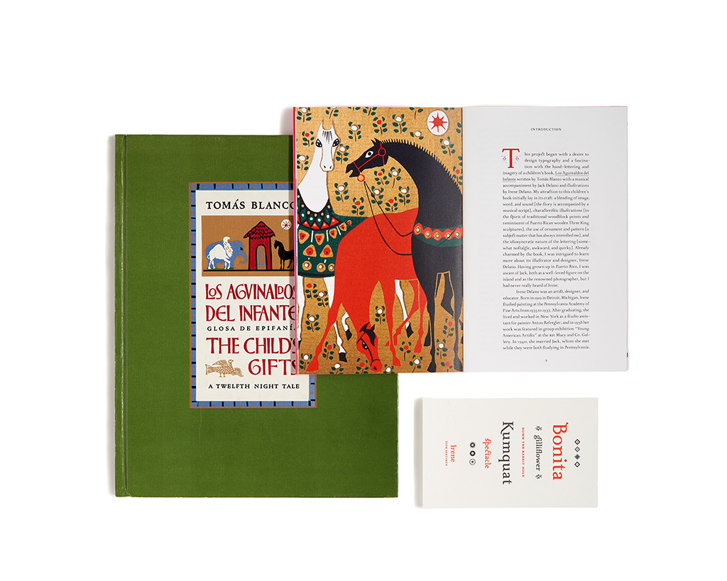
The cover of Los Aguinaldos, one of Laura’s type specimen cards, and the Irene type specimen book that accompanied her thesis (photo: Kennon Photography, 2016)
Besides Irene, what are your favorite existing typefaces to use or read?
I do tend to use Irene a lot in my personal work, but I’m not sure that I would call it my favorite. I am too aware of all the work that still needs to be done.
Some of the ones residing at the top of the list are Elido and Odile by Sibylle Hagmann; Dolly by Underware; Base Mono and Mrs. Eaves by Zuzana Licko; Maple by Eric Olson; and Noe by Schick Toikka. I also enjoy work by Suitcase Type Foundry, Type Together, Oh No Type Company, Klim Type Foundry, and Colophon Type Foundry.
Laura’s thesis exhibition
Do you have a particular approach as you begin a project?
My process begins with a pretty intense round of research. I find it hard to move forward if I don’t feel firmly grounded in whatever project I am working on. Additionally, exploring a subject is the source for creative output later on. That’s where I begin to make connections and formulate ideas. After that, there is a pretty murky period of trial and mostly error, while I push my ideas around. When I am working on designing type, this is when I would sketch characters by hand with paper and pencil. I can never jump straight onto the computer. Once I’ve decided on a direction and develop the concept, then I get down to the nitty-gritty fun of making.
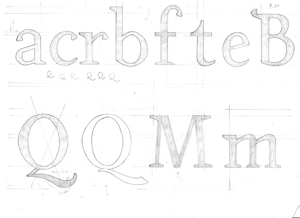
Sketches for Irene
Why does this form of artistic expression suit you?
Perhaps a way to explain my obsession with letters is to compare it to human relationships. First, there is that initial, purely physical attraction. I’ve always been fascinated by the written word and letterforms—I just can’t stop looking at them! Then, delving deeper, typography lies at the intersection of a host of interesting historical and contemporary relationships. Typography keeps pace with developing technologies. It lies at the root of how language and communication have evolved and continue to function both socially and culturally, and it’s the foundation of graphic design. Lastly, designing type also suits my temperament. After the initial bout of creative work, there is a ton of tedious, detailed, monotonous work that goes into producing a typeface. I absolutely love it! I find that part of the process relaxing yet challenging—it can be very satisfying when you are done.
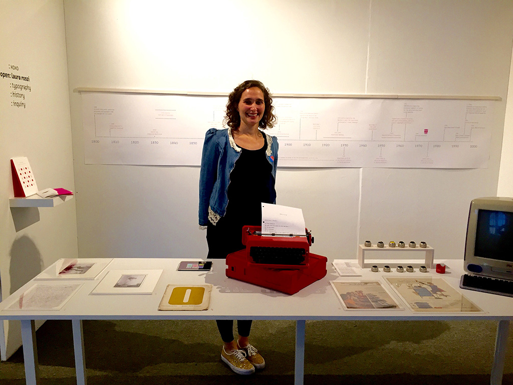
Laura at her thesis exhibit
What has been your experience as a woman in the graphic design industry?
I am pretty young in terms of graphic design industry years. Before attending VCFA, I worked in museums and galleries in curatorial capacities. My undergraduate degree is in Art History. So, I can’t say that I’ve had a varied or well-rounded experience as a woman in the field. Keeping in mind that most of my experience with graphic design has been at VCFA, it’s been a very positive one. Again, I’ve been lucky.
Irene type specimen
Who are other artists that inspire you?
There are many designers, writers, and artists that I admire! There is a lot of great work out there, but I am especially drawn to and inspired by other women in these fields: Denise Gonzales-Crisp, Rebecca Solnit, Gail Swanlund, Sibylle Hagmann, Paola Antonelli, Lorraine Wild, Isabel Allende, and Ellen Lupton, to name a few. My mother and my sister (both working artists), as well as my colleagues, classmates, and the fabulous faculty at VCFA are a constant source of inspiration.
About the Author:
Cameron Finch is a first-year MFA in Writing & Publishing candidate at Vermont College of Fine Arts. She is the managing editor of Hunger Mountain: The VCFA Journal of the Arts and an intern for the VCFA Publications/Marketing Dept. In addition to writing creatively, she also freelances for Michigan Quarterly Review and Buzzworthy Media. Learn more about her at ccfinch.com.Nike air jordan Sneakers | nike fashion
