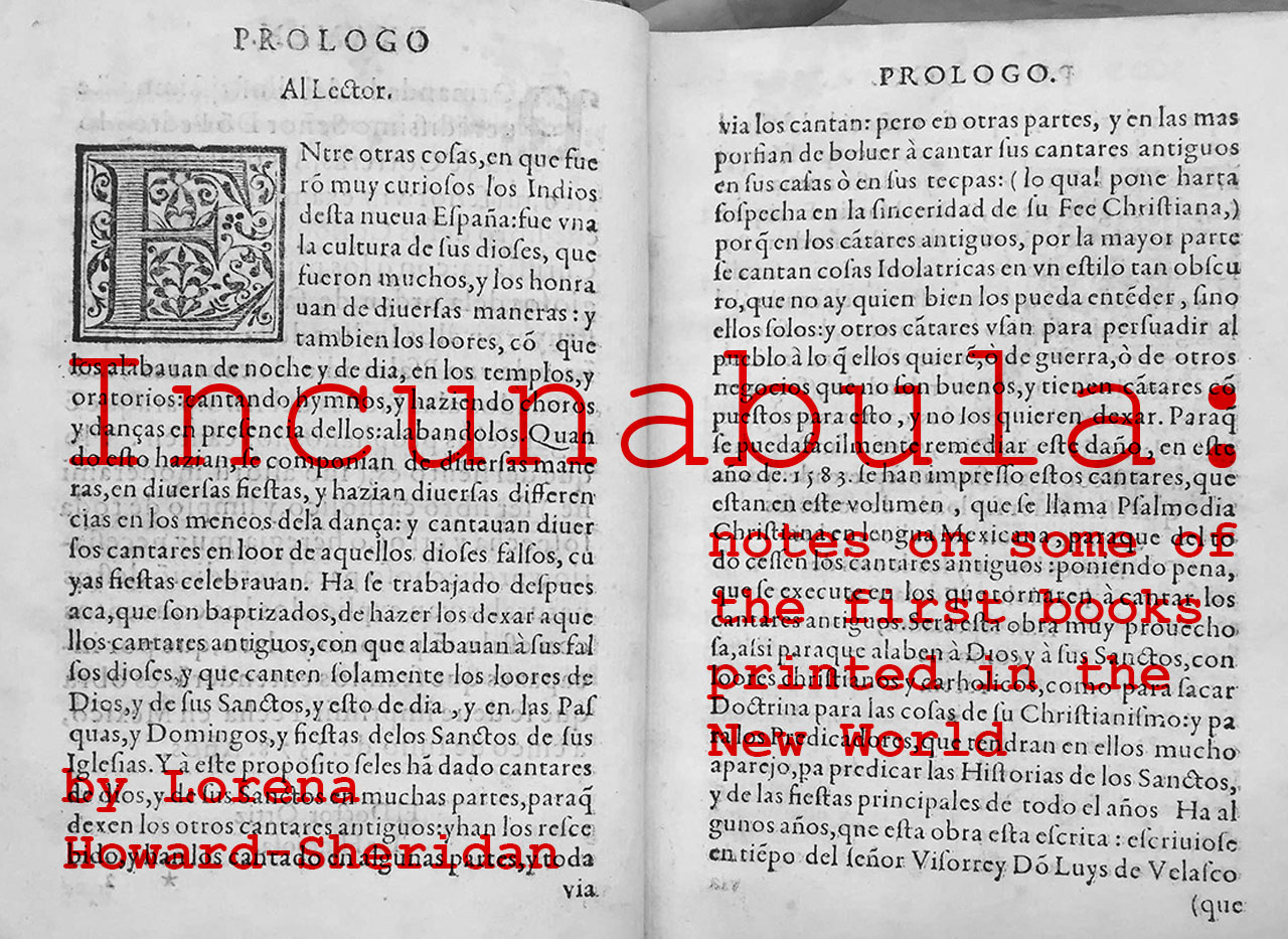
The memory of the Juan Pablos Printing House generates an aura of tradition and expertise. One can only imagine the busy halls crammed with stacks of paper, the clanking and thumping of the press, mixed with voices and smells of inks, at the site of what would become a prolific enterprise: the first printing house of the New World, established in 1539 in Mexico City.
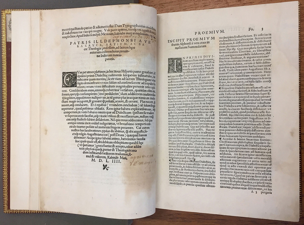
(Fig 1): Alonso de la Vera Cruz, Resolutio cum texto Aristotelis… 1554, Juan Pablos Printing House. The first study of Aristotle published in the New World.
The Pre-Hispanic cultures had their own rich history of book making—worth of another post—, although the vast majority of those books (which are known as “Códices”/Codex ) were deplorably destroyed soon after the subjugation of the new lands. Some of them, like the Codex Borbonicus, are extraordinarily complex and beautiful.
The freshly founded colonies were a rich soil for the production of books, not only because the native cultures were receptive to such form of communication, but also because the Spanish Crown made it a priority to initiate the religious transformation and catechesis of the indigenous population, along with the spread of alphabetic literacy.
Besides practicing diverse cults and having pictographic and logographic writing systems, the Mesoamerican peoples also spoke a plethora of languages and dialects. Thus, plenty of publications would be needed, in order to translate religious writings into various dominant tongues, as well as to teach those idioms to the European missionaries. The rich mélange of communication systems, races and beliefs, would yield publications of all kinds: religious, philosophical, scientific, artistic, linguistic, and so on. The land was large, book demand was high, and for a long time Mexico City—and Puebla afterwards—would be the printing center of the Viceroyalty of New Spain—and of the whole American continent.
A good number of incunabula volumes (in Latin America, the title is granted to those printed between 1539 and 1601) belong to the collection of rare books at the Benson Library at the University of Texas (http://www.lib.utexas.edu/benson). José Montelongo, the bibliographer of the Mexican collection, showed us several of these items, and shared some his knowledge on the topic.
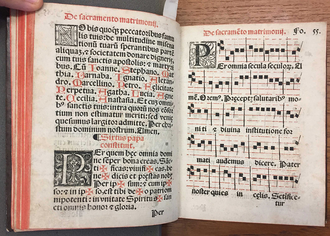
(Fig 2): Manual use of the sacraments, according to the Mexican Church… 1560, Juan Pablos Printing House. The second book with music to be printed in the New World.
Juan Pablos came to the Americas with the mission of opening the first printing shop at the service of the Spanish Crown. He had been trained in Sevilla, Spain, by the German printer Johannes Cromberger, which was nothing unusual at the times—after all, the printing press is widely acknowledge as a German invention—but this German patronage might help explain the abundant use of Black Style typefaces in the early publications of the of the New Spain, as well as for its conspicuous presence up to our times in Mexico. For all the negative associations that would afflict Black Styles—due to its use by the Nazi regime during World War II—, in Mexico, at least, what we refer to as the Gothic Style has eluded any kind of bad reputation.
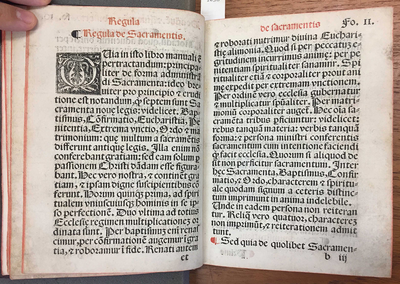
(Fig 3): Manual use of the sacraments, according to the Mexican Church…
There are four Black Letter sub-styles: Textura, Fraktur, Bastarda, and Rotunda, characterized by narrow-to-wide characters, and thus darker to lighter text colors, respectively (the term “text color” stands for the overall shade produced by the texture of letterforms). It is easy to differentiate them by looking at the letter ‘o’, which in the case of this spread is round and open, easily readable. This sub-style was commonly used for texts in Latin (as in this case) and other Romance languages.
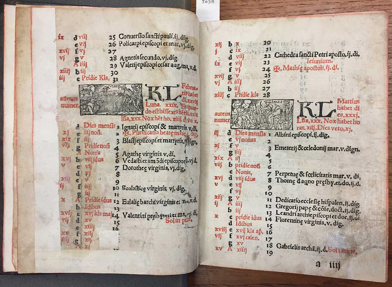
(Fig 4): Manual use of the sacraments, according to the Mexican Church…
The content pages, with their more complex layout and some wood engravings, use a Humanist typeface.
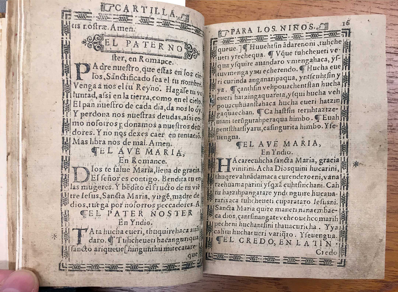
(Fig 5): Spiritual Treasure of the Poor in Language of Michoacan, 1575, printed by Antonio de Spinoza. Spread featuring the Lord’s Prayer and Hail Mary.
Spiritual Treasure of the Poor in Language of Michoacan is a pocket book of prayers and religious instruction; it has got text both in Spanish and Purépecha, the dominating tongue of the region of what today is the western State of Michoacán. The small volume was a guide for indigenous families in the process of absorbing both Spanish and Catholicism. Texts in Purépecha, Latin and Spanish were used on this spread, for there were a lot of terms and names that eluded any acceptable translation.
Notice that in many of the spreads that we are showing, the words left at the bottom of the text columns are not typographic widows; they repeat at the beginning of the next page, as a tool of the trade meant to help with collation of pages during the binding process (we find them helpful for the reader, too).
There are many other differences in the way we display text in our times compared to the incunabula volumes: arbitrary abbreviations to fit a line within the text box, different sounds assigned to a single letter (i.e.: capital ‘V’ is sometimes still used to represent the sound of ‘U’, while ‘f’ represents the sound of ‘s’ or ‘f’ depending on the context); not to mention the necessity for diacritics corresponding to sounds inexistent in Spanish (interestingly, many lacking consensual representation up to our days). Many of these text-display practices have to do with the natural evolution of language and orthographic rules, that intensify when such language is imposed on a foreign culture; however, printed materials have been a key tool in the stabilization of Spanish—and of other languages as well—which is spoken nowadays by 400 million people.
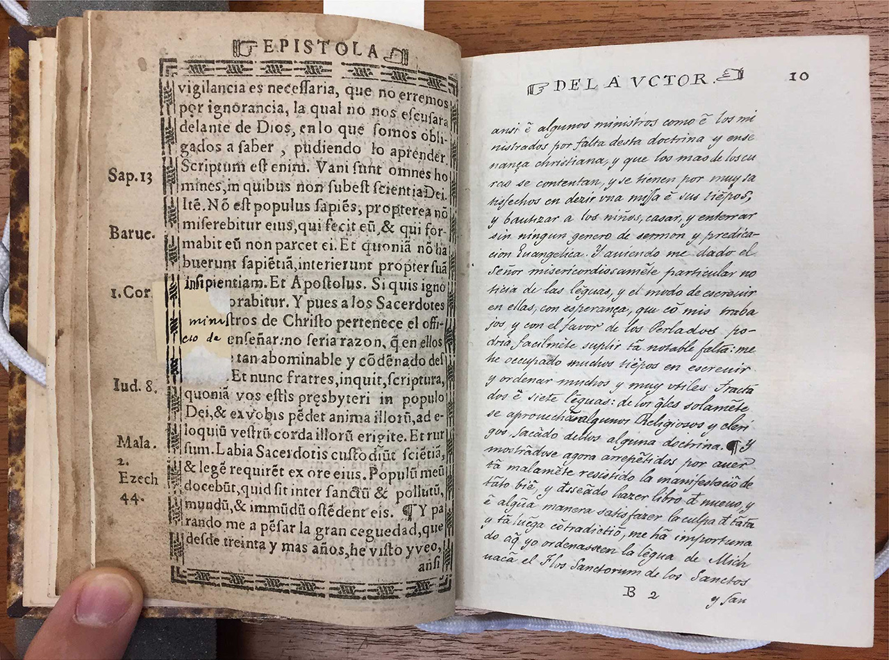
(Fig 06): Spiritual Treasure of the Poor in Language of Michoacan
It is worth noting the effort to preserve the integrity of the book throughout time; some pages have been entirely replicated dutifully by hand, while restorations have been made to missing segments of some pages.
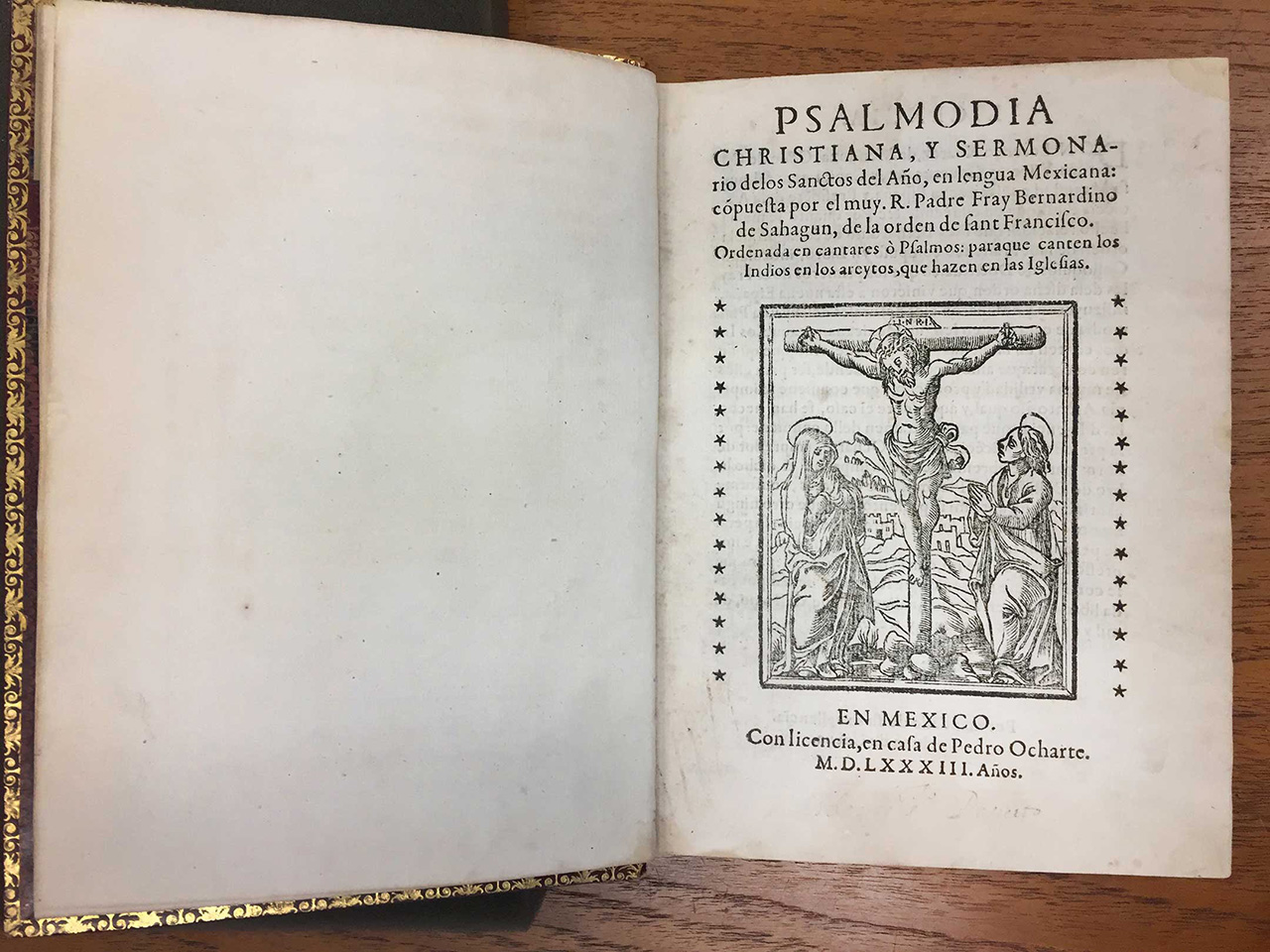
(Fig 07:) Christian Psalmody, and Sermons of the Saints of the Year, in Mexican Language, 1583. Printing House of Pedro Ocharte.
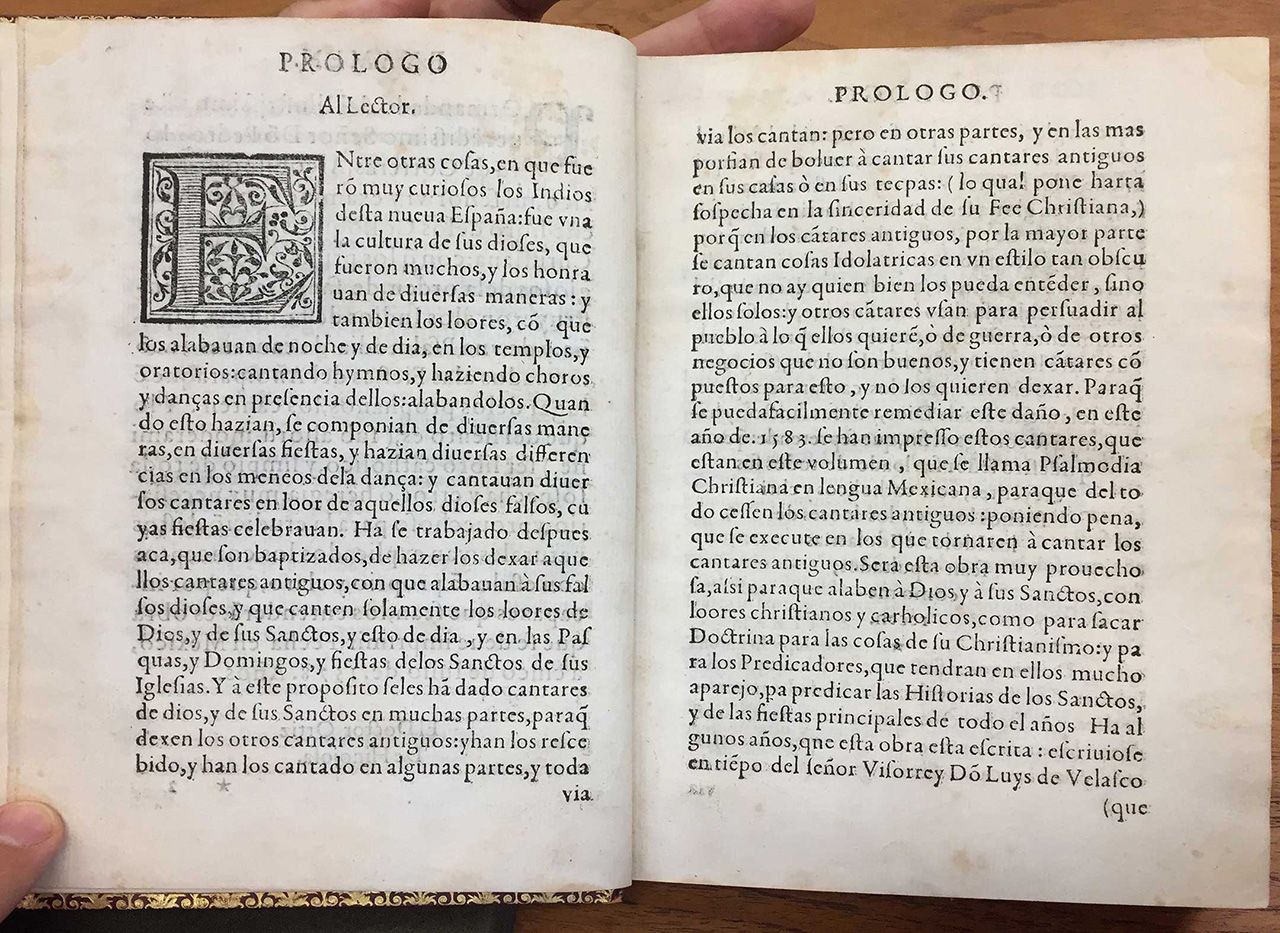
(Fig 08): Christian Psalmody, and Sermons of the Saints of the Year, in Mexican Language
The prologue to this book, written in Spanish, recounts that the indigenous population used to sing and dance in honor of their gods before the arrival of the Spanish. Therefore, this book had the ambition of introducing Catholic chants in Náhuatl, the Aztec tongue (from what would become Mexico City), as to facilitate their integration with the ruling of the Church. It was set in a humanistic typeface with ligatures and an elegant letter ‘Q’ tail, which required considerable technical ability.
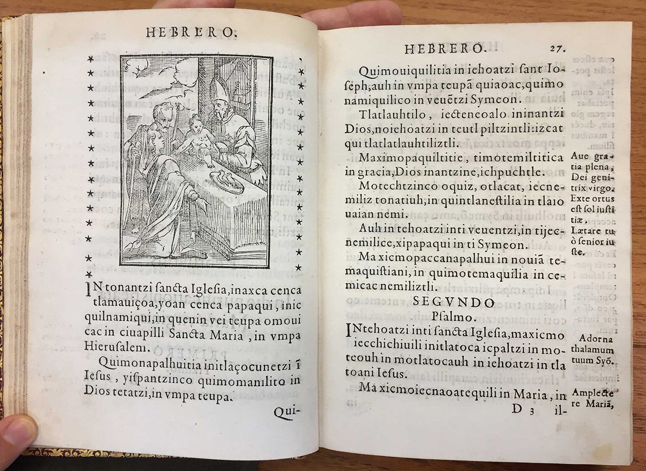
(Fig 09): Christian Psalmody, and Sermons of the Saints of the Year, in Mexican Language
Both this Náhuatl text and the book described before (in Purépecha) shows an abundance of letters ‘i’, which would result in a text color different from one obtained from Latin and Spanish texts; soon enough, the copious linguistic differences of the native languages would generate considerations for typefaces fit for each case, just like in Europe typographers cared to cast typefaces that would make printed justice to their national idioms.
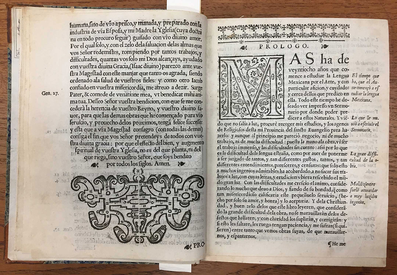
(Fig 10): Spread from Sermons in Mexican Language, 1606. Printing House of Diego López Dávalos. Not strictly an incunable volume, but still printed within the first century of printing in the Americas.
The Spanish Crown employed—predictably—copious native labor for the establishment of its kingdom in the new lands: roads, buildings and infrastructure had to follow the styles prevailing in Europe—more specifically, in Moorish influenced Spain—, so it is natural to suppose that printing would be no exception.
The iconography of incunabula volumes was logically following the European tradition, with spatial descriptions that were unfamiliar to pre-Hispanic forms of representation. Much has been written about the interpretation of European styles by the hands of Mesoamerican native workers; their version of the Spanish Neoclassic style and, later on, baroque embellishments, resulted in churches and chapels—among other work—that have fascinated art historians for centuries. On this spread, although we ignore who was the author of the ornament on the left hand page, it seems reasonable to imagine a native hand might have played a role in the drawing of the woodprint—which seems a bit foreign to its counterpart on the right side page.
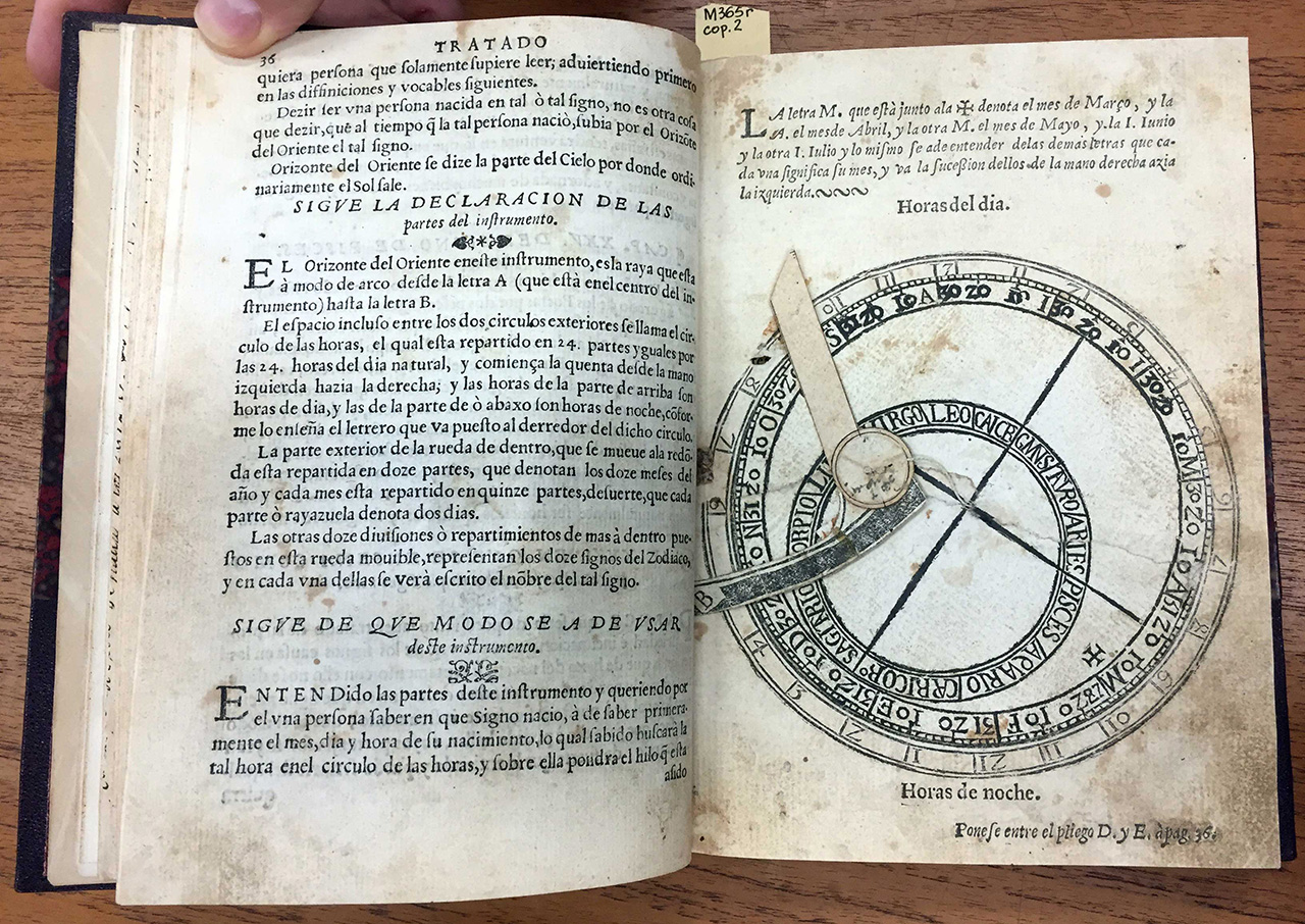
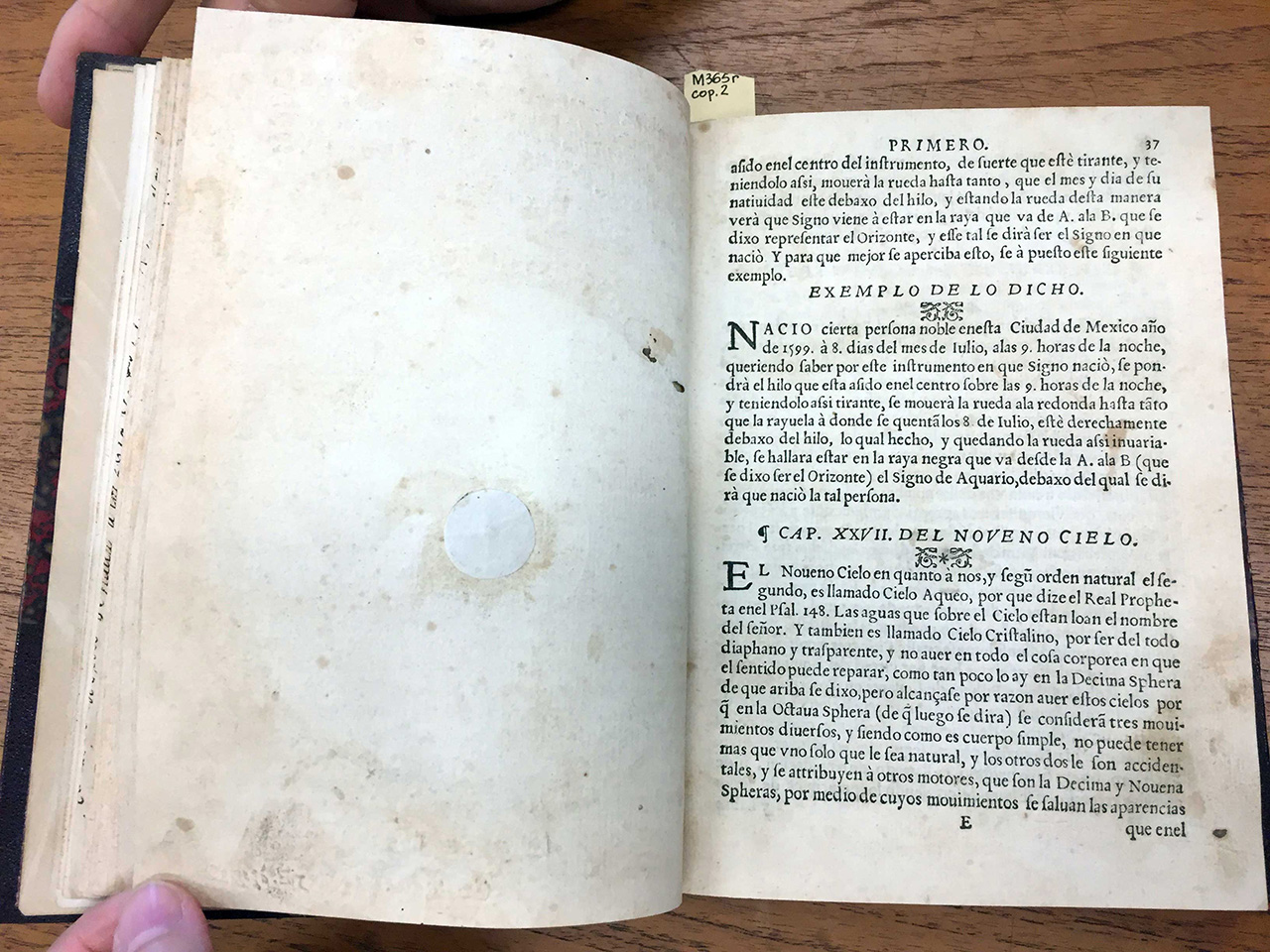
(Figs 11 & 12): Henrrico Martínez, Repertoire of the Times, and Natural History of this New Spain, 1606. Printed in the author’s own Printing House. Front and back of page with horoscope artifact, which skipped a page number.
This volume, also not strictly an incunable, contains a carefully crafted instrument that allows the reader to calculate his or her zodiac sign, based on the month, day and time of birth, and by placing the top squared-angled shaped contraction according to the instructions in Spanish.
The horoscope for those born under the sign of Cancer (the month in which this post was written) reads as follows:
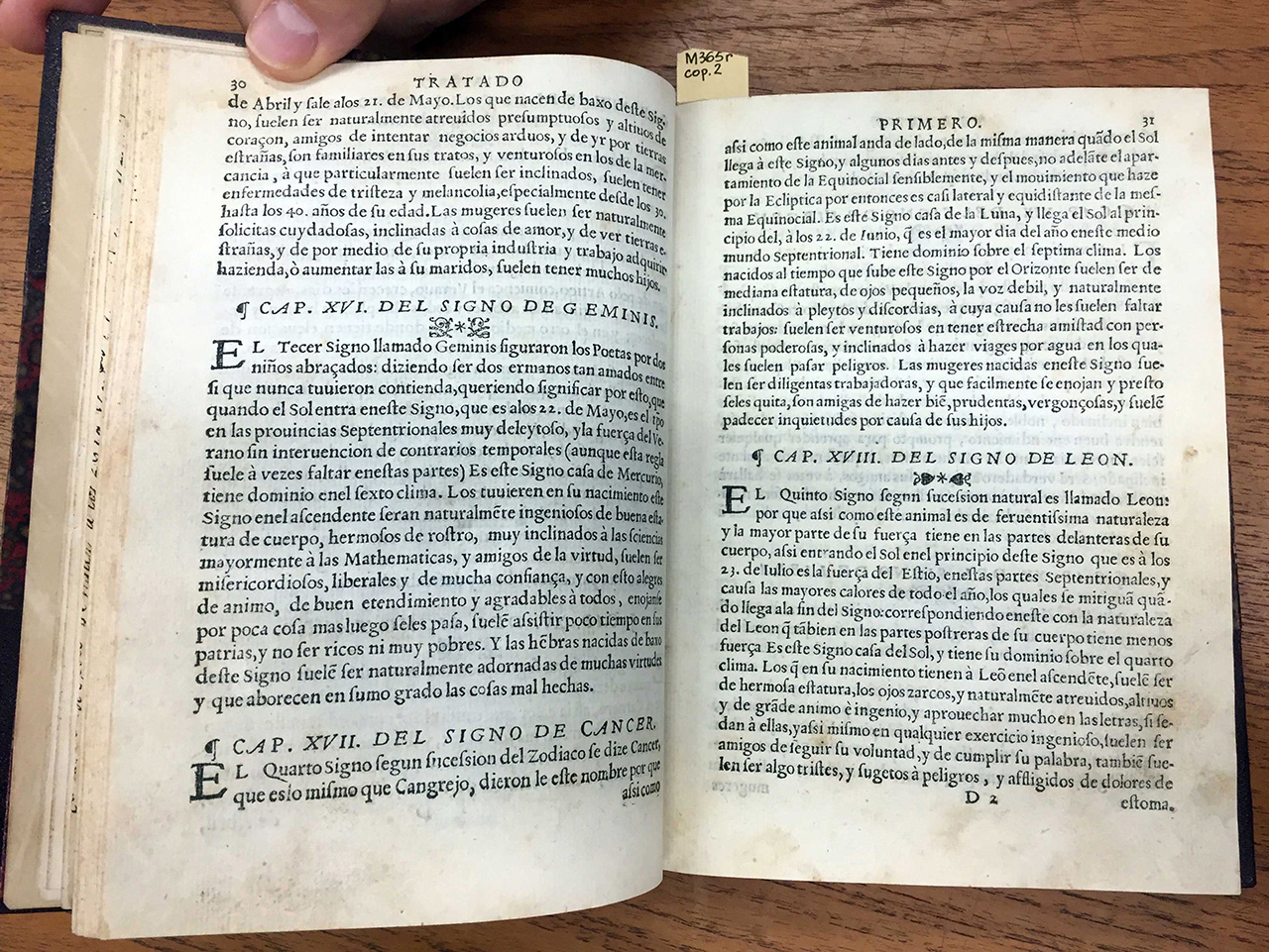
(Fig 13, Repertoire of the Times, and Natural History of this New Spain.)
“The fourth sign according to the zodiac is said to be Cancer, which is the same as Crab, they gave this name because just like this animal walks sideways, in the same way as the Sun arrives to this sign, and some days before and after, not sensibly ahead of the separation of the Equinoctial, and the movement that it makes through the Ecliptic at that point is almost lateral and equidistant to that same Equinoctial. This sign is the house of the Moon, and the Sun arrives at its beginning, on the 22 of June, that is the longest day of the year in this mid-Septentrional [meaning “of the North”] world. It has dominion over the seventh climate. Those born at the time this sign raises over the horizon often are of mid-height, small eyes, weak voice and naturally inclined to fights and discord, for which they usually won’t need to make an effort: they are usually successful in having close friendship with powerful people, and lean to make trips by water in which they often go through danger. Women born under this sign are usually diligent workers, and get mad easily mad and get over it rapidly, are friends of doing good, prudent, shameful [meaning “discrete”] and usually suffer restlessness because of their children.”
Final commentary
Designers and typographers review publications from the perspective of intertwining a textual message with the graphic form. To give an example, a humanist typeface may have been a wink to the ideals of Renaissance, while Black Style would reveal a more conservative stance. The formats of the books were meant to enable the use of each volume to teach and learn, or to read from a seat at a church, or from the pulpit; the sizes of the text were engaging to its audience’s literacy. Just like with a child learning to read, the Western notions of space and proportion, margins and rhythm, would become implicit to the viewer through the printed page.
During the sixteenth century, manufacturing books was a lot more costly and burdensome than it is now a day. Besides, the moral authority of printed matter was rather imposing, a target of political intricacies and power struggles; many an author and a printer faced persecution by the Inquisition. Despite the indisputably dark side of the history of European colonies in the Americas, one cannot help but be moved by the courage and gigantic effort to crowd more than half of the continent with books.
These pages, with their sober elegance and proper execution, are a physical testimony to such bravery, alongside their much friendlier approach than weapons and forced subjugation. Their volumes spoke for Western civilization and what Spain believed to be legitimate and truthful, but at the same time, were—in a subtle yet inevitable way—permeated by the obstinate remains of subjugated nations. The collision of the two worlds was to become what Latin Americans call home, and incunabula volumes offer a chance to engage in a conciliatory conversation—with a past that should eventually, hopefully, be the predecessor of the common good.
– Lorena Howard-Sheridan
© 2017latest Running | Nike Wmns Air Force 1 07 Essential White Silver Gold Women Casual , Cellmicrocosmos Marketplace

