In the latest Process post, VCFA MFA candidate Sarah Davis talks in detail about her recent project “Found Play Things”:
I am fascinated by Joseph Kosuth’s 1965 piece, “One and Three Chairs.” So, for this piece, I set out to create a work that would challenge and access the viewer’s interpretation of an object.
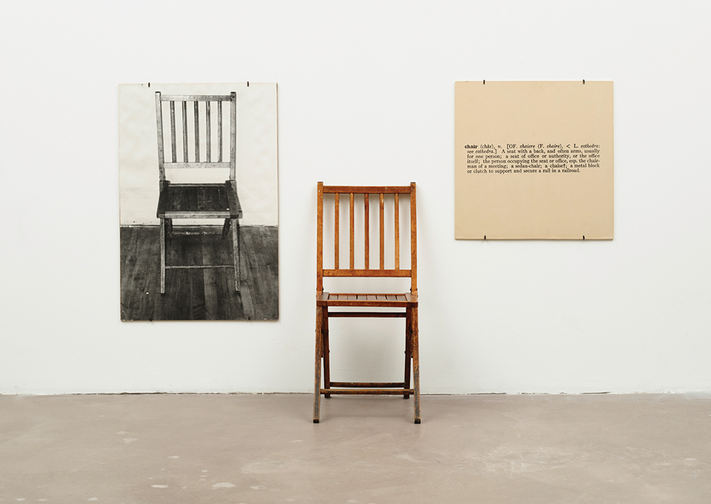
One and Three Chairs: Kosuth shows three different instances of what we could call “chair.” One instance is an actual chair, one is a large photograph of a chair, and the third is an enlarged reproduction of a typographic definition of “chair” from a dictionary. In each case, the viewer interprets the object as a chair. But, the artist challenges us to think about which one is the actual chair. We can say the physical object in front of us is an actual chair (unless we stand on it and use it as a ladder, then it becomes a ladder, no?). The photograph, however, is both an icon and an index of an actual chair. In reality, the photographic artifact is just a big piece of paper on which an image of a chair has been printed. And, in the case of the typographic dictionary definition, the chair is only in our mind as an implied representation of what we define as “chair.” Again, this points to an indexical representation of our concept of “chair.” It is implied. In this way, Kosuth prompts us to realize the semiotic constructs that operate in our visual language.
“Found Play Things” was created for the annual Art and Design Faculty Exhibition at West Liberty University, WV (http://westliberty.edu/art/). The theme for the 2016 exhibition was “The Toy Show.” This piece is an extension of the work that I did in my third semester at VCFA and explores the semiotic relationships within our visual language and how we interpret signs.
I chose to make this a collaborative work and incorporate input from other individuals due to the often social nature of toys and play within our culture. I also wanted to challenge the scope of what we define as a toy through the lens of imagination.
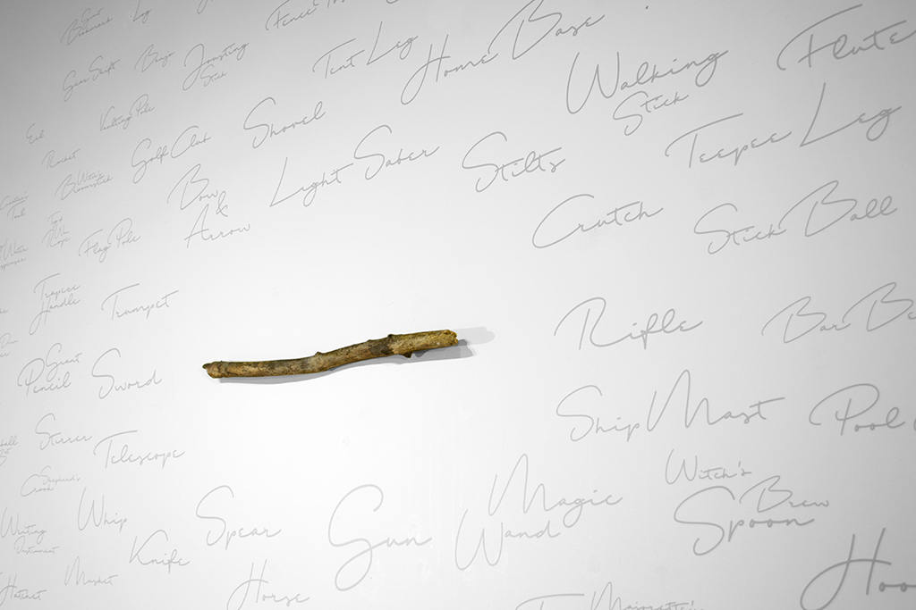
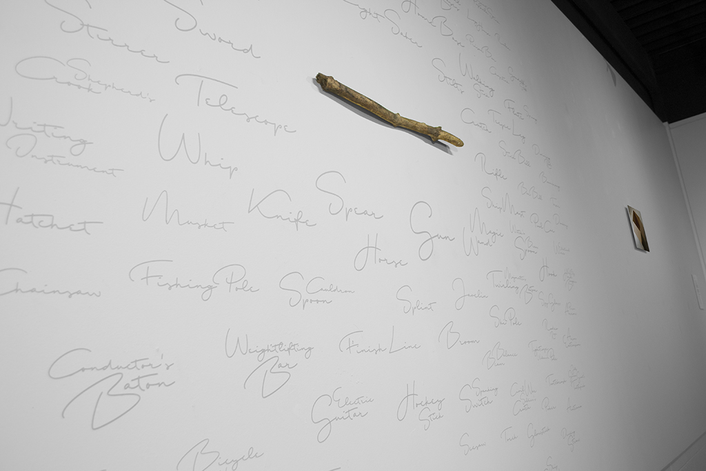
I brainstormed and listed what I thought were the most unsophisticated, natural objects that might become a toy in the hands of a creative individual. I settled on a simple stick. After all, who has not played with a stick in some way during childhood, or even as an adult?
I asked a group of 15-20 people via an email survey the following question.
The email also included a photograph of the stick I had selected as a model.
“When you were a kid, how might you have played with a simple stick as a toy? What might that stick become?”
Please list as many ideas as you can think of and email the inventory back to me.
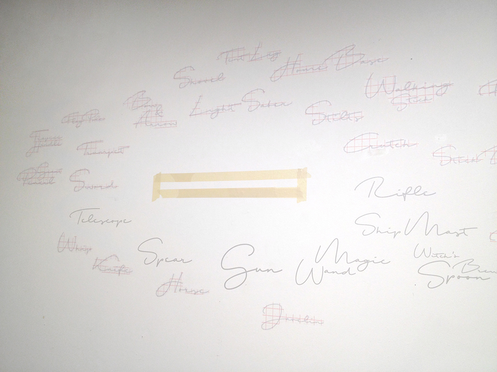
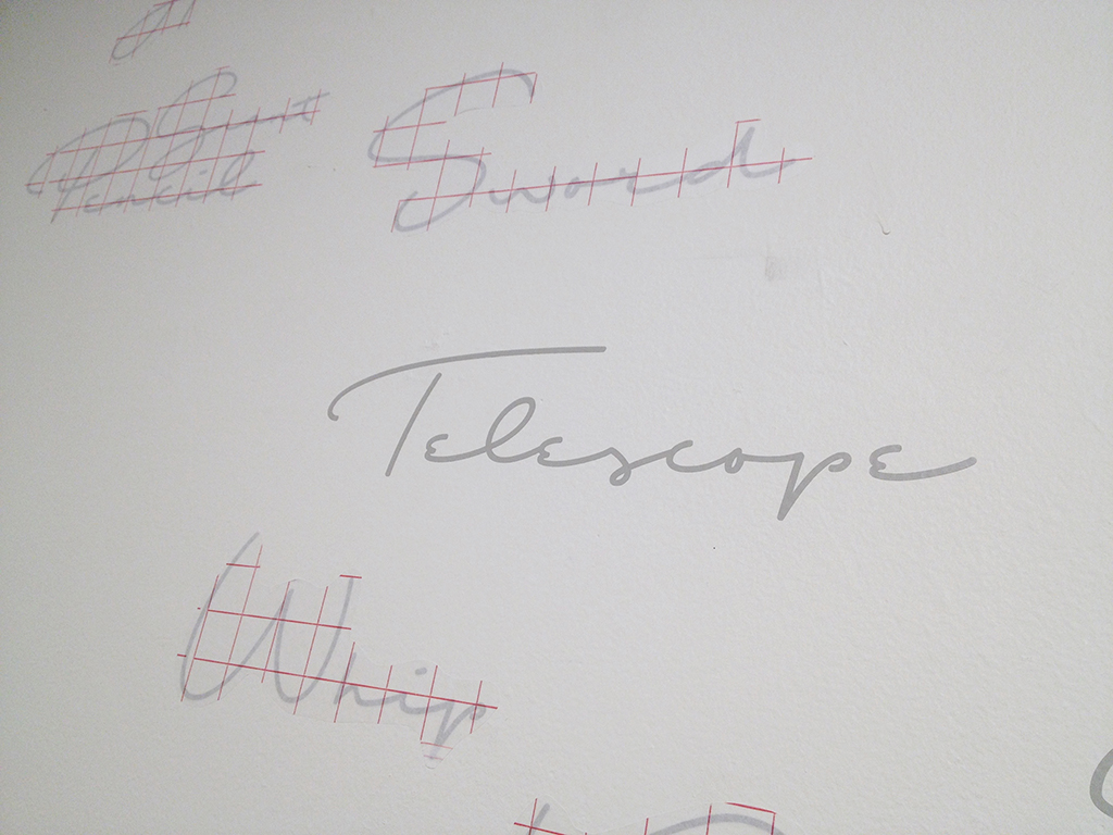
As a result, I received over 150 possible instances that this simple stick might become in the act of play. These words were organized and prioritized according to the repetition of each named occurrence. Words that repeated most were the largest in size and places closest to the stick. The opposite was true for those words listed only one time by an individual participant.
A second part of the installation revealed itself when I decided to add a second image to prompt the viewer to participate in a continuous piece. I juxtaposed a photograph of a cardboard box, also a simple toy, on the other side of the wall with no visible words for what it might become through play. The goal was to encourage the viewer through visual means to exercise their imagination without seeing any words from which to choose. It was also purposeful that the actual object mounted to the wall represented the stick and the cardboard box was represented as a photograph, again playing with the iconic and indexical nature of photographs.
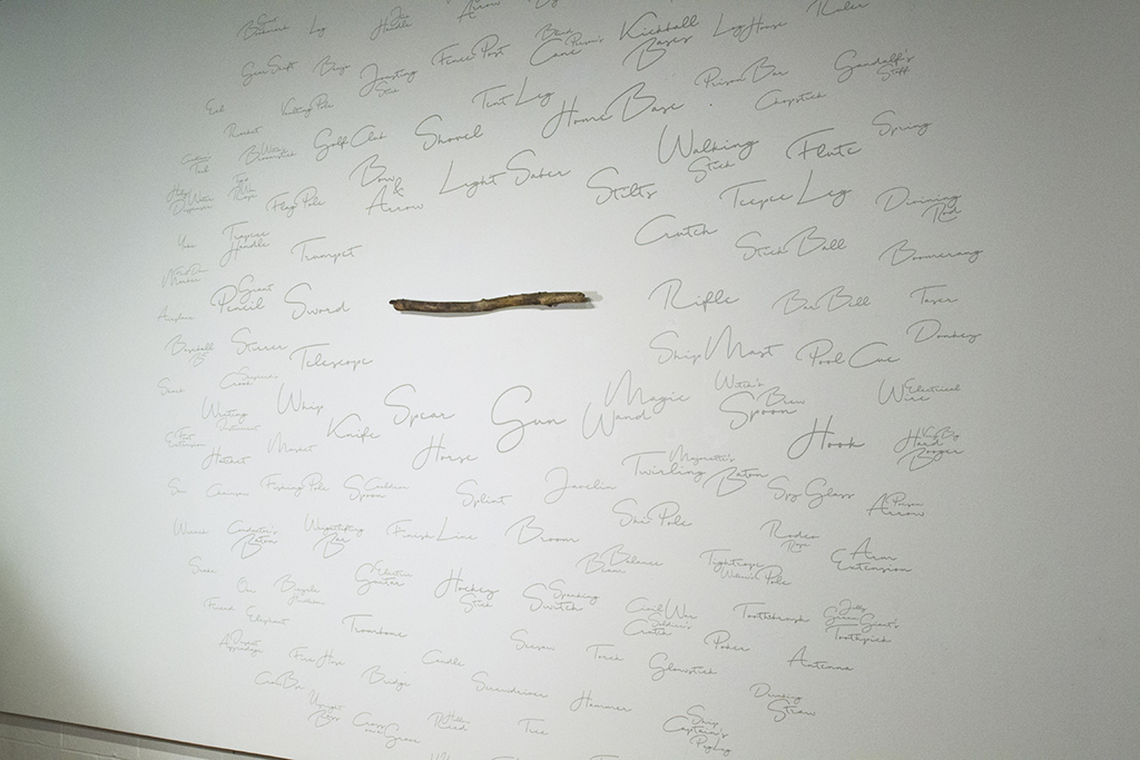
Installation showing one-half of the ten-foot by twenty-foot wall including the mounted stick and applied vinyl lettering.
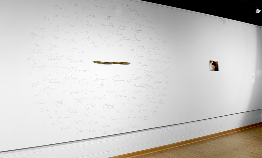
Installation showing the entire wall including the mounted stick with applied vinyl lettering and the photograph of the cardboard box and description of the piece.
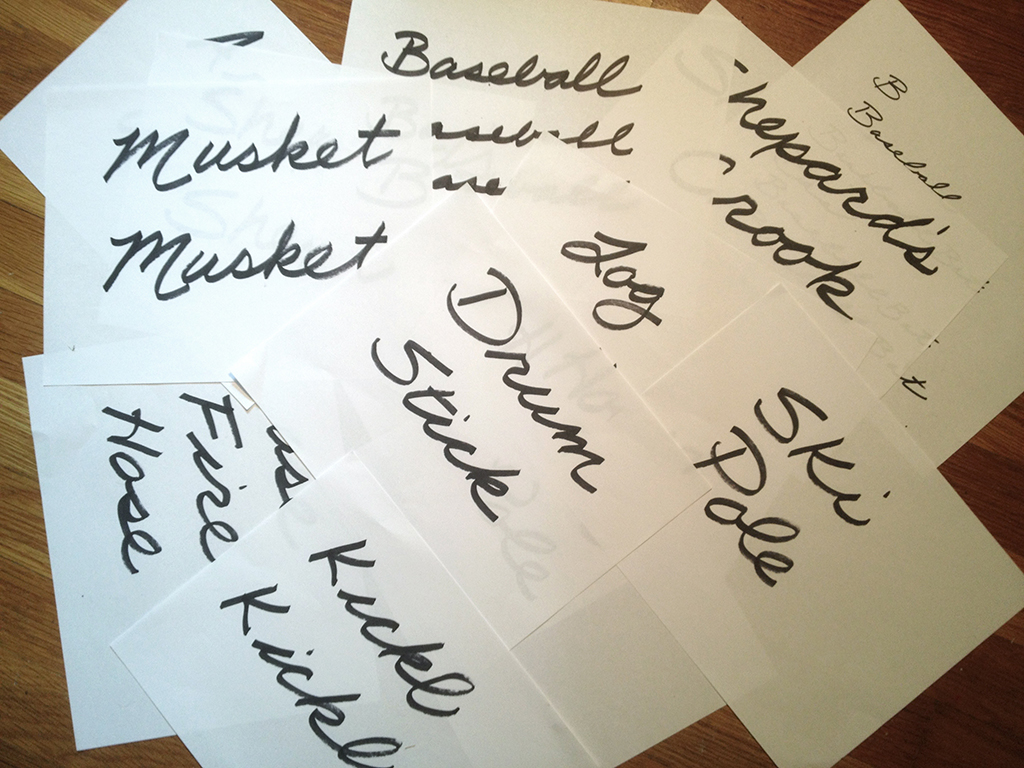
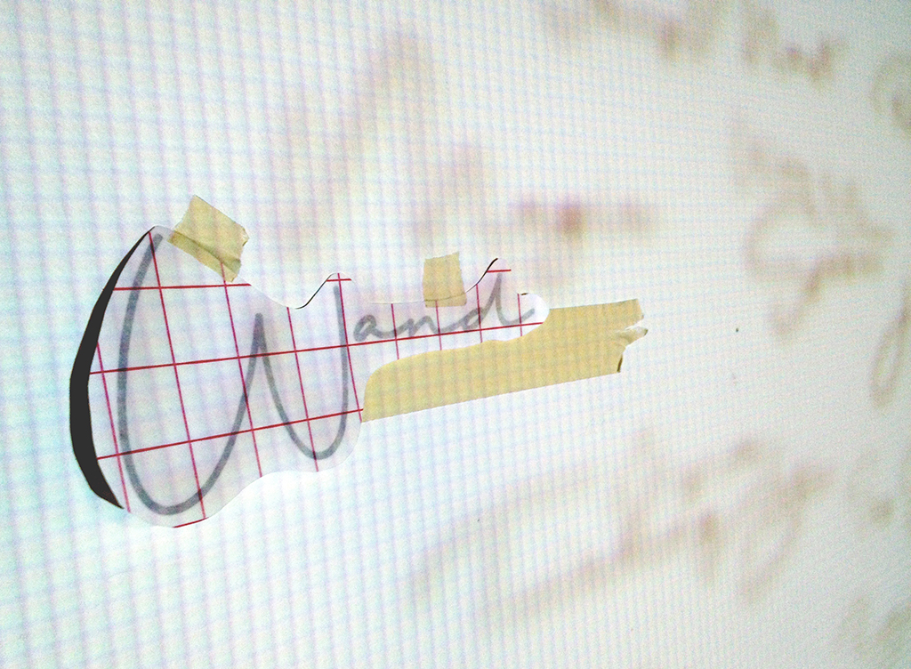
Handwritten words created at the beginning of the process. These words were hand-written by me using a Sharpie marker on inkjet printing paper. I used a script font to indicate the human quality of words’ origins. These were not words from a dictionary or a pre-existing list but elicited from real people.
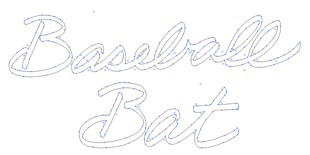
My hand-written words were scanned and translated into vector graphics, then sent to the vinyl-cutting machine. After spending a few days on this process, I decided that the qualities inherent in the letterforms were not communicating as I had hoped. I felt the words were too identifiable as my handwriting and that my personal identity was dominating the message. This issue brought up some interesting questions about the role of handwritten fonts in contemporary design and the innate qualities that carefully designed, handwritten-style fonts possess over letterforms created by humans. In this case, despite the investment of time in the handwritten process, I chose a pre-designed, generic script font in the end.
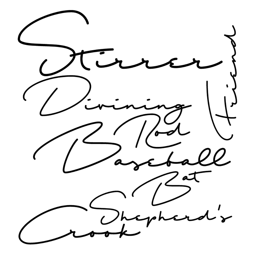
This image shows an arrangement of words in the chosen font, Shopping Script Demo. I selected this font due to its commercial quality and its legibility issues. I wanted to poke fun at how huge the retail toy industry has become and how play does not require the latest invention. I also wanted to invite the viewer to become more intimate with the piece by purposely making it hard to read. The gray type on a white background created a reduction in contrast that also reinforced my intent for viewer interaction.
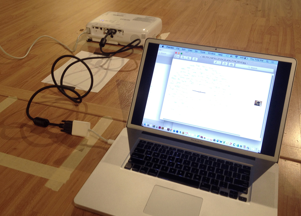
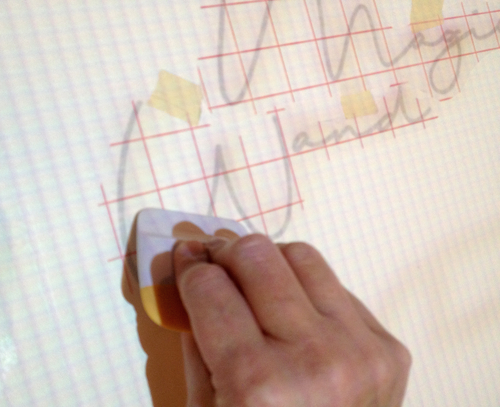
To apply the vinyl lettering in the shape I planned, I created a digital layout and projected it onto the wall. After I had found the correct location for the projector, I taped it off to ensure it stayed in position during installation.
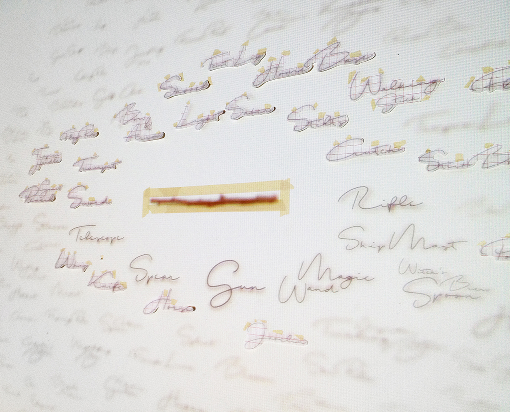
This photo shows the digital layout projected onto the installation wall with some of the vinyl lettering taped in place or adhered to the wall. The stick at this point is just a projection as opposed to the actual mounted stick, which was the last element installed. The vinyl lettering process, including digital type, cutting, weeding, transferring to wax mounting paper and trimming involve the process of transfer and transformation that is also a common element in my work.
A close-up of what I saw as I was placing the type in the correct location. I used a level for each word to make sure it was straight. This careful and tedious process allowed me to meditate on the meaning of the piece as I worked to complete it.
Here, I used a simple burnisher to adhere the vinyl to the wall. Before final installation, I tested several different types of vinyl on my studio walls and gallery walls as a test.
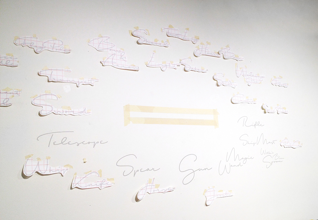
Here you can see that I positioned the words in rings, then turned off the projector and continued to burnish them onto the wall, to save bulb life on the projector. This consideration points to an additional aspect of efficiency that runs through the production of the piece.
As I proceeded to remove the wax paper from the words, they adhered very well to the wall. Although, I did have to be more careful with the application process as the fonts grew smaller.
Close-up of one vinyl word with the wax application paper removed.
Close-up of the final result.
Medium angle shot of the final result.
Word Organization:
The larger the word and the closer it’s placed to the stick, the more often it was submitted as an option.
Participant Age Range:
24-76 years old
Locations Represented:
Buffalo, NY
Champaign, IL
Chicago, IL
Claysville, PA
Dallas, TX
Indianapolis, IN
New York, NY
Pittsburgh, PA
San Francisco, CA
St. Louis, MO
York, PA
Nike Sneakers | Women’s Nike nike roshe heart and sole shoes for women Shadow trainers – Latest Releases , Ietp
