While in residency, Ian Lynam was interviewed for The Japan Times about the four short-listed Olympic logo proposals. His comments were featured in this article.
VCFA Visiting Critic and Designer Kenneth FitzGerald, VCFA faculty members Nikki Juen, Dave Peacock, Matthew Monk, Tasheka Arceneaux-Sutton, Natalia Ilyin, Silas Munro, Lorena Howard Sheridan, Ziddi Msangi offered the Japan Times a comprehensive critique of the 4 proposed logos which sadly did not make it into print.
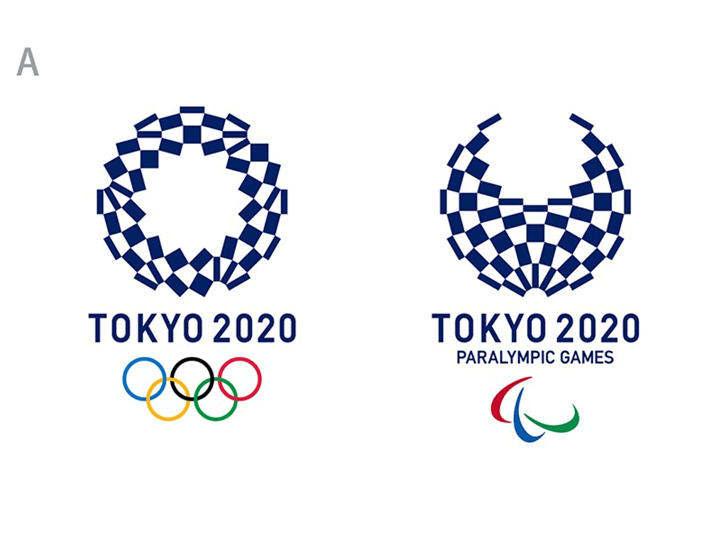
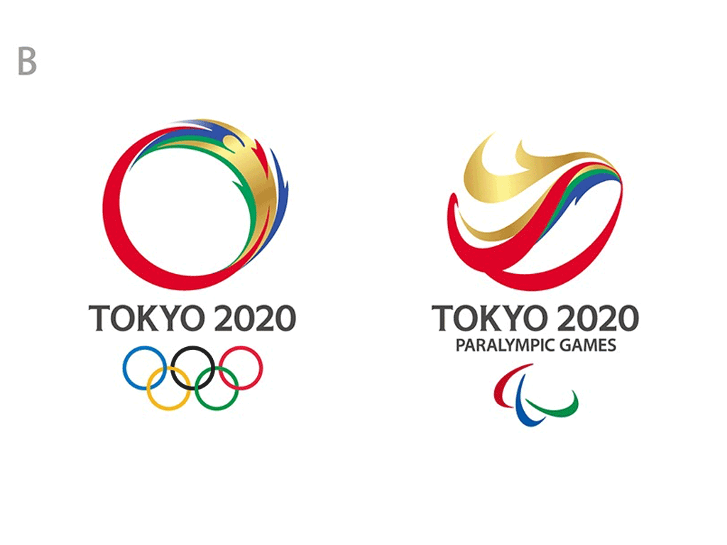
And so, here for you, our critical opinions of the four shortlisted Tokyo Olympic logo options:
Option A:
An epileptic fit-inducing NASCAR black hole wreathed in a lobster bib from a seafood chain restaurant.
Option B:
Donald Trump’s coiffure meets My Little Pony in a Human Torch ouroboros viewed on the Mozilla Firefox browser.
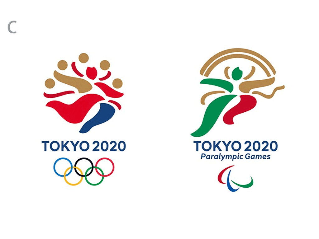
Option C:
A Matisse chopped salad that is actually drawn and quartered, but with a hint of toothpaste branding skipping rope, but not in a good way.
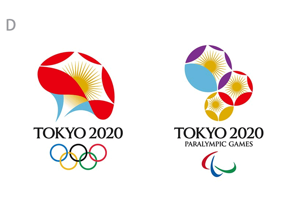
Option D:
It might be an exploding brain core, but it is missing the little dog listening to the Victrola, or maybe it’s a freshly plucked chantrelle mushroom. *Suggestion*: swap out the Paralympics logo for the Olympic one and redo the Paralympic one. The type is badly spaced/kerned, but evokes the Roman iteration of the Olympics. Perhaps the most appealing, though perhaps just a hot mess.Adidas footwear | Nike Air Zoom Pegasus 38 Colorways + Release Dates , Fitforhealth
