Mr. Keedy is an educator, designer, type designer, and writer, who has been teaching in the Graphic Design Program at California Institute of the Arts since 1985. VCFA Chair Ian Lynam caught up with Mr. Keedy to talk about the state of design education and design criticism today.
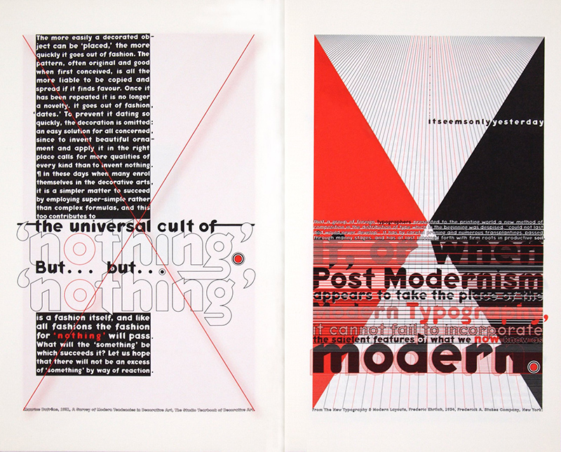
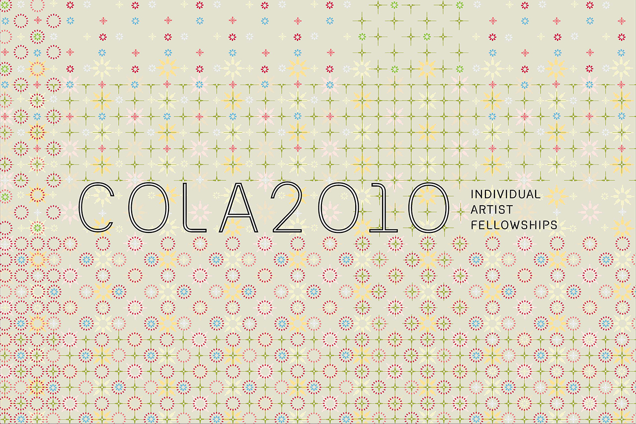
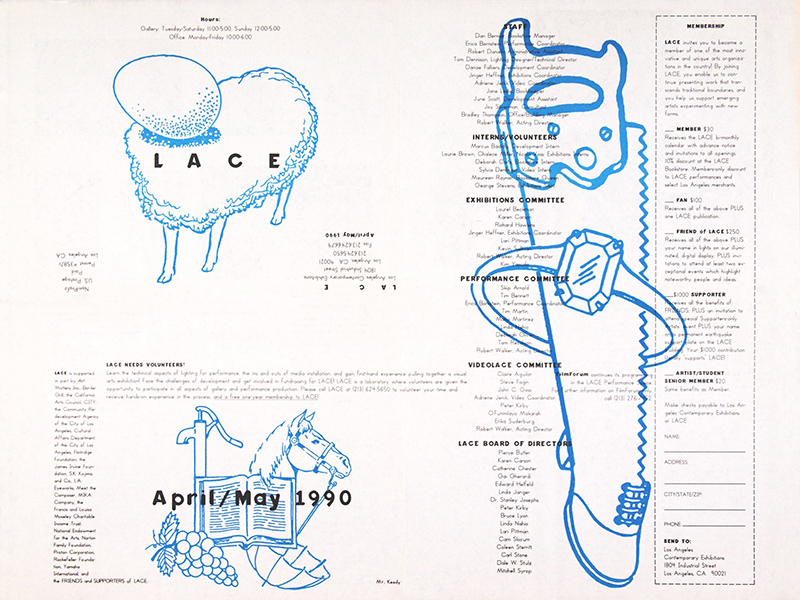
Keedy has been recognized for his design work for institutional and commercial clients in branding, packaging and publication design. His design work has been published in Typography Sketchbooks, New Ornamental Type: Decorative Lettering in the Digital Age, The Handy Book of Artistic Printing, Boxed and Labelled: New Approaches to Packaging Design, New Design: Los Angeles, LACE: Living the Archive, and in the textbooks Graphic Design in Context and Graphic! Design History. His essays have been published in Eye, I.D., Emigre, Critique, Idea, Adbusters, Looking Closer One, Two, and Four, and The Education of a Graphic Designer. His work has most recently been exhibited at MoMA, SFMoMA, CAM Raleigh, and The Biennial of Graphic Design, Brno, Czech Republic. His typeface Keedy Sans was added to MoMA’s permanent Architecture and Design Collection in 2011.

In the past, a critic was an arbiter of an aspect or aspects of culture which had intrinsic and extrinsic value to society. In his book Creative Destruction, economist Tyler Cowen wrote that, “…critics act as specialized monitors in support of diversity and quality… allowing markets to economize on how much monitoring is needed”. The past decade has seen the notion of design gaining cultural value, but what of the design critic?
You have to take the long view with criticism. It takes a while for critical positions to sort themselves out into useful ideas that push serious design discourse forward. There is some good Design Criticism out there, and I think the best is by designers themselves. There are always going to be a few designers who like to think about their discipline and it’s place in the world. But you have to make a real effort to find it in a crapload of regurgitated dumb ideas and self-aggrandizing propaganda. The internet mobocracy has turned everything into a popularity contest and criticism is not popular. It is unrealistic to expect that design criticism would have anything but a small audience, there are just not that many smart designers (like you reading this now).
No one disputes the cultural value of design and design thinking anymore, but designers? Not so much. The biggest offenders are the designers themselves because they routinely celebrate mediocrity in their publications, exhibitions, and conferences. They set the bar so low as to be indistinguishable from amateurs who are now better than ever thanks to new technology. When the culture thinks a design is important it calls it “art”, precisely because it doesn’t value design as much.

What are your thoughts about design as a ‘science’―or perhaps pseudo-science? The past few years have seen an emphasis on “design thinking”, as if it were a preset methodology of inquiry as applied to research in the corporate sector. Simultaneously, the desire for individuals to quantify their habits, actions and tendencies graphically has become increasingly resonant in popular culture (e.g. Feltron, et al). What do you think this all represents culturally?
Quantification, seems to be indisputable and objective. A clear and accurate picture of the situation that will lead to informed decisions that can be “backed up with facts”. In practice for a client, pedagogy in schools, or in personal life decisions, it’s hard to argue with “hard data” and “facts”. I think scientific design thinking is motivated by a fear of accountability. How does one account for their design decisions? Having “objective” data and processes one can point to and say “these are the facts, it’s not my subjective taste,” is an unassailable (safe) answer. This is of course a bunch of hooey!
A description is not a definition or explanation of anything. And every description is mediated by perception and context and that is where the messy business of subjectivity is hiding. I call this In-faux-mation Graphics. It looks like the truth. But who’s truth? The lack of real objectivity is self-evident in the subjectivity of the results. Why is it that the most stylistically consistent and predictable work always comes from those who renounce style and subjectivity?

Have your feelings changed at all about practice and theory being inherently separate in terms of design as praxis?
Most writing about design is methodology. It is directly related to the practice, the how-to or the what and why of a particular design. A lesser amount of design writing is concerned with making a judgment about work, that is design criticism. Theory in it’s more traditional sense is independent of practice so as to be unencumbered or prejudiced by a particular ideology associated with a particular practice or person. This “pure” theory acts as an inspiration to methodological and critical approaches. Theory has to be apart from any practice to allow for the most imaginative and innovative ideas. George Nelson and Otl Aicher are among the very few designers who wrote what I would call ‘pure’ theory about graphic design. Most pure design theory was written and continues to be written under the general heading of Aesthetics, by people like Alois Riegl, John Ruskin, and E. H. Gombrich. In a perfect world, I think designers would read theory to help them write criticism and develop methodologies that inform practice. But in reality, design theory continues to be of interest to a handful of academics at best.
In practical terms, the thing that would most benefit designers and design culture (if there really is such a thing) is good criticism (as everyone knows!). It should come for the most part from academia, but it hasn’t because they have spent most of their time playing catch-up to technology and establishing a history for the discipline. Also, I think it has to be said that graphic designers take criticism poorly, and they rarely solicit it. That is because they see themselves as underdogs in the culture—an unfortunate byproduct of getting a design education in an Art school.
When I studied under you, you really pushed me to go out in the world and dig out the mysteries of design. It was due to this suggestion to uncover the unknown that I became really interested in exploring oddball and little-known aspects of design culture, e.g.: the Mazdaznan cult that Johannes Itten and other members of the Bauhaus were participants in. Are there mysteries or little-known/abstruse history in design culture that you wish people knew more about?
Anything before the 20th Century.
The first half of the 20th Century saw the implementation of modernism as the official style of capitalism and design.
I lived through the second half of the 20th Century which was mostly a rehash and elaboration of the first half.
So I speak from experience when I say that I am sick of the 20th Century. That is not an opinion that will get me many “likes” among designers because they have a nostalgic retro love for all things 20th Century. The only exception is typeface design where they will concede that a few fonts before Helvetica like Bodoni or Garamond have some merit. That is the “received wisdom” of the last century in design.
Modernism reduced design to cool functionalism which is great for making money but crappy for expressing the full range of human experience. There is so much more to explore outside of the modernist paradigm, but the vast majority never do. If a graphic designer’s style deviates too far from that thin slice of Western culture they risk being out of fashion or worse, “not cool!” For graphic designers it’s always the 1920s.

A lot of people used to choose graduate schools because of the visual styles associated with different schools (Yale/Werkplaats = the Global Style, CalArts/Cranbrook = eclectic Postmodernism), yet more and more there has been a fairly universal flattening of style in the past decade. It is often difficult to place where work has come from. Has this shifted your perspective on graphic design education at all?
Where the work comes from? How about who and what the work is for?
The democratization of taste has leveled everything out so that the stylistic signifiers that used to represent certain ideological approaches or schools of thought, no longer have much significance other than being a historical referent. Design schools are still the primary source for how design looks but they are a more liminal influence on style than they were in the past.
There are larger forces at work than what an individual teacher or program wants to achieve. Political and economic realities demand accountability that is now measured only in dollars. This has pushed design education into a more vocational model. The student-as-consumer has created the teacher-as-administrator. The profitability of design education has flattened the diversity of programs. There are a lot more design programs to choose from now but they are also much more similar. Should we be surprised that the work looks similar? When everyone has the same on-line education and uses the same software what do you think the outcome will be?
And that sums up this edition of “Huh?”, dear readers—stay tuned for more soon!
bridge media | 2021 New adidas YEEZY BOOST 350 V2 “Ash Stone” GW0089 , Ietp


