Andrea Tinnes is an insanely multi-talented type designer, typographer and educator living and working in Berlin. Her design practice is focused on client-based as well as self-initiated projects. In 2004, she founded her own font label, Typecuts. As her work is very much at the nexus of so much we focus on at VCFA, we thought it’d be good to pick her brain at length and find out more!
After several years of teaching at Norway’s Bergen National Academy of the Arts she took on a professorship of Type and Typography at Burg Giebichenstein University of Art and Design Halle in 2008. From 2010 till 2014 she was prorector of the school, being particularly responsible for the school’s new visual identity and communication. Andrea has a degree in communication design from the FH Mainz (1996) and an MFA in graphic design from CalArts (1998).

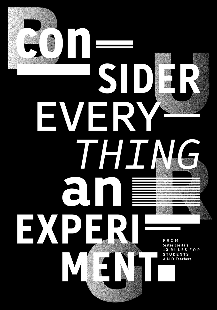
Poster featuring all the elements Burg Giebichenstein’s visual identity
Design: Anja Kaiser and Andrea Tinnes
Her range of typefaces ranges from the ornamental Volvox via a number of experimental fonts to type families like Skopex, Roletta and Burg Grotesk.
Andrea’s work has been featured in many national and international publications, such as Area_2, Graphic Design for the 21st Century, etapes: and EYE Magazine and in several exhibitions including the TDC53 exhibition, Chaumont 2007, Call for Type. New Typefaces and Deep Surface: Contemporary Ornament and Pattern.
She holds awards from the American Center for Design, red dot 2001/2002 and a Certificate of Typographic Excellence, TDC53 2007. Her work was selected for the Festival d’affiches de Chaumont 2007 and Output 02 in 1999. The typeface PTL Skopex was selected as Typographica’s favourite fonts 2006.

Visual identity of Burg Giebichenstein University of Art and Design Halle
Concept and design: Wolfgang Hückel, Wolfgang Schwärzler, Anja Kaiser and Andrea Tinnes
Photos and Set Design by Sanna Schiffler and Judith Will, supported by Matthias Ritzmann
As someone who has worked on large scale identity projects, do you have any underlying or overarching methodologies that inform how you proceed in tacking an identity project?
This was actually the first time I worked on such a comprehensive visual identity from the beginning to the end; all the projects before I was mainly responsible for the typographic work (logotypes and typefaces).
The project wouldn’t have been possible without the help and work of my wonderful assistants, Anja Kaiser (first year of the project), as well as Wolfgang Hückel and Wolfgang Schwärzler (the following years).
Our starting point was an intense research about visual identities in general (very much referring to Ulrike Felsing’s book Dynamic Identities in Cultural and Public Context) and a comprehensive evaluation of the past and current state of the school’s visual culture in particular (digging deep into the school’s archive of printed matters). We also looked at visual identities of art schools around the world and we created a Tumblr blog where we collected everything we found on the subject matter (in order to not repeat what’s already out there).

Visual identity of Burg Giebichenstein University of Art and Design Halle
Concept and design: Wolfgang Hückel, Wolfgang Schwärzler, Anja Kaiser and Andrea Tinnes
Photos and Set Design by Sanna Schiffler and Judith Will, supported by Matthias Ritzmann
Above all, we conducted many interviews with the school’s community, questioning their expectations and demands for a new identity (a common wish: instead of being rigid and highly regulated the new identity should leave room for individual design choices). Our then president Axel Müller-Schöll, who initiated the entire identity project, coined our guiding principle: “Identity and difference” demanding that the new design should strengthen the schools identity while promoting difference and diversity.
When our investigation and analysis were done, we were of course confronted with the big challenge of finding a visual solution. We came up with the idea to focus on the four letters BURG – the colloquial and informal abbreviation of our school, which hasn’t been an element in official communications so far – it was there that we finally found our concept and visual approach: the new visual identity keeps closely with the Burg’s visual tradition. Existing and historic elements are integrated, re-interpreted and combined to form a contemporary and independent visual language, moving between tradition and modernism, and between functional and experimental application.
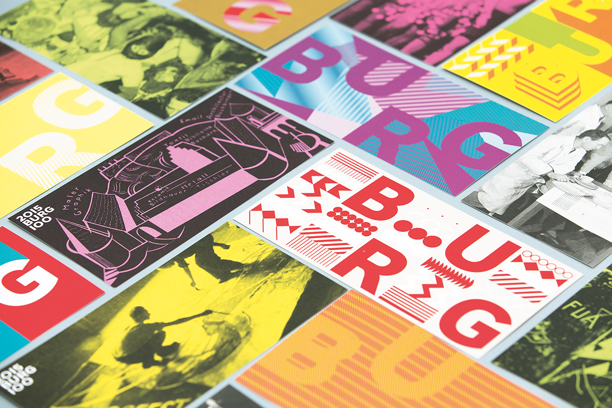
Visual identity of Burg Giebichenstein University of Art and Design Halle
Concept and design: Wolfgang Hückel, Wolfgang Schwärzler, Anja Kaiser and Andrea Tinnes
Photos and Set Design by Sanna Schiffler and Judith Will, supported by Matthias Ritzmann
Our solution is a modular system composed of constant and variable elements that
can be combined in a playful way:
- the Burg logo
- the Burg letters (BURG)
- the university’s name in German and in English
- the fonts Minion and Burg Grotesl
- the Burg symbol font
- the color scheme and photographic imagery
This concept was then presented to all the different members of the school in many conversations and presentations. New ideas were absorbed, evaluated and incorporated into the concept at the refinement stage in close cooperation with our school’s president and management.
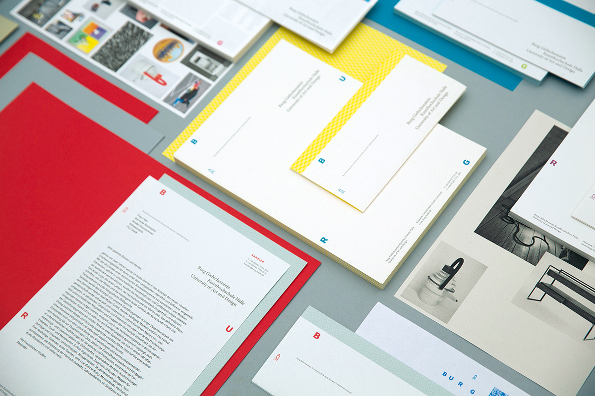
Visual identity of Burg Giebichenstein University of Art and Design Halle
Concept and design: Wolfgang Hückel, Wolfgang Schwärzler, Anja Kaiser and Andrea Tinnes
Photos and Set Design by Sanna Schiffler and Judith Will, supported by Matthias Ritzmann
This dynamic dialogue between designer and user is the reason why our new visual identity is highly accepted and valued and everybody identifies very much with the BURG identity.
What does the term “identity” mean to you as a designer?
Design plays an important part in constructing personal or collective identities, especially when it comes to style and visual self-expression. However “identity and design” is such a complex area of discussion, encompassing all kinds of aspects from the political, social, cultural, sexual, psychological to the philosophical. So, I actually don’t know how to answer this question in a short paragraph… but, I don’t want to put and end to the discussion, so here’s an excellent quote from Andreas Werde, describing the area of study “identity and design” at the Cologne International School of Design:
“Individuals, groups and organizations wrestle in various ways with the themes of attention, acknowledgement, power and ultimately with identities. The political, social, cultural and economic implications that are bound up in this, along with their contradictions and divergences are a part of design thinking and practice. It is all the more important that designers have expertise and the corresponding communicative skills at their disposal that go above and beyond the attributes of identity-creating communication.
In this context, design can »and must« also formulate its own identities and maintain them vigorously.”
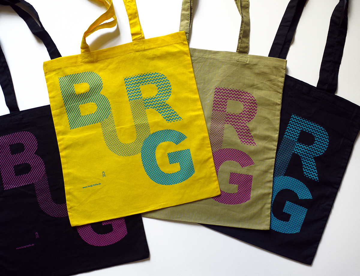
Tote bags from the visual identity of Burg Giebichenstein University of Art and Design Halle
Andrea Tinnes
Some of your earlier work directly relates to the ornamental, and dare I say, the baroque… In terms of cultural influence and importance, how do you think contemporary culture perceives ornament created now versus from history?
The perception of ornament depends on the culture you’re referring to. Speaking about the contemporary German academic design world both “ornament” and “decoration” are sort of derogatory terms. To declare a piece of art or design as decorative or ornamental is often meant as a critique (meaning shallow, meaningless, anti-intellectual).
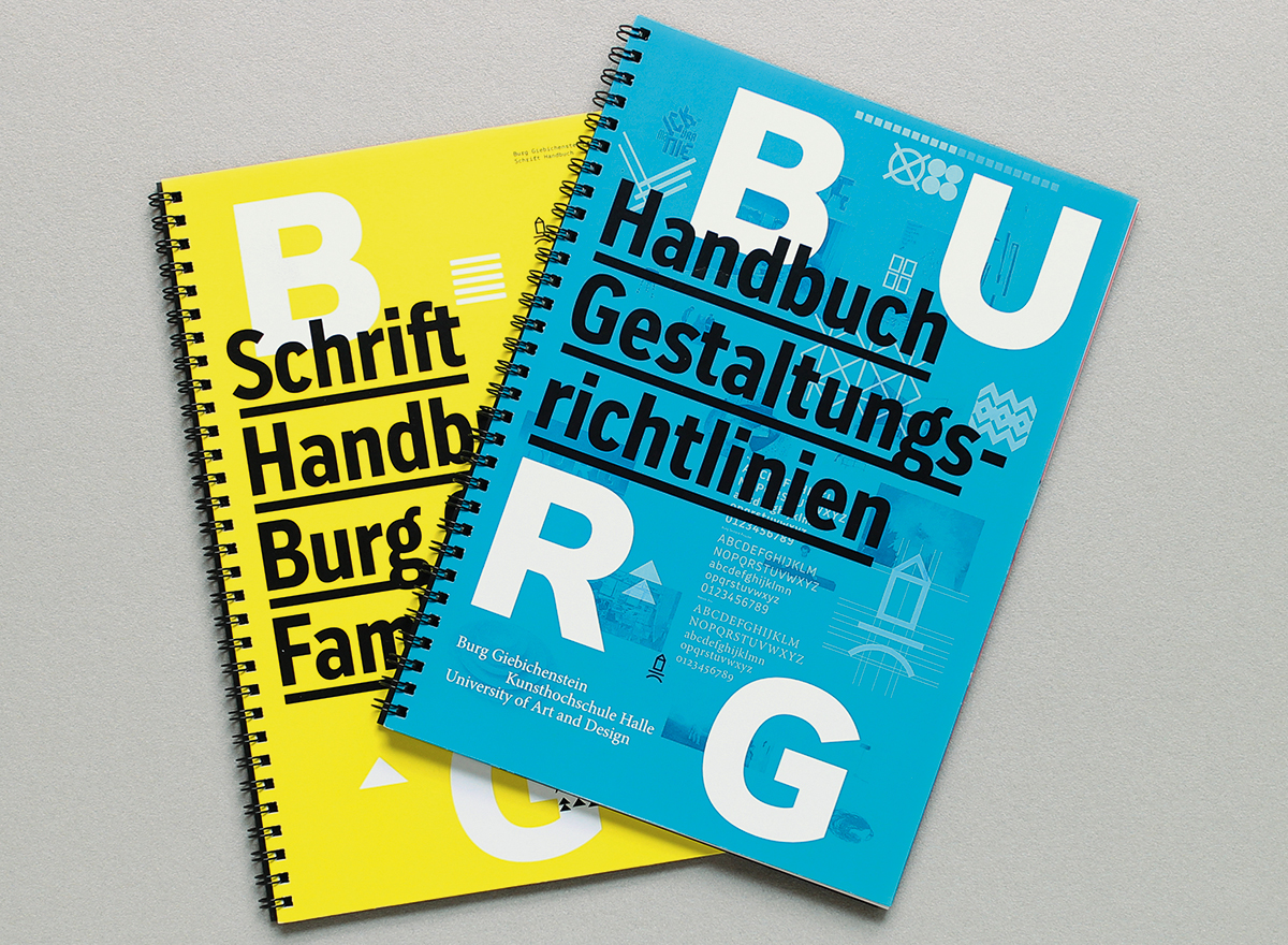
Manual and Type Specimen for the visual identity of Burg Giebichenstein University of Art and Design Halle
Concept and design: Wolfgang Hückel, Wolfgang Schwärzler and Andrea Tinnes
Although there is much appreciation for ornament within the type design community (historical and current ornaments are usually seen as well crafted signs and symbols) I often find myself in a position of self-defense when talking to graphic designers, justifying my enthusiasm for form, color and visual exuberance.
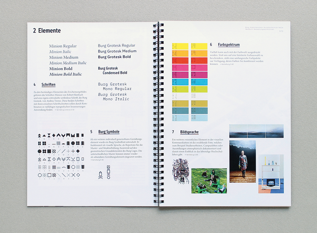
Manual and Type Specimen for the visual identity of Burg Giebichenstein University of Art and Design Halle
Concept and design: Wolfgang Hückel, Wolfgang Schwärzler and Andrea Tinnes
What are major influences on your work? And what about minor influences? Just anything—be it writing, design, or other that has helped spur you forward as a maker and thinker.
For the last couple of years, my major influences were the people I work with at school: colleagues, assistants and above all the students: interacting with them and learning from them as well as looking at design with the fresh eyes of a first year student.
Attending CalArts had an essential influence on my work: to combine critical thinking with playful form-making, to develop my individual voice and style and to reflect history while exploring new ideas in the field of graphic design.
Any other than that I draw inspiration from any aspects of visual culture: signs and alphabets, street art and hand painted murals, pop and kitsch, visual poetry as well as commercial art, psychedelia as well as minimalism.
I collect and archive all kinds of design ephemera: from historical type specimens and type catalogues, historical design magazines, maps, lexica and science books to contemporary flyers, brochures, and packaging.
And just like everybody else I take pictures of all kinds of typographic artifacts I find on the streets.
There is also music, film, art and politics and always books, books and books…
Last but not least: a major influence in life is of course my partner who is absolutely not interested in design at all and always brings me back to earth, to draw my attention back again to the world beyond design.
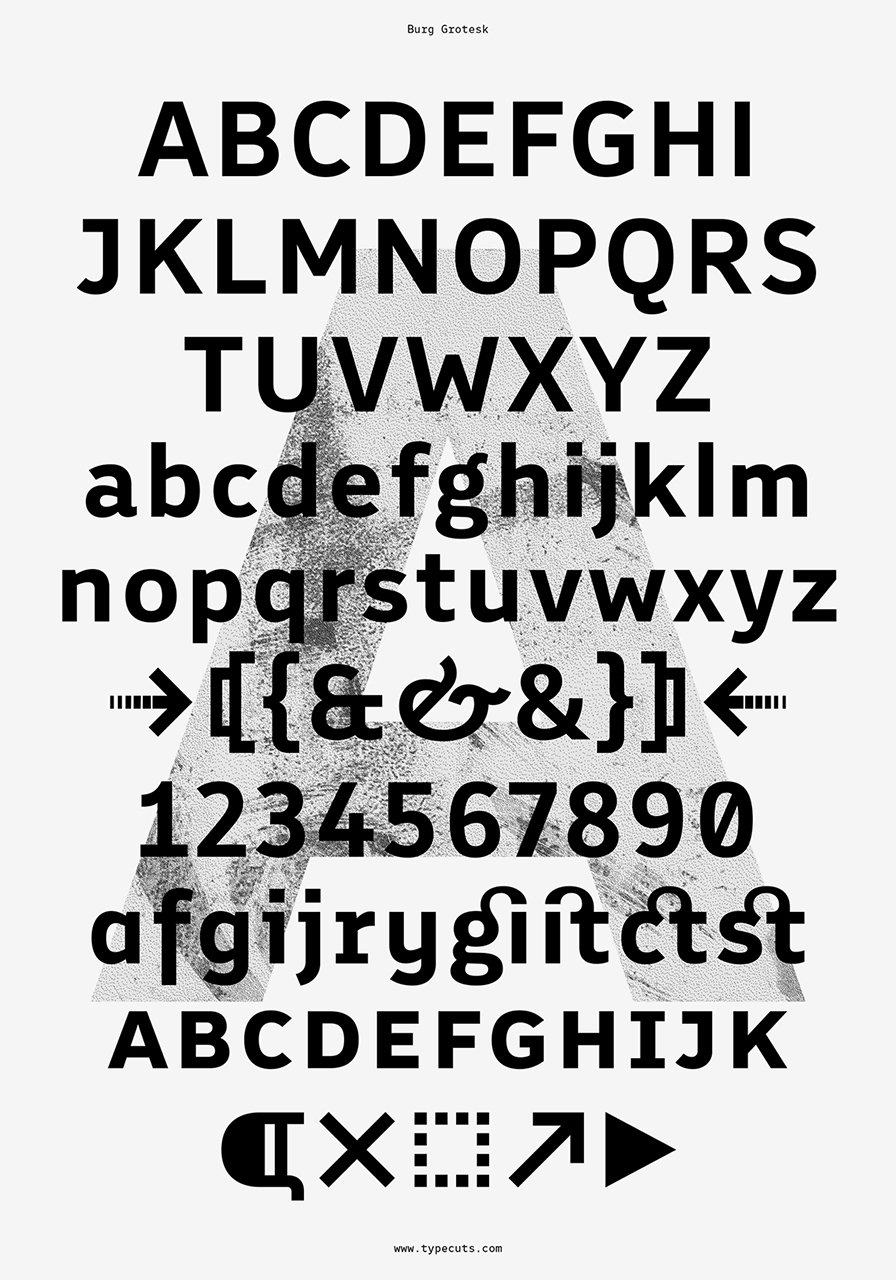
Burg Grotesk
2011, 2015
Burg Grotesk is the official typeface of Burg Giebichenstein University of Art and Design Halle, specifically designed for the new visual identity of the institution.
Burg Grotesk is a sans serif typeface based on PTL Roletta Sans, a comprehensive round family also designed by Andrea Tinnes.
Compared to PTL Roletta Burg Grotesk has sharp corners at its stroke terminals, while still combining functionality and playfulness with many refined details. The typeface is characterized by a mixture of rather modest capitals with a slightly smaller proportion and more vivid lowercase letters with a slightly wider proportion, adding fluidity and rhythm to the text.
Burg Grotesk currently consists of three weights — regular, medium and bold — as well as a bold condensed and a regular monospaced version; more fonts and matching italics are in the making. The OpenType fonts include many advanced layout features with various figure sets, small caps, alternate characters, ligatures as well as geometric symbols and arrows. Burg Grotesk also comes with a symbol font offering a wide range of geometric composites and a logotype font called “Burg Letters”.
As a design educator, what are some of your goals?
My biggest goals are to inspire students with my own fascination with type and typography in order to turn them into type aficionados as well as to teach them to be critically engaged citizens with a unique visual voice.
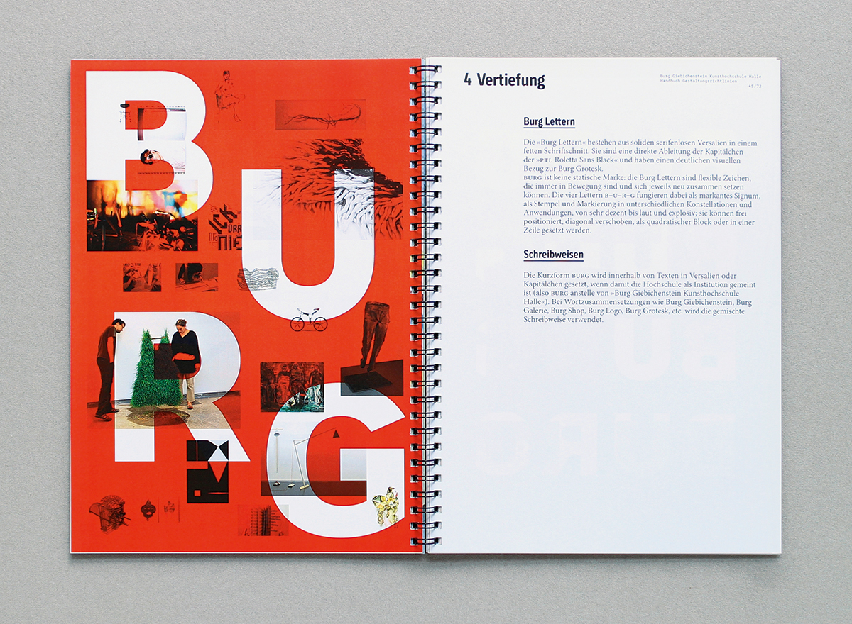
Manual and Type Specimen for the visual identity of Burg Giebichenstein University of Art and Design Halle
Concept and design: Wolfgang Hückel, Wolfgang Schwärzler and Andrea Tinnes
And working within design education, how do your teaching methodologies and approaches differ from others?
I very much internalized Sister Corita Kent’s 10 rules for students and teachers in my teaching methodologies.
Knowing that many design educators refer to her list of principles for learning, I actually don’t consider my approach so different from other teachers.
However, here are some general thoughts about my approach to teaching:
I highly enjoy teaching and I’m very enthusiastic about the subject matter I teach. So I try to be be a committed team player, a curious interrogator, a critical questioner, a challenging motivator, a contagious enthusiast, a helpful supporter or just simply a “jolly fellow”
🙂
Besides teaching all aspects of type and typography I want to encourage students:
- to look
- to read
- to work
- to observe
- to inquire
- to question
- to research
- to discover
- to anticipate
- to experiment
- to use imagination
- to use process as a method
- to explore methods and tools
- to approach from many directions
- to accept coincidences
- to explore extremes
- to follow intuition
- to work beyond the limits
- to make choices
- to be curious
- to be courageous
- to be critical
- to be doubtful
- to be self-disciplined
- to be independent
- to be visually literate
- to be aware of details
- to think cross-disciplinary
- to be open-minded
- to be not afraid to fail
- to be interested in the obscure as well as the mundane
- to think beyond the obvious and expected
By the way, the museum Hamburger Bahnhof in Berlin is currently showing an exhibition about Black Mountain College and its teaching methods. I haven’t seen the show yet but I’m so excited to learn more about their progressive and innovative teaching methods…
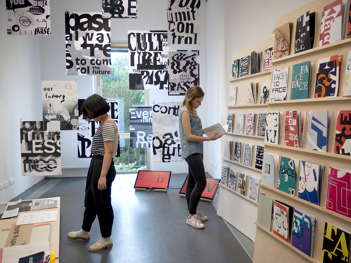
Type and Typography Exhibit, @burghalle
How do you combat the miasma of anti-intellectualism so present in contemporary graphic design in the classroom?
I’m actually more of a hands-on maker than an intellectual thinker, however I consider research and theory absolutely mandatory within the design education. Since typography is a visual language, the basis of typography is always text. I try to incorporate as many meaningful texts and writings as possible in my assignments and projects. Writings can range from poetry to politics and topics from a systematic theoretical investigation into all formal aspects of type to a critical examination of mass surveillance and censorship.
Here’s an example:
Under the headline “Commanding Phrases and Utopian Forms” my assistant Anja Kaiser and I taught a workshop last year in which students were supposed to typographically explore a variety of political and artistic manifestos, ranging from the “Manifesto for an Accelerationist Politics” by Nick Srnicek and Alex Williams to the “Declaration of the Independence of Cyberspace” by John Perry Barlow to Platform 21’s “Repair Manifesto” (just to name a few).
In engaging with a radical political response to capitalism (“Manifesto for an Accelerationist Politics”) or with feminism and gender politics (Valerie Solanas’ “SCUM Manifesto”) we highly encouraged critical debate among the students.
In another project we used Brett Gaylor’s “Remix Manifesto” to explore Remix as a political, cultural as well as aesthetic strategy while at the same time debating the restrictions of corporate copyright laws and their effects on the production of cultural artifacts.
All this is of course the intellectual groundwork to create new innovative typography.
What is a dream project that you haven’t taken on as of yet?
I would like to take at least one year off and go on a world tour with my wonderful partner.
That, Andrea, sounds like a plan!!! Thanks so much for making the time to talk with us at length! It was so wonderful to speak with you!
And that, friends, concludes the 22nd installment of “Huh?”. Stay tuned for more, notably an additional post about an exciting exhibition by Andrea shortly!Buy Sneakers | Nike
