VCFA Chair Ian Lynam chops it up, both literally and figuratively, with Manuel Krebs of the Swiss graphic design studio Norm. Manuel, alongside Dimitri Bruni and Ludovic Varon and a cast of assistants have been producing some of the most intriguing graphic design in Europe for decades—from visual analyses of döner kebab signage to unique typeface designs (most recently featured on the cover of the new book IDEA Document) to designing the corporate identity for Swatch to the design of a digital typeface family for an airport.
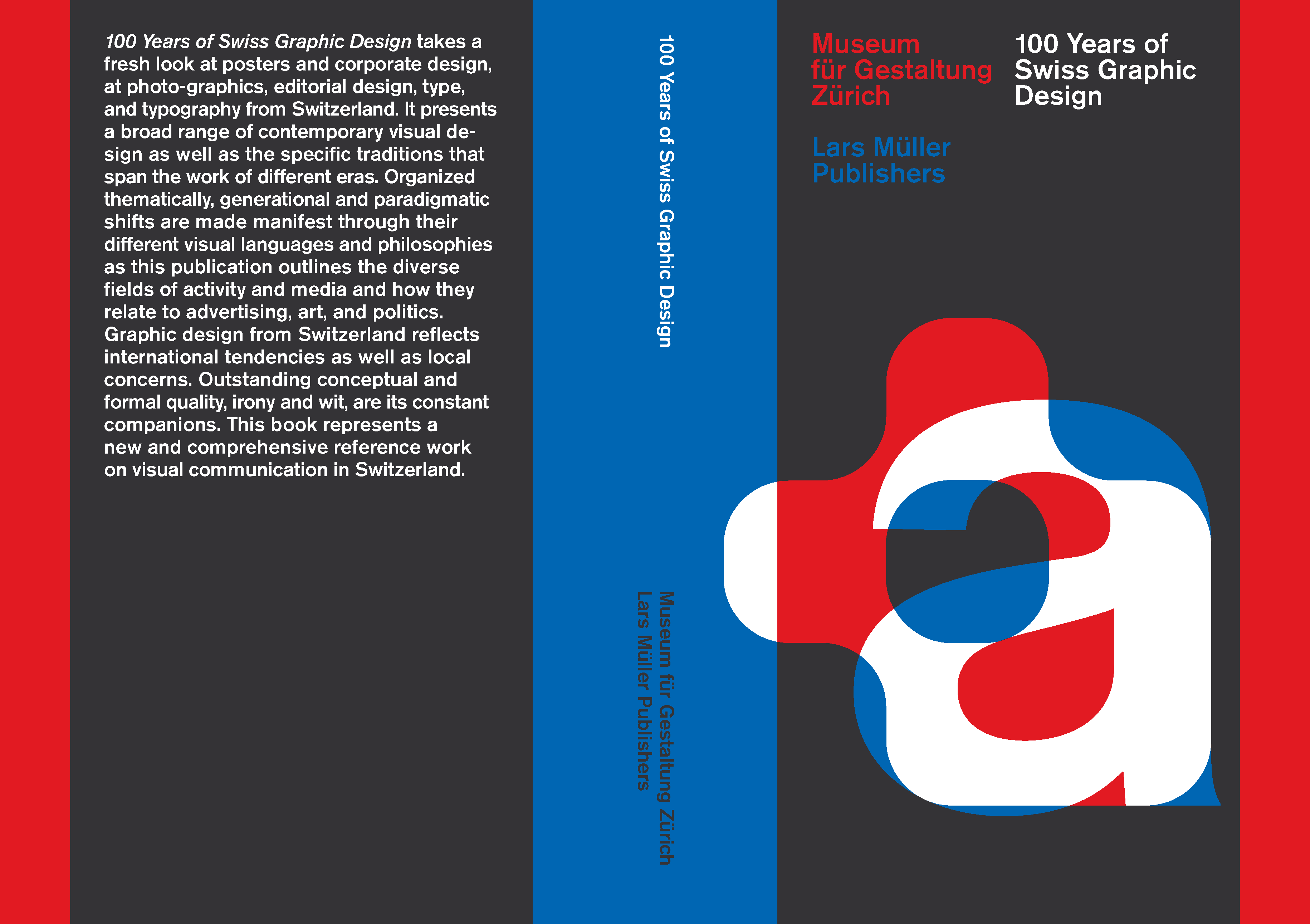
The Norm-designed 100 Years of Swiss Graphic Design. The Norm-designed 100 Years of Swiss Graphic Design, published by Lars Müller Publishers
Your graphic design studio was recently tasked with designing 100 Years of Swiss Graphic Design, the most comprehensive history of Swiss graphic design that has ever been published. While that is definitely flattering, it must’ve scared you guys shitless! That is a really big burden to carry. What was the process of designing both books like?
It was over a year ago that we finished that project and it took far too long!
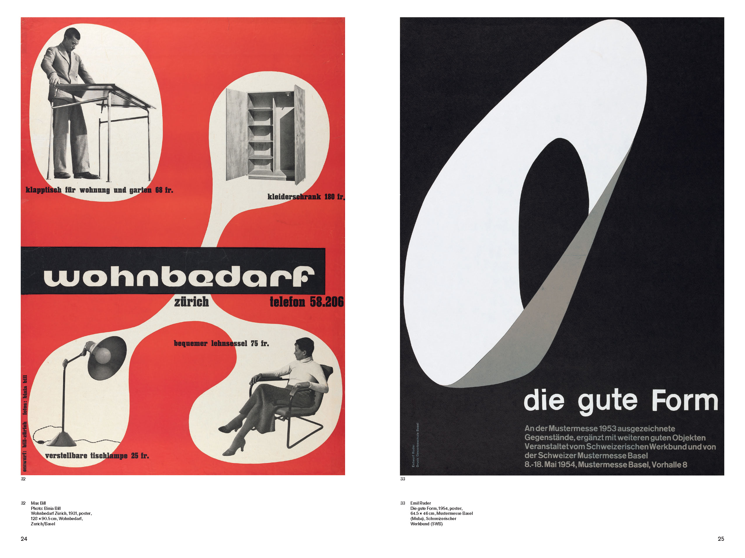
A spread from the English version of 100 Years of Swiss Graphic Design
We discussed what the right response should be, as we wanted to avoid ‘to making a statement by Norm’. We prevented big graphic gestures and tended to rely rather on the visuals, as they alone are the historical ’truth’, rather than the text… nothing against the text, mind you. We used only one typeface in three sizes, and we kept to the grid (and for that, we admit: no surprise there!).
Type research for 100 Years of Swiss Graphic Design – a study in Akzidenz Grotesk
Regarding the type choices, either Helvetica or Univers would have been ‘correct’, though probably have been too obvious. We then agreed on Unica, the ambitious 1977 type project that was meant to bring together the best out of Univers and Helvetica, but when working with it we were not happy. The regular cut was to light for us and the medium cut is rather bold. In the material we had, the version we created of Akzidenz Grotesk has a very strong presence. So, we turned to that typeface, or rather, a few variations of it—we used Berthold Akzidenz Grotesk Medium for the titles, covers and introduction text. For the body text and legends we used Akzidenz Grotesk Next Medium.
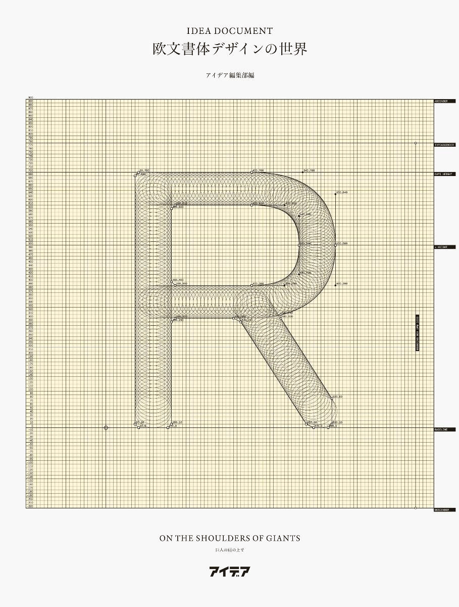
Norm’s typeface Replica on the cover of the new book IDEA Document – a comprehensive bilingual (English and Japanese) overview of the past two decades of writing on typography and type design from IDEA, Japan’s oldest graphic design magazine.
You guys design typefaces, as well as use them in your design projects. Why the hell would you create that much work for yourselves?
Designing typefaces and most especially, using our typefaces is essential to our practice. When we started the office, designing typefaces was much easier and lighter in terms of scope—matrix-based and pixel fonts did the job, as everyone did at the end of the 90s. Expectations were low and so were our skills. Frankly, we profited from that, as we were not trained in type design and our desires and demands grew like our peers. We have always designed typefaces for ourselves first—for our practice. Having a typeface you designed yourself is extremely liberating, because you know it’s right.
I think our first serious attempt was the typeface family Simple which we used primarily between 2002 and 2005. Next, we started working on Replica, which we started using in 2006, though the ‘official’ commercial release was in 2008. We used Replica almost exclusively for everything we did for the next four or five years. For the past couple of years, we have been working with our new typeface Riforma, which has not yet been released commercially. We have beta versions which we keep changing and modifying. At the moment we use Riforma for every project we do. It is part of our identity, if you like, or maybe better, it expresses our attitude. We feel like we can go much more in-depth within that given parameter—it is maybe less about the type you use but more about how you use it. We aim for precision within a certain language—our visual language.
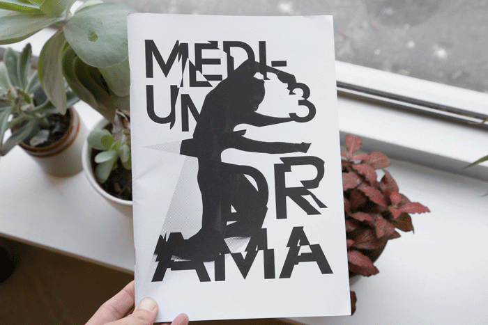
Medium No. 3 by Shirana Shahbazi, Tirdad Zolghadr and NORM.
Your personal projects spill out from the confines of the studio. What, or perhaps more appropriately, who is Shahrzad, and what the hell is Medium?
This aligns perfectly with the previous question—in our work with Norm we set up many standards and regulations, from formats, to type sizes, typeface choices, grids, colors, and how design should communicate. Shahrzad and Medium are projects to which those rules do not apply. They do not follow rules. They are the therapy that keep us balanced.
Medium is the same thing as Shahrzad—a magazine. After a couple of issues, we decided to change the name and the format. It’s a collaboration between photographer Shirana Shahbazi, writer/curator/educator/free radical Tirdad Zolghadr and Norm. We usually pretend to have a theme (like poetry, sculpture or drama) but this is just pretend. Shirana delivers the pictures (namely, whatever she wants), Tirdad, the writing (whatever he wants) and we bring it together (in any way we want) and sometimes we do this as if we were Shirana or Tirdad, or the other way round.
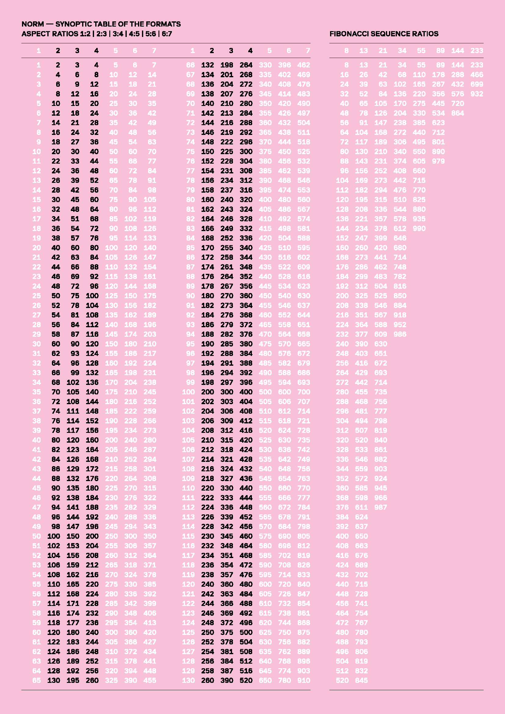
NORM’s graphic design format chart
You guys have done some gigantic projects. Are there any milestones/dream projects that you have yet to hit/undertake?
The next important project is our new book, the third volume in the trilogy, preceded by Introduction and The Things. We had planned this book for release in 2004(!), and we’ve worked on it for over ten years, but as we’ve had countless other projects in-between, we kept changing and modifying it. But, for the last maybe two years we’ve working on it in a stringent way and we hope to be ready in about one year (coinciding with the release of our Riforma typeface family).
The word on the street is that you like to cook. Can you share one of your favorite recipes with us?
This is my favorite recipe (it’s actually Japanese—probably not very exotic for you, Ian, but in Switzerland it’s a burner). I always make sure to pour the Coke exactly like the chef in the picture!

Editor’s note: This is Coca Cola and green onion stewed pork. It is, in essence, culinary crack cocaine.
Next time you make it, shoot me a flick!
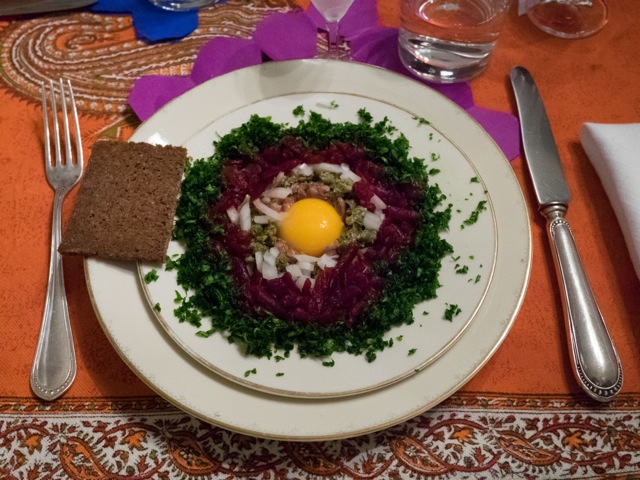
Here’s the next recipe, “The Swedish Sun. (Note: Manuel whipped this up, along with amazing zucchini flower tempura last time I was in Zurich. It is, in short, tastebud brutality.)
The other heavy hitter is “The Swedish Sun”. It’s a fairly simple recipe. Merely arrange in concentric circles from the inside to the outside:
- raw egg yolk
- anchovies
- capers
- chopped raw white onions
- minced beets
- parsley
This dish should be consumed with vodka.
Thank you so much, Manu!!! Much, much appreciated!
And thus ends another installment of “Huh?”, and it ends on the best of notes—design is great, but you need that content, too!
More “Huh?” coming soon!url clone | Nike Running
