Aaron Winters is an award-winning and internationally-published creative professional and educator living in Sacramento, CA. His private practice spans 20 years crafting brand identity, user experience, front-end development and illustration. Aaron teaches at Sacramento City College and the Art Institute, Sacramento. He earned his MFA in Graphic Design from Vermont College Of Fine Arts in October 2014.
You can see much of what the ever-prolific Aaron is up to here:

“A” (2015) Mixed Media for @36DaysOfType
During your time studying at VCFA, what would you say was the locus/focus of your research?
I went into grad school thinking it was about identifying your weaknesses, then shoring up gaps in your experience to become more employable. Turns out it’s about learning to see those gaps as passageways, not holes, and how to use them to your best, unique advantage. The VCFA model helps you get your shit together without removing you from the equation. I wish everyone could go through a process like this. Although I likely am less employable (mostly by choice), I’ve become a better person, a smarter designer and a more emotionally engaged educator since.
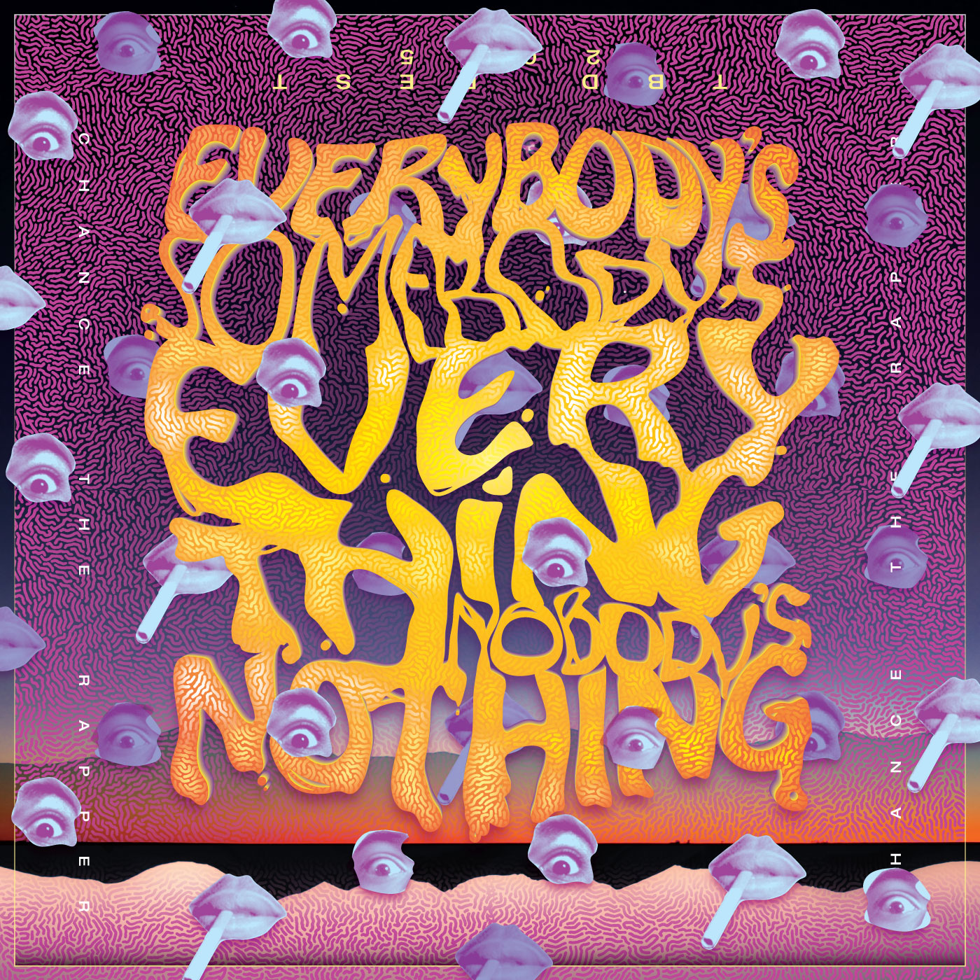
“Everybody’s Somebody’s Everything” (2015) 18″ square cloth gig poster/bandana/doo-rag for Chance The Rapper’s appearance this summer at TBD Fest, West Sacramento.
Fittingly, I guess that my focus, in a word, could be labelled Context ― learning to examine opposities and embracing the uncomfortably fun gray areas between them. What I found over the two years was an interest in designing a sort of extra-narrative conversation. A lot of these were print, some interactive, some long-form text, some purely formal. Regardless the media, I worked a lot towards using visual language and cultural references to “write,” critique, whathaveyou … just expanding my vocabulary and concept of inclusivity.
My favorite example of this is the graphic-ish novel I created/curated during my last semester keying together the Industrial and Digital Revolutions, and their respective Gothic Horror and Postmodern Graphic Design genres. The balance between decay and growth we call “culture” is super-fascinating to me.
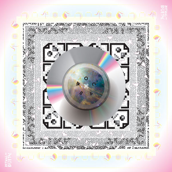
“Dijital Do Ritual” (2014) 24″ square silk handkerchief used as part of thesis installation.
How’s this whole post-graduation thing going?
I came back from Vermont to a steady stream of client work and the daunting task of academic applications for 2015. That overlapped with spring teaching, including two new classes at a new school. Add in a client project that kind of took over my life and it has been a bit of a bummer from a ‘personal satisfaction’ angle, but I’m really very grateful for all of it since it definitely beats the alternative.
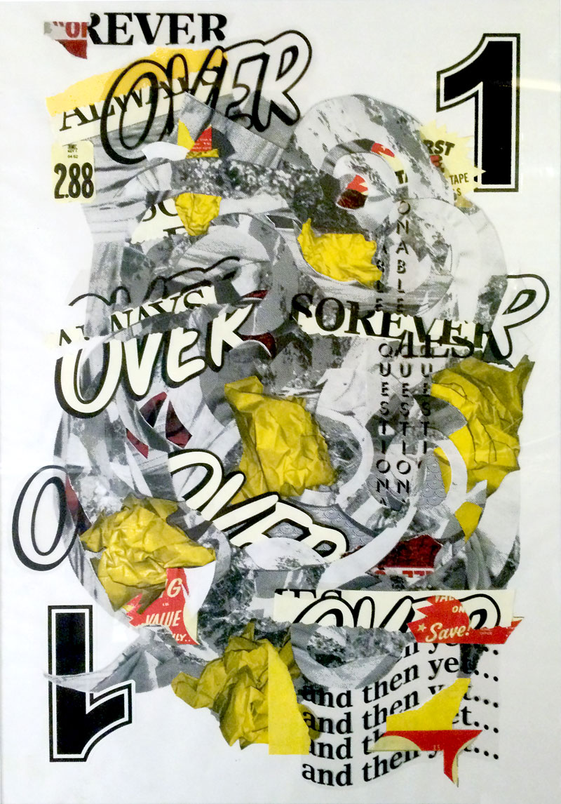
“Crimson” (2015) 24×30″ mixed media collage (analog). Shown as part of group collage art show at Arthouse Gallery, Sacramento in June 2015.
The application process was a bit rougher than I’d hoped. I did fairly well as far as getting calls back, visits, etc. but nothing came of any of it. I’m honestly not sure I’ll make another run at it for 2016. I’m happy at Art Institute where I just started, so I hope that this whole ‘gainful unemployment’ thing continues to work out as well as it has.
Despite the workload, I did manage to show in a handful of group exhibits, mostly analog collage. I had some work in Ed Syder’s Natas & Gonz book, and in the newest (Australian design conference) Typism catalog. I attended TYPO conference in San Francisco (thanks Silas!) and am headed to present at DesignWeek at Otis in mid-June.
I’m looking forward to scaling back a lot of my ‘have-tos’ over the summer and having some time to do creative projects again. I cleaned out a RadioShack’s entire Arduino rack, but haven’t touched any of it yet. I still want to try Processing, always need to go back to Javascript and would like to do more with CSS variables and SASS. There’s a lot of room to bring these technologies into traditional design projects. I just really want to keep making: more print/publishing, textiles, installations, environmental ― not to mention revisit the stack of leads in my Evernote so I can try to get back into writing on a more regular basis.
“Gonz & Natas” (2015) 6×9″ digital collage for Ed Syder’s Natas & Gonz book. Sheffield UK.
You’re a prolific reader (and writer). What are your top 5 picks for stuff that folks should read presently?
I love everything Nick Carr, Rob Horning and Evan Calder Williams have been doing. Max Bruinsma and Geert Lovink had a series (from around 2000–2004 I want to say) that I still want to find time to get more into.
I find that outside references tend to feed designers better than design can feed itself. Sites like The New Inquiry and Dis just picque my interest so much more than yet another look at the Life of Hermann Zapf, an exposé on responsive x-heights, or worse. Even Bloomberg Businessweek reads like a more competent source of cultural commentary ― and is more interestingly designed ― than most “design” stuff. Pitchfork Review has been blowing my mind as a cultural asset as opposed to just holding its place as a music magazine. Editor-in-chief Jessica Hopper ― who was also one my favorite writers for Punk Planet ― has brought a really high level of intelligent criticism back to the advertorial wasteland of that genre. It’s also a unique model in that it “did it all backwards” by building its rep as an online magazine for like a decade before beginning to publish a very legit and beautifully-designed print quarterly.
It’s not as bad as some make it out to be. There’s stuff out there if you’re willing to wade and/or widen your funnel a little. The Connor Oberst of design writing can occasionally write the emotional-chocolate off even a technically-oriented thinkpiece. Francisco Laranjo’s Critical Post-critical thing was cool. I just got Tim Belonax’ Process… book. There’s entire paychecks’ worth of stuff on DrawDown that we should all be slowly filling our homes with, too.
You’re also a prolific lover of music ― if you were going to make a YouTube Playlist mixtape of songs about design and art, what would the tracklist be?
Right now I’ve mostly been getting into some washy guitar space-outs from Mark McGuire (not to be confused with the steroid-laden Hall Of Famer) or his previous band Emeralds. Noveller can be good like that too. I also recently rediscovered The Sugarcubes and have become quite the fan of all things Björk (been listening to a lot of her live shows on NYCTaper). Mudboy, Zac Nelson (aka Hexlove) and Daniel Trudeau (aka Pregnant) all do this electro-freak folk I just can’t ever get enough of.
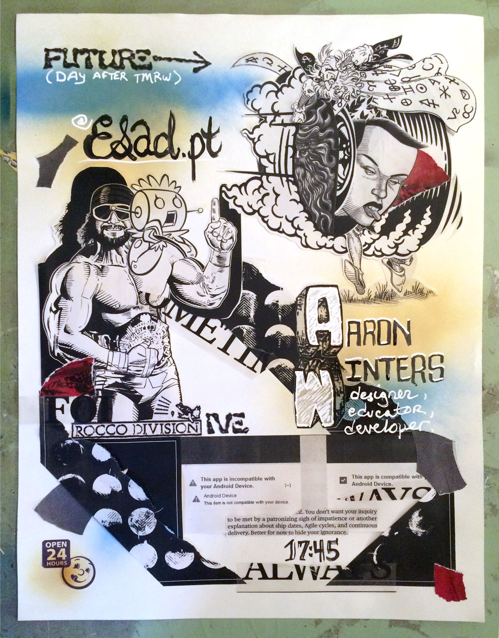
“Future Flyer” (2015) 24×30″ mixed media collage (analog). Aside from blowing the size requirement, this follows Ed Fella’s assignment.
Ed Fella used to do a project called The Future Flyer. If you were to do this project, what might it look like?
FUTURE FLYER (A Flyer Project with Constraints and Requirements)
– An 11 x 17 “flyer”, no bleed, black only on white, cream or grey paper
– All hand-crafted (nothing computer-generated). Draw, collage, cut & paste, Xerox.
– Must use at least 4 display faces (fonts or hand-lettered) (Lots of visual imagery. Or not!)
– No text smaller than 12 pt. (other than credit lines)
The Content is YOU (pretend) giving a lecture or exhibition on your (pretend?) work in the
future, the date, time, place/venue and any clever things you have to say about it or show
about it that would make one want to come to the event and be amazed!
Thanks for giving me an excuse to make something fun this week in between grading finals! I’m a little obsessed with the Portuguese design scene and had some fun speculating on a dream of visiting and speaking at ESAD in Porto.
A little obsession never hurts anyone! Thanks so much Aaron!
Ever generous, Aaron also kindly provided us with his reading list from the past six months, as well!
That’s it for now – stay tuned for the next installment of “Huh?”, coming SOON!Buy Sneakers | Nike nike air max paris 1 patch 2017 , Sneakers , Ietp STORE
