
VCFA Chair Ian Lynam takes some time out to chat with one of his mentors, Louise Sandhaus, a graphic designer and graphic design educator. She was the former Graphic Design Program Director at CalArts and is currently a faculty member. Her design office, LSD (Louise Sandhaus Design) has mostly specialized in exhibition design doing projects for LACMA, UCLA Hammer Museum, Los Angeles Natural History Museum, among others.
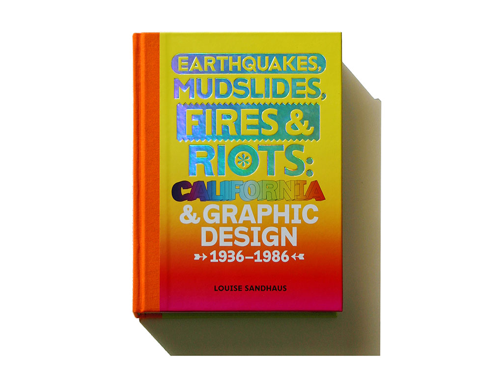
The US edition of Earthquakes, Mudslides, Fires and Riots: California and Graphic Design, 1936-1986
Her book on California graphic design, Earthquakes, Mudslides, Fires and Riots: California and Graphic Design 1936-1986, was just co-published by Metropolis and Thames & Hudson. The book has received attention from The New York Times, The Guardian, Design Observer, and Creative Review among many other publications. She is currently working on “Making History,” a web/wiki platform that will enable a crowd-sourced endeavor to further the documentation of California graphic design.
Your new book Earthquakes, Mudslides, Fires and Riots: California and Graphic Design, 1936-1986 is a phenomenal piece of research, writing, collaboration and design. What was the initial impetus that made you dive into researching the history of graphic design in California, specifically, as opposed to ‘the West Coast’ in general?
I ask, because I grew up in upstate New York, and the idea of “The West” is something that was imprinted on me in my teens as a skateboarder. The West is a driving force that ties together so many disparate locations and sentiments: the so-Right-it’s-Left libertarian elements of rural Texas; the great marijuana harvests of Northern California; the nude hot springs (and occasional waterlogged immigrant Russian corpses) of Oregon; the desolate biker bars (and wineries belonging to alt-rock bands) of Arizona—each is a bearer of mythos and hyperbole, the proverbial pillars upon which the banner of The West is slung. The West as a conglomeration is a potent, aggregate mixture of tobacco-stained mustaches, sun-faded tattoos, daring feats, the lurking threat of violence, and straight-up exaggeration and bullshit in the search of that which is most elusive: freedom. Long question short: why California?
To my mind it was those myths—or I love the way you put it—“mythos and hyperbole” attached to California specifically that were the lure. I’m referring to the myths so great and vivid as to permeate the American and perhaps global consciousness as a place associated with hell-fire and brimstone disasters of the earthquakes, mudslides, and fires variety. But there are also “California” images of equally great social transformation embodied in urban uprisings such the Berkeley free speech movement, the Diggers free everything idealism, the Black Panthers who sought social justice for the black community; and the mega magnitude cultural shifts of rock, hippies, alternate lifestyles, self-awareness, hallucinogenics. Mimetically speaking these all seem to emblematize California most specifically rather than “the West.”
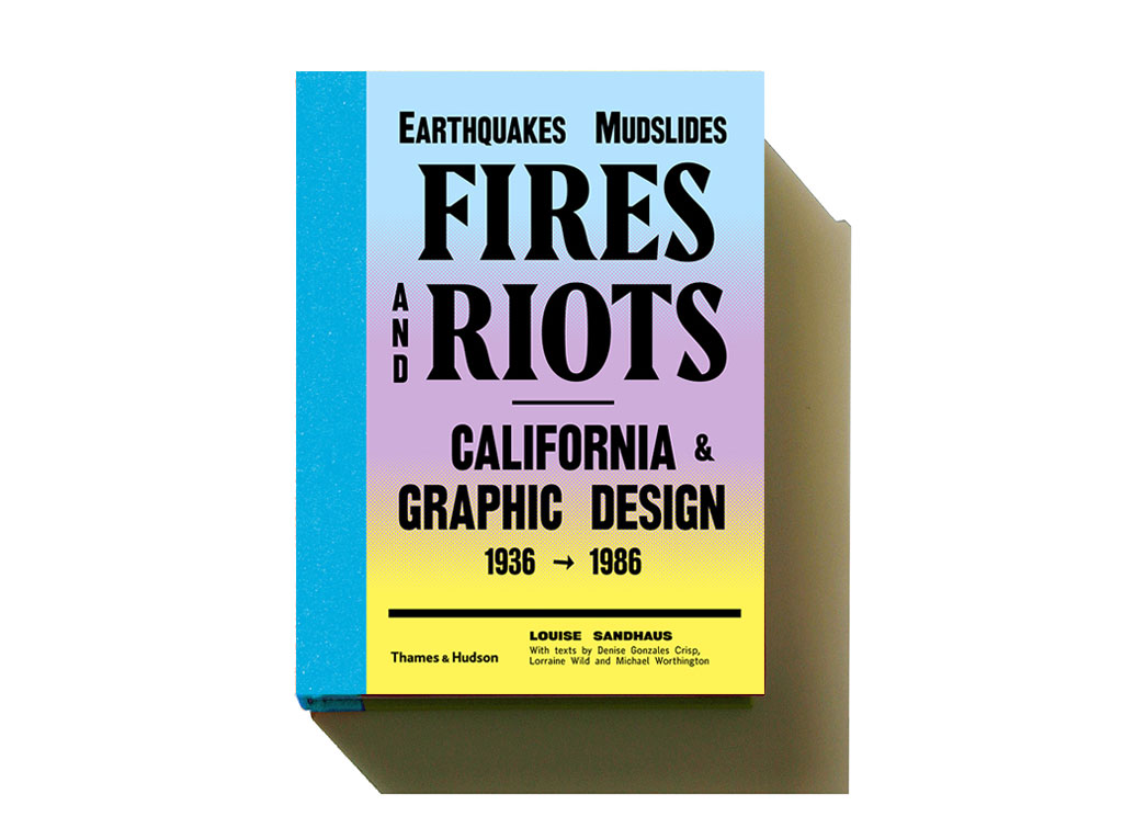
The UK edition of Earthquakes, Mudslides, Fires and Riots: California and Graphic Design, 1936-1986
What I really started with was with the question of how could a place attached to so many diverse images and so iconic not have looked at its graphic history beyond that of the 80s New Wave with which the state is graphically most associated outside the psychedelic posters. But once I got into the story I realized the problem was that Graphic Design— capital G capital D variety—was too limiting to accommodate the lower case graphic one. In other words, the stuff that any self-respecting, card-carrying graphic design professional wouldn’t pay attention to until post-modernism brought the vernaculars to “hey, that’s graphic design too, attention.” Yet there was still another threshold of graphic production to encounter—the enthusiastic amateur as well as the equally energetic, often un- or minimally trained “hack” as Ed Fella lovingly refers to commercial designers who didn’t come from bona fide graphic design programs.
What I then began to look for was vibrancy and energy—the kind that suggests the sort of freedom that you refer to as what “California” embodies. Often I’m asked as to why I stopped the book at 1986, and here’s the answer as wide-sweeping and generalist as it is: The eighties was when the promise and energy that modernism once had in its quest for new forms for new ways of living seemed to breathe it’s last breath. Design then became word-n-picture formulaic. A nice photo and a blobby serifed typeface like Souvenir or Helvetica everything were ubiquitous until the postmodern experimentation and attention towards vernacular forms began to shake things up a bit. And we’re experiencing this same sort of boring, safe responses today in the worst way thanks to the Age of Pinterest. It makes me shudder because it represents narrowness, conformity, and passivity (guess I’m an old hippie after all) as if everything has been subsumed into a mighty machine of capitalism so great that we can no longer see it as the very air with which we’re becoming design zombies eating other zombies. When there is no longer any struggle to find forms that express complex and varied experiences and emotions, it’s troubling socially, culturally and politically. So at the very heart of my making this book was a drive to show that those who are grappling mightily with their voices. That’s the shining beacon of disruptions that I was hoping for—the same one that the Constructivists were after—that you change the world by changing what it looks like, what it says and how it speaks.
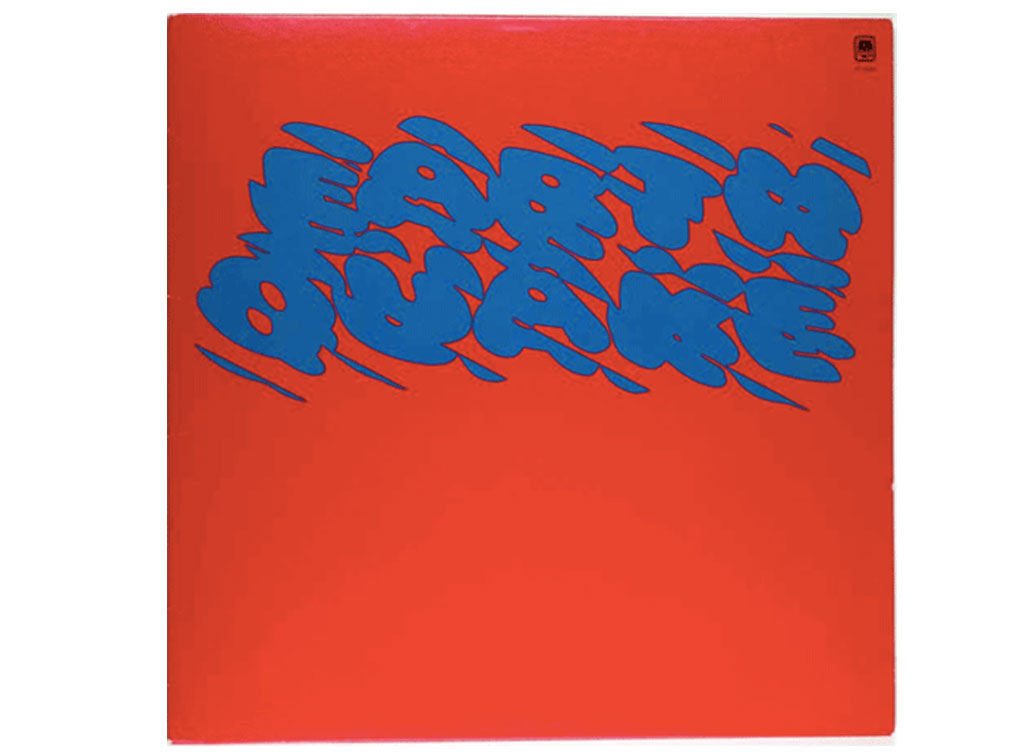
Featured in the book: album cover design for the band Earthquake by seminal LA designer Louis Danziger.
When do you feel you became a Californian?
The minute I set foot in California I felt that I’d arrived home. I thought I’d found the utopia that I couldn’t imagine existed. I thought it was an ideal come true! No-partriarchy-land as I refer to it in the book. Flowers in February (I was coming from Boston). Fresh food, sunshine. And something resembling sophisticated culture… or at least a sense that they could get it up for producing culture instead of just preserving it, which I was frustrated by in Boston and plagued by in Florida where I grew up. I found a place where I waive my personal freak-flag.
7Up “Bubbles” commercial by Robert Abel and Richard Taylor from 1975 – one of the motion graphics projects discussed in the book.
You have a vibrant multi-disciplinary practice—why do you do everything that you do?
Rebellion and curiosity! For so long I felt a sense that I had something to prove and “knew better” how things might be. I didn’t really know what I was doing, but I was driven by a vision of what I could do and somehow managed to convince others to go along for my ride. But the common thread in all my projects is that they are experiments in how a communications experiences might take place more successfully.
The first big project that I did after grad school was for Tricon who owned fast food restaurant chains like Taco Bell. I was hired to art direct the interface for an operations management system—in other words, a system that would run all the restaurant operations giving workers step-by-step instructions of what to do when. I pretty quickly realized that the way the thing looked and what it did needed to be designed together or the system would be useless. I couldn’t just put design lipstick on the software developer’s pig. What I ended up designing—was the design methodology or the approach to how the team would design the system together.
It was the same impetus that started me doing exhibition design—the sense that there was a different way to approach the design.
My strength as a designer is not that I make beautiful things or am a brilliant typography. As Sol Lewitt described it “The idea is the machine that makes art.” Abbott Miller, in a piece that he did for Eye magazine, followed that the same “holds true for design that lets form unfold from structure.” So I’m a designer that’s good at designing structures and know enough now to collaborate with designers whose talents and skills are in the formal arena.
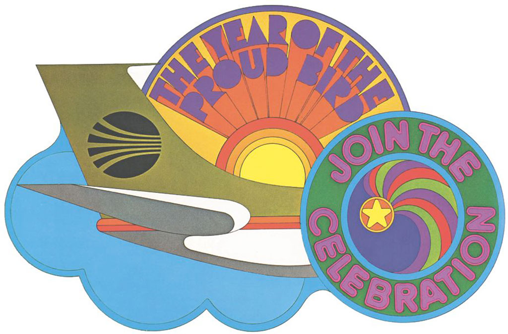
From the book: a 1960s design for Continental Airlines by Nicolas Sidjakov.
What are some writings that you feel every graphic designer should read?
I’m going to qualify these as graduate readings, since it’s mainly Graduate student’s whose role is to reflect on design. But also these were my personal revelatory readings.
- McLuhan, Marshall, Quentin Fiore, and Jerome Agel. The Medium Is the Massage. New York: Bantam Books, 1967. Not only does this book integrate words and images, but it offers conveys fundamentally and dramatically how media changes our perceptions.
- Eisenstein, Elizabeth L. The Printing Press as an Agent of Change: Communications and Cultural Transformations in Early Modern Europe. Cambridge: Cambridge UP, 1979. Rocked my world out the park when I read this. The title real sums up the tale of the printing press and with it the development of the structuring of thought as bringing about transformative cultural development and change.
- Banham, Reyner. Los Angeles: The Architecture of Four Ecologies. Berkeley: U of California, 1971. This is the guy who looks a subject—in this case the designed and built environment of Los Angeles and sees it through fresh eyes rather than through the conventional pair of specs through which we observe, analyze and critique those things around us. Fun and flair rule this tome.
- Banham, Reyner. Theory and Design in the First Machine Age. 2nd ed. New York: Frederick A. Praeger, 1960. This is book that rocked my world and really showed me what theory and design is about as it traces the idea of “what should things look like for our age.” Through this challenging reading you understand the theoretical ideas that are advanced and the forms that resulted.
- Lupton, Ellen, and J. Abbott. Miller. Design, Writing, Research: Writing on Graphic Design. New York: Kiosk, 1996. The was probably the first real contemporary theory book that I read written by two graphic designers who early on in the development of a literature of graphic design gave the subject thoughtful consideration.
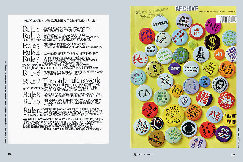
A spread from the book: on the left, the defining missive from Sister Corita Kent’s class, and on the right, CA Magazine.
Who are your heroes/heroines?
- Lorraine Wild. She has been a mentor and friend for years. The power of the things she’s said to me and connection she’s help me to make have been unparalleled. I likely owe my entire career to her.
- Kali Nikitas. Girl on fire! Her energy, drive, ability to make things happen that connect people and to forever tell it like it is are endlessly inspiring. And that hair and those clothes! She’s an Amazon in every sense.
- Diana Murphy. She was my publisher for the book. She held the vision for the book in the center of her heart the whole time. She never let me waiver and was there as a colleague and friend equally.
- Antonin Gaudi. He made the mostly fantastically impossible and endless fascinating forms happen because he understood structure.
- My husband, Michael Shapiro. He’s always there for me and for others who need him. He’s also a political and social activist who has brought about the kind of change that I can only dream about addressing.
… and without sounding like I’m pandering… you, because you are everywhere doing everything with grace, charm, bravado, aplomb, and remarkable, gifted talent. You tell it like it is through form, word, and deed. I’m green.
Jesus H. Christ, Louise! How the hell do I respond to that?
Don’t let it get to your head, Lynam!
Thanks, Louise! I won’t!
And with that, stay tuned, dear readers… the next spine-tingling installment of “Huh?” is coming your way soon!affiliate link trace | Nike News
