VCFA MFA in Graphic Design Chair Ian Lynam recently chatted with Mitch Goldstein and Joshua Namdev Hardisty of the graphic design podcast Through Process. Interview subjects on Through Process have included amazing design educators like CCA’s Martin Venezky, Cranbrook’s Elliott Earls, Yale’s Michael Rock and VCFA’s own Silas Munro and Jason Alejandro. That these two guys make the time to make a podcast about their field of work is amazing, especially considering that they both have teaching careers on top of their own design studios.
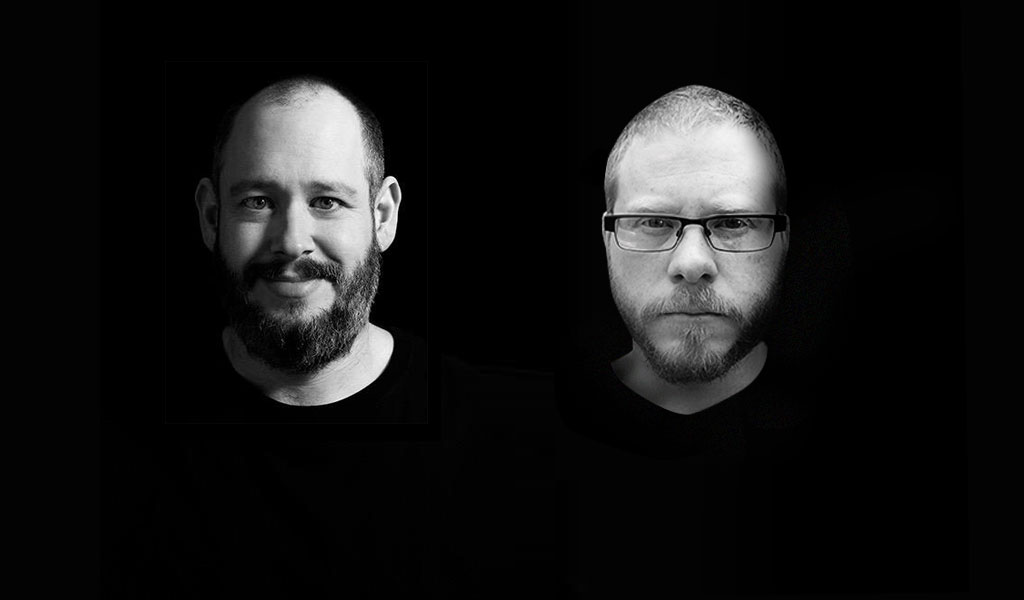
Mitch Goldstein and Joshua Namdev Hardisty of Through Process, a podcast about graphic design.
About the Through Process co-hosts:
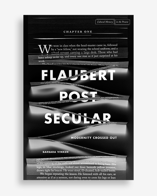
Flaubert Postsecular: Modernity Crossed Out by Barbara Vinken, designed by Anne Jordan and Mitch Goldstein. By his national affiliation and choice of genre, French novelist Gustave Flaubert can be considered emblematic of modernity. This book showcases his specific and highly refined imaginary as at once unique and symptomatic of an era.
Mitch Goldstein is a designer and educator. He received his BFA in Graphic Design from the Rhode Island School of Design, and his MFA in Design/Visual Communications from Virginia Commonwealth University’s School of the Arts. Over the past decade, Mitch has taught in the departments of Graphic Design and Illustration at RISD, the departments of Graphic Design and Foundation Studies at MICA, the department of Graphic Design at VCU, and the department of Art at Rhode Island College. He has given lectures, presentations, and been a guest critic at institutions around in North America. Together with his wife and partner Anne Jordan, he was principal of the interdisciplinary design studio Hypothesis, Ltd. for seven years. Mitch currently teaches at the Rochester Institute of Technology (RIT) as an Assistant Professor in the School of Design, and continues to collaborate with Anne in a creative studio practice.
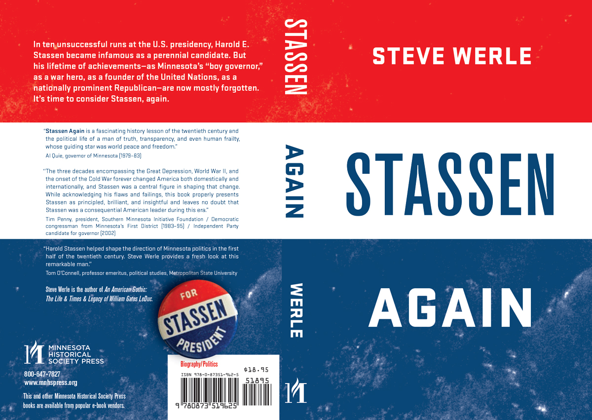
Stassen Again is a biography of a trailblazing Minnesota politician and perennial US presidential candidate Harold Stassen designed by The MVA.
Joshua Namdev Hardisty is a designer, author, educator, and occasional artist. He runs The MVA Studio with co-founder Kimberlee Whaley where he and a small group of collaborators design books, tee-shirts, and posters for clients in the arts, publishing and non-profit sectors. Since 2008 Joshua has taught in the design programs at Minneapolis College of Art & Design and is the co-host of Through Process, a podcast about design practice and education. Hardisty is the author of three books about design and visual culture including New Skateboard Graphics (2009, Mark Batty Publisher) and Function, Restraint & Subversion in Typography (2011, Princeton Architectural Press)
1. Why did you decide to start a graphic design podcast?
Mitch: Doing a podcast was never on my radar, but I was asked to be a guest of “On The Grid“, which is a design podcast hosted by Matt McInerney, Andy Mangold, and Dan Auer. After enjoying the conversation immensely, and realizing that it was technically pretty straightforward to publish a podcast, it planted a seed in my mind that this could be an interesting avenue for more design dialog. A bit later on Twitter, designer Helen Brennan joked after some Twitter bantering that Joshua and I should do a podcast together, and we both basically thought “what the hell?” and did it. I think Joshua and I compliment each other well, and agree on lots of things, but also disagree on more things. We also have different backgrounds, interests, and design idols. All of which makes for better conversations — and much more useful ones.
Joshua: The full exchange is here. I think we recorded the first episode about two weeks later. I had been interested in doing a podcast that almost certainly would have touched on design but I never thought “I should talk about critiques for 84 minutes and see if anybody is interested.”
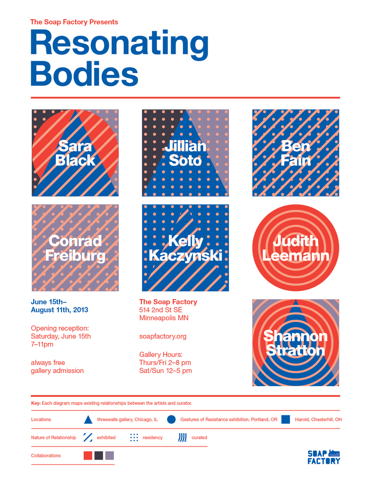
Poster designed by The MVA Studio for a group exhibition All of the artists had existing working relationships with the curator or another artist in the show. The graphics behind their names are visualizations of these connections that can be read using the key at the bottom.
2. How do you see the state of design criticism today?
Joshua: I’m struggling with this question. Is it the same as its always been — one or two interesting publications in a sea of entry-level pragmatism? Or is it worse than ever? Does it sucks in the same way that everything sucks now — where 90% of any discussion is 140 character opinions of haters and cops, 8% is entry level discussion designed to get optimum page views and the remaining 2% is thoughtful reflection and insight? Maybe, but the more I think about this issue the more I wonder if its just that there’s one or two publications’ worth of great ideas adrift in a sea of bullshit. I guess it comes down to this: I couldn’t care less about the state of design criticism as an eco-system but I’m glad that there’s good stuff out there in the form of tweets, blog posts, articles, keynotes and podcasts from Mitch, you, Chappell Ellison, 2×4, Experimental Jetset, Jarrett Fuller, and the odd graphic design related piece over at Design Observer. And of course I read my own stuff obsessively.
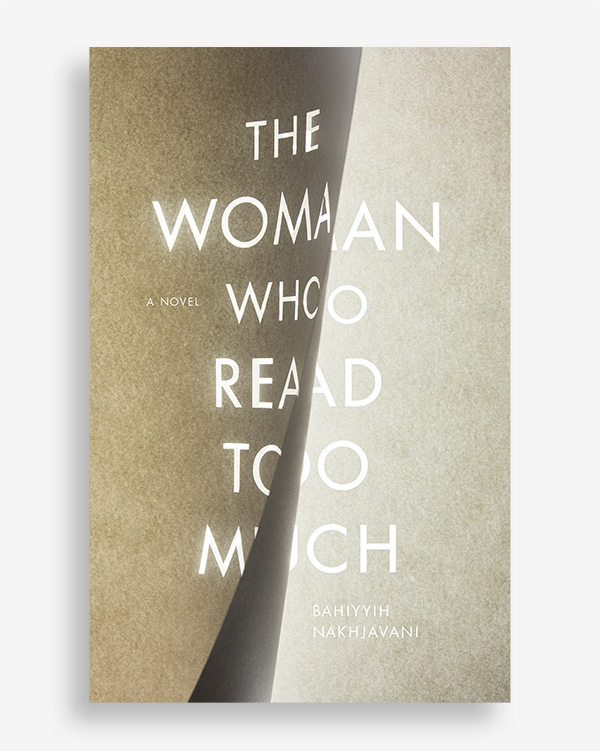
The Woman Who Read Too Much by Bahiyyih Nakhjavani, designed by Mitch Goldstein and Anne Jordan
Mitch: Design criticism has gotten much broader, in the sense that lots and lots of people are writing about design — just open up Medium to see clear evidence of that. Design has been getting more noticed as humanity gets more exposure to more things via the Internet — it is much easier to see the different ways people create the same things, be they posters or chairs or experiences or systems. With more stuff comes more people being critical of said stuff — and again, the Internet makes seeing this criticism incredibly easy to have access to. The flip side of this is a great deal of frothy, fluffy worldbabble — lots and lots of writing for tweets, writing for likes, writing for the reaction to the writing, rather than the illumination of the topic. Now that the playing field is so much more level in terms of “publishing” your ideas, it feels like it can come down to being more about rising to the top of the pile, rather than really deep, really intense, really critical discourse.
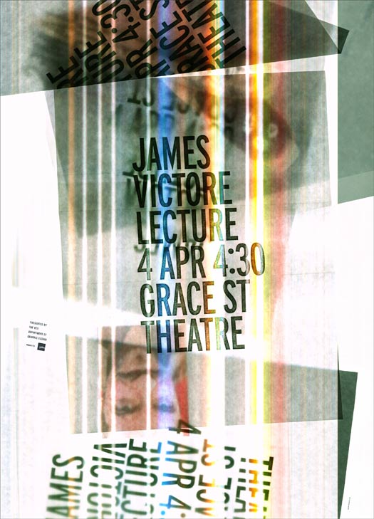
This is a poster for designer James Victore’s lecture at VCU in April of 2011, created with a single scan of materials on a flatbed scanner by Mitch Goldstein.
3. How do you see Through Process adding to graphic design discourse at the present moment?
Mitch: I think the primary goal of TP is to ask questions about design, process, education, et al, rather than take them for granted. Since 100% of what we talk about lives inside ambiguity, with virtually no rules, and relatively few guidelines, it is up to us (who are on the podcast, and who listen to it) to decide what is and is not worthwhile, or what might help move us forward as designers and educators. “That’s the way we have always done it” is no longer a valid argument, and most of what we ask on TP is “OK, how else could you do it?” I have gotten some feedback from more than a few people that our episodes are too long, and sometimes meander too much, but to me that goes to your last question — we are not doing TP for Tweet-able, Facebook-able fluff — we are doing it to understand and discover more, and that process of discovery is often messy and ambiguous.
Joshua: The most important thing that we provide is honest discussion around design education and the questioning of the status quo. Neither Mitch nor I hold back on what we think about teaching and students and I think that’s the best part of our show. In my cumulative six years of education I never heard anybody say that critiques were a drag and maybe not necessary. Or that “good design” is a fucking illusion. And while neither Mitch nor any of guests thus far agree with me, I’ve never heard a teacher advocate for not teaching the “rules.” I don’t know the extent to which Through Process affects anyone or anything but its important to me that we talk through these ideas (even if we end up changing our minds later).
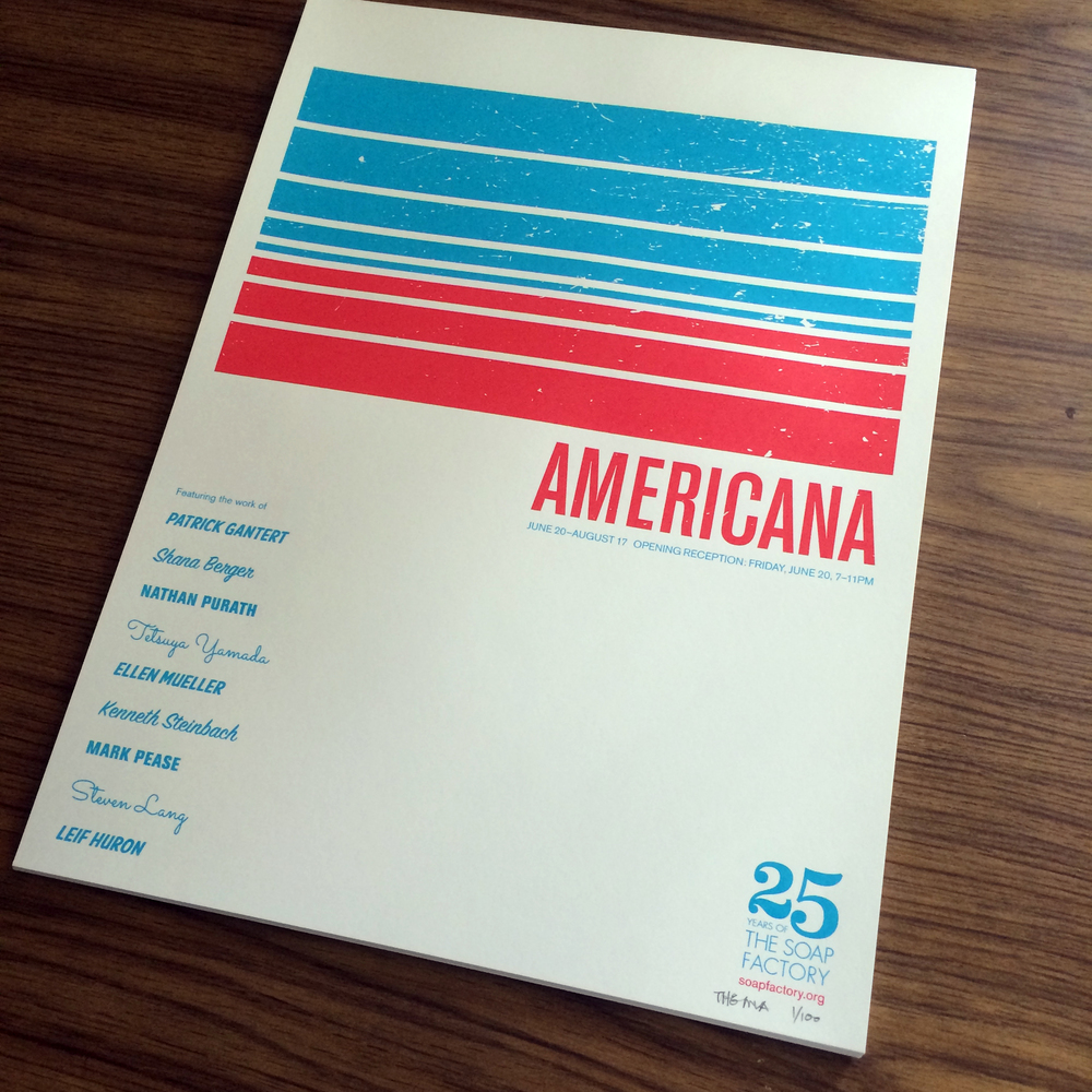
Poster for a group show of artists’ whose work deals with the American experience. The visuals are a collage of graphic elements lifted from different eras of car manual covers. Designed by J. Zachary Keenan for The MVA Studio.
4. How do you feel about the under- and over-currents of anti-intellectualism in graphic design today?
Joshua: Most graphic design sucks. Its made by people who pretend to give a shit whether they’re the “just make it look cool” crowd, the “my work explores the intersectionality of unmodified syntax, context and micro-indie publishing” artist statement makers or boring “competent” designers making wine labels. All three of you suck and I’m trying to avoid you. Its probably no coincidence that the chunk of graphic design I’m interested in—my personal upper echelon — is made by people who intellectualize their work and are interested in conversations about history, process and theory.
Mitch: I think graphic design exists on a wide, massive scale. A nine-year old making a flyer for a lost cat is as much “graphic design” as a multimillion dollar Pentagram rebranding. Therefore any broad statements about graphic design tend to be almost inherently misrepresentative of the field, as it is so massive. With that being said, something I do have an opinion on is over-intellectualizing work conceptually or in terms of application, while forgoing form. To me, the place where too much graphic design gets “stupid” is in terms of form — it seems like making work that is visually seductive has become far less important than work that is intellectually clever (as long as you get it explained to you.) I am the first to admit that I fetishize form — I love it, and I think classifying me as a “formalist” is a safe bet. I have to wonder if this reluctance (or maybe even fear) to deal deeply with form is due to contemporary designers being driven away from it in school, and instead pushed towards more “rational” or “purposeful” aspects of design. Design that really gets me excited lives in both places — formally and conceptually extraordinary. Design that bores me is design that looks like and works like all the other design — only with a new font.

Rock show poster
designed by The MVA Studio and Landland” width=”1000″ height=”664″ class=”size-full wp-image-716″ /> Rock show poster designed by The MVA Studio and Landland5. If a sizable FM radio station offered to have you switch operations from a digital podcast to a radio broadcast in order to reach a morning “drive time” audience over a wide swath of the eastern seaboard including most major cities, but you had to choose one or the other, which way would you lean?
Mitch: Definitely podcast. TP has been ridiculously rewarding intellectually, pedagogically, and conceptually — and part of that is the absolute, 100% complete control Joshua and I have over it. We answer to a relatively small group of design education nerds and ourselves — and really mostly to ourselves. I record the podcast from a completely selfish and totally Mitch-centric standpoint: I love this shit. I find it super-interesting. It has helped me be a better educator and a better designer. If you like it too, great. Join in. Lets chat. If you don’t like it, no problem.
Joshua: Assuming that there’s an audience that could support a major radio show that talks about graphic design at an insider’s level for more than 4 days, I would stick with the podcast. Not because I’m above that (Lord knows that I just want to get paid for talking), but because the show would fail to meet my needs. I want to talk through ideas (very often to no real resolution) and our lack of structure allows that to happen. To fit the format of a radio show would require us to make statements rather than ask questions, or to interview our guests rather than converse with them, or to start getting topical by talking current events. Certainly that stuff is great but that’s not the podcast I want to listen to. I would guess that I’m the biggest fan of Through Process. It changed how I teach, how I view design and how I work. If we lost every listener I’d still to try to get Mitch to record new episodes for no other reason than that I like them.
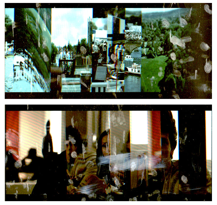
“A visual investigation of cinematic imagery and how it can be represented as a still image. These are roughly 45-second long flatbed scans of the film The Social Network playing on an iPad. I find the way you see a number of moments of the film in a single, unanticipated composition to be an interesting play on the flexibility of time in cinema.” – Mitch Goldstein
6. If you were forced to assign movies to watch to your students as part of the curricula, and title sequences were not a factor, which movies would you pick and why?
Mitch: Forced? More like I wish I could show them 100 movies a semester. I have a pretty beefy list of movie references online here – all of which would be things I recommend to my students. But if I have to pick one:
The Five Obstructions is by far my favorite film about art and design. It is completely about the collision of process, systems, chance, and rules. I typically base a least one assignment per class on it (and sometimes the whole class on it.
Joshua: No one has to force me! These are the movies that I try to show in class:
- Gerhard Richter Painting: If you watch this and are looking for the lessons in it then you could be a a great artist without the help of school, teachers, critics and feedback. I live by this movie.
- Helvetica: At this point the whole world has seen this movie but its still such a great primer on graphic design and it how affects the built environment. Also, you get to see Massimo Vignelli, Paula Scher and David Carson say incredibly stupid shit.
- Idiocracy: This movie is rough around the edges but it tells 90% of the story through graphic design. It proves the point that Helvetica tries to make.
- Adaptation: A great introduction to the real cause of creative block—being stuck on an outcome rather than starting at the beginning. Plus, “fuck fish.”
- F For Fake: Orson Welles’ last film explores the art of making the false appear real. So its basically about graphic design.
Thanks so much, guys! Much, much appreciated! We’ll be listening!
Stay tuned for the next installment of “HUH?”, coming soon!short url link | 【国内4月24日発売予定】ナイキ ウィメンズ エア アクア リフト 全2色 – スニーカーウォーズ
