David Karwan’s essay “Ray& Egon& Peter& Winston.” is one of my favorite pieces of writing by an individual just getting out of graduate school. I asked him if I could include it in IDEA #360 in a piece that I edited and curated about the legacy of the Graphic Design program at CalArts (where both he and I went to grad school), and I asked him if we could digitally ‘reprint’ it here, as well, to which he kindly agreed. The essay is a really thoughtful piece about what happens after graduate school, as well as a slick piece of great emotive writing about design and potential. I think you’ll enjoy it.
– Ian Lynam
Ray& Egon& Peter& Winston.
by David Karwan
As I decompress from the CalArts graduation celebration, which is said to mirror Mardi Gras, I face the traditional post-school question: “What are you going to do next?” But like any good American diploma conqueror, I gave myself permission to morph into a bit of critical detox during Memorial Day weekend, where lazy behavior and escapist entertainment are celebrated rituals. It’s this type of post-grad ideology which leaves one wandering into West L.A. on an early Friday night to seek out a Hollywood blockbuster.
Elevating to the top level of the Landmark Sunshine off Pico Avenue, all the movie posters began to expose themselves. In full disclosure, I had no idea what half of these films were, but it didn’t matter much as the majority of movies between 6:00 and 8:30pm were sold out. The only one that didn’t have the vengeful red all-caps letters obscuring its show time was Men in Black 3.
While shuffling along in the ticket line, the trailer streamed across the flat screen five feet away from me. As I learned that the story revolved around WIll Smith traveling back in time to fix the future, my own mind began a time-traveling adventure to the movies I used to escape reality when I was a kid. In a flash, I departed the extraterrestrial big screen to seek out a supernatural DVD.
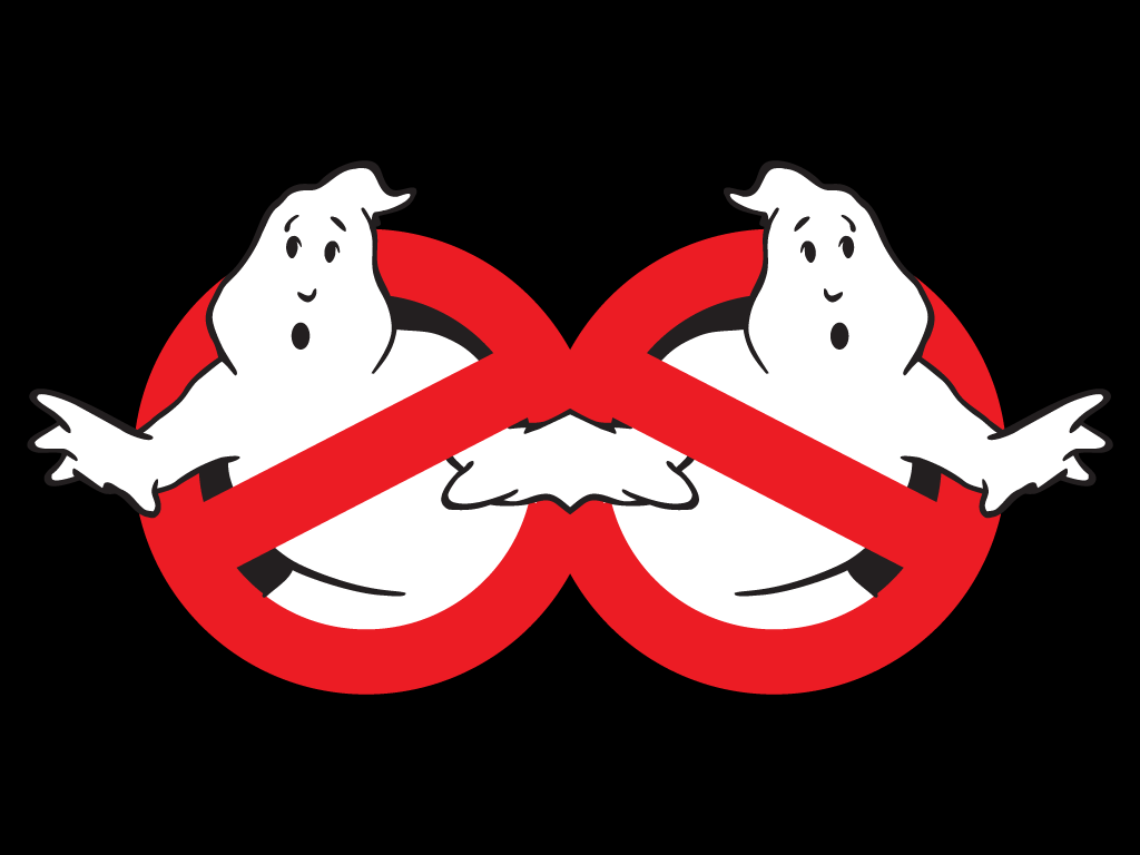
Rolling north up the 405 seemed to take no time at all for a Friday at 6:30pm, but during the whole forty-minute drive my mind focused on an epic 1984 film: Ghostbusters. I awed at remembering their iconic logo and began to think how visually sophisticated the Ghostbusters identity was. The brilliant mark juxtaposed an illustration of a surprised white ghost with the universal red “No” symbol, also known as the “prohibition” logo. It’s unforgettable and emotional, especially if one grew up with the movie, its cartoon and its toys.
Unintentionally ignoring the fact that my roommate actually owned the movie as well as the high probability I could access Ivan Reitman’s classic on Netflix, I ended up in New Hall’s last weird video refuge: Video Depot. Now, I was unsure of what category the movie would physically reside in. Was it Sci-Fi? Action? As I pondered, the shaggy oracle of the videodome directed me to the comedy section. I chuckled at myself as my pervious experience watching it as a child always deemed the flick action/adventure, but certainly not comedy.
Starting to rewatch Ghostbusters was like putting on an old pair of sneakers. I instantly remembered my favorite part, itʼs when Bill Murray’s character, Peter Venkman, evaluated two subjects, using electric shocks, to study the effects of negative reinforcement on ESP ability. A closer inspection highlighted the filmʼs sharp-witted verbal and visual execution. The film wisely forgoes a would-be inconvenient title sequence and opens immediately to the film. It was humorous and enjoyable to revisit the film, but twenty-one minutes back into the film, my jaw dropped, leading me to reexamine the film in a whole new light.
This discovery came twenty four-minutes into the story as Egon Spengler, the scientific analytical cynic of Ghostbusters played by the iconic Harold Ramis, snapped a contemporary design cliché: “Print is dead.” I was floored that this witty dialogue emerged from a comedic special effects blockbuster of 1984, a time when very few would have predicted the monumental rise of Apple, mobile devices and e-readers. This jolt of sardonic energy multiplied with the striking logo had me attempting to extend a sense of witty imagination to find a narrative that connected the Ghostbusters to graphic design.
After my notes were compiled, I surmised that the Ghostbusters can be used as an archetypal model for a graphic designer’s studio practice. It’s easy for a graduated graduate design student to empathize with the characters played by Dan Aykroyd, Harold Ramis and Bill Murray. They were all thrust out of the world of academia, so it only seemed natural to go into business from themselves. This leads to a very practical connection between a post-grad and the Ghostbusters: debt. The loan Aykroyd’s character depressively took out for their business would definitely rival the figure for many students’ debt!
The Ghostbusters ambitiously carved out a niche for their profession – “professional paranormal investigation and extermination service” – much like designers of today creating their own space and categories to operate within and not simply investing in conventions of established systems. Their wonky car, Ecto-1, engineered proton packs, ghost traps and containment units. This serves as a reminder to graphic designers that we should be investigating our own tools and processes to solve problems in unique idiosyncratic ways. Another lesson from the Ghostbusters, which could translate into a contemporary condition, was their utilization of a rundown fire station. They mockingly declared that the area around their would-be office looked like a “demilitarized zone,” but given the present economic conditions many urban cities are facing, trying to refurbish a defunct public library, post office or other public service sector space is quite a real possibility for designers. Movie magic aside, they seemed to have their act together.
Their whole company had a very designed feel. Their witty logo was applied to signage, a vehicle and uniforms. It would be hard to pass up a connection between the uniforms for the Ghostbuster’s paranormal investigation and Alexander Rodchenko’s 1920s production clothing, which aimed at a collective attitude of modernism’s technological agenda to move the world forward. While it may be a stretch to contextualize too many aspects of European Modernism from the early 20th century to this group, the Ghostbusters were definitely a collective where each member brought certain insights and personality traits to strengthen the whole of the group. It’s fair to say their studio culture is not unlike many present-day practices: a mixture of sarcastic, intelligent banter between a close group of individuals who eventually bring in people to fill specialty positions such as an office manager or a freelancer when thereʼs a surplus of work.
Their bizarre vibrancy and slightly ambiguous nature of “ghost busting” leave their practice in a sort of half-life where you can visibly define what they are doing. While investigating and exterminating ghosts can be labeled a basic service to the greater public, it’s their inquisitive nature of unearthing research in the fields of art, architecture, literature and religion that allow them to execute their vocation stunningly. They are basic problem solvers. Ghostbusters may seem like an unlikely mash-up of comedic dialog and 1980s special effects, but its byproduct is an unparalleled look into the inner workings of a fictitious enterprise that could inspire a real design studio model. This “Ghostbusters as studio” appraisal is my own playful introspection about how a young designer can start his or her own studio. Graduate school for me was not just formal projects, but time and space for creative incubation, cultural connection and an expanded hypercritical look into things I liked. Now, the real challenge is how to transmit this maelstrom back into a professional practice. In a time where a graphic designer’s “profession” seems to be having a bit of an identity crisis, I believe the only way out is for us young designers to develop our own idiosyncratic working methods and processes which can lead to building community among like-minded individuals. Doing so, we can fashion tools and ideas to solve new problems in the public, private and cultural sectors. If we identify and expand the traditional idea of studio practice, we could avoid being another optical entrepreneur of an already visually verbose world. If I actually learned anything from my creative detox Memorial Day weekend, it confirmed that post-graduate school I would rather be a part of an unusual thing that had never existed before, like a “professional paranormal investigation and extermination service,” than join an established agency where my name is reduced to a letter.
Originally published in FISK in 2012 and in IDEA #360 in 2013. Copyright David Karwan 2012.latest Nike Sneakers | Air Jordan XXX1 31 Colors, Release Dates, Photos , Gov
