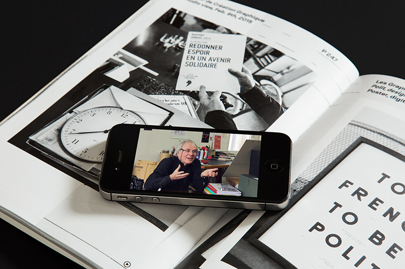
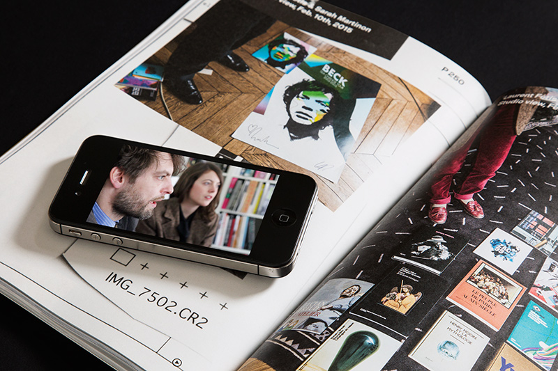
VCFA Chair Ian Lynam takes some time to chat with Julia Kahl, co-owner of the company Slanted Publishers which she runs together with Lars Harmsen. Julia studied communication design at the University of Applied Arts in Darmstadt before she started to work at Magma Brand Design for Slanted Blog and Magazine as a managing editor. She became co-owner in 2014 and is half of the creative powerhouse that is Slanted.
1. Being a graphic design publisher is a fairly rare gig these days—how did you come to publishing and editing Slanted?
Right after my diploma, I started working at the design studio MAGMA Brand Design who started Slanted as a weblog in 2004 and then released the first printed magazine in 2005 to attend to the topics in greater detail and be more intensive. It was printed via a cooperation with a digital printer partner in a print run of 200 copies to present their machines. They were one of the best printers digitally at that time so we could really have nice paper and colors reproduction. But, there was no distribution, no subscriptions, no advertising and it actually wasn’t a truly professional magazine at that time – so, if somebody was interested in obtaining an issue he/she would just send over an envelope with money and would receive back the printed issue. It became time to change that and Slanted became renowned very quickly due of lots of awards it has received as well of a fast growing community being fans of Slanted. So, my job was to build up the distribution, to also be part of the editorial team and eventually I became managing editor of Slanted and was responsible for the whole project. In 2014, 10 years after the whole project started, Lars Harmsen and I then set up Slanted as an independent company which is led by the two of us.
2. There are more type designers than ever globally today. Is ‘the new type economy’ sustainable?
Globalization leads to bigger competition and more visibility globally. There have always been lots of designers as well as good bakeries or restaurants – the best and most original will survive. It’s sustainable for sure!
3. Why did you decide to shift to the city/locale-themed format for the past few issues of Slanted?
Previously, 20 issues of Slanted focused on a specific type classification, we felt that there are not much left to discover there conceptually or thematically. We could have started the Antiqua Boom Issue #2 or the Monotype #2 etc., but then by some conicidence we had the chance to work on the Cuban issue and with this have a closer look on the design scene and young poster designers on Cuba. This was mind-blowing for us. We then had one anomaly again with #22, focusing on typography in the art scene, but then it was clear to us that we would like to focus on what happens in countries or cities all around the world to catch an insight view and to get to know other cultures. It’s different if you are at a place physically, meet and interview the people there or if you just have a look from the outside and requesting materials. Culture has a lot to do with graphic design and the people behind it. This is becoming more and more clear to me personally the more issues we release.
4. The concept for Slanted #25, the Paris issue, as quoted from the official Press Release for that issue:
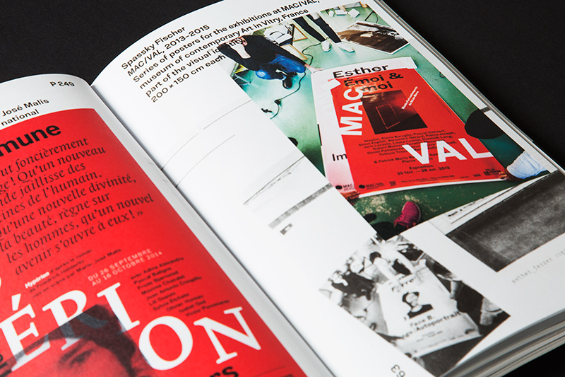
Loved and hated, hated and loved—seemingly no other European nation has a similarly segmented relationship to their capital as the French. Everything starts in Paris and everything conspires here. The city is the undisputed center of gravity of the country—almighty and omnipresent. All power originates and disperses from the city; politics, economics and culture.
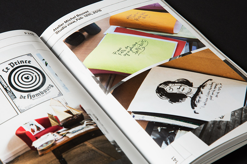
In February 2015, the Slanted editors embarked on a one-week-trip to Paris to take a close-up look at contemporary design work and the loved and hated capitol of France. The Slanted team met 18 design studios and found a virtuosic approach on the unconcealed wounds and contradictions of a rapidly changing society as well as spirit and humor as a subversive armamentarium. They produced comprehensive studio portraits which provide a vivid and up-to-the-minute picture of the scene.
What places are on the ‘hitlist’ for future issues?
The next issue will be focusing on NY (to be released November 2015), then it will be Lisbon/Porto (May 2016) and then we have some ideas for Kyoto/Tokyo, Poland, Iran, Belgium … it will not end.
5. What do you see as ‘missing’ from graphic design writing and publishing today?
In terms of design magazines in general, I think that there is very often a lack of true content. People are producing beautiful magazines, but with less and less content and actual editorial work inside. This is a pity. I feel very lucky, that we can always find brilliant writers for our magazines from all over the world. We are extremely lucky to have their support!
6. Stripes or dots?
Mmmmm… looking at my wardrobe: stripes.
Thanks for the interview, Julia!
Stay tuned for the next installment of “Huh?”, coming soon!Nike footwear | nike air barkley posite 76ers shoes for women Maximum Volume DJ4633-010 Release Date – SBD
