VCFA’s Ian Lynam recently interviewed designer and educator James Chae. James provided an excellent introduction—far better than one we could craft:
“I am a Korean American designer and educator based in Seoul, Korea. This is my ethnic homeland and also the closest thing I can call a hometown, as I lived here in my teens. It’s a beautiful place that is both native and foreign to me, which is why I choose to live here. I am excited to have the opportunity to shape the design culture of Korea. My design and research interests are varied, but I’m continually fascinated by publishing, commercial imagery and the designer’s hand in manufacturing it, and how the web is a tool for creation and research.”
So now, on to the interview!
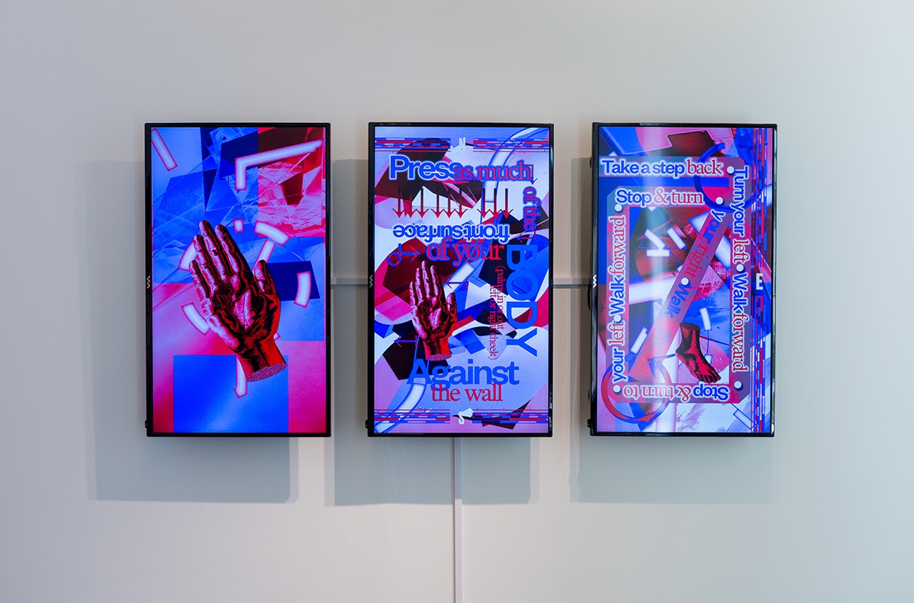
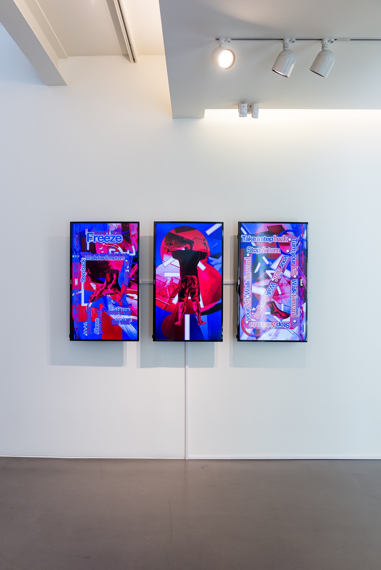
Current Location. As a part of Typojanch 2017, Chae created a 3-channel video and an acrylic panel installation. The piece displays three text directives for the viewer to position his/herself in the gallery space. The actions politicize the body on display. Text from Bruce Nauman’s text piece, Body Pressure was also included to connect the work to a longer lineage of performance and body.
You’ve been creating a really vibrant body of work over the past few years, resulting most recently in the exhibition “Acting Bodies”. Can you tell us about the exhibition, the participants, and your role in creating the exhibition?
The exhibition “Acting Bodies” was an auxiliary exhibition that was part of the 2017 Typojanchi Typography Biennial. It was curated by Huh Minjae of Studio Double D and held at the Hyundai Card Design Library. I was one of four designers included in the show and it expanded on the Biennial’s theme of ‘body and typography.’ For the exhibition, I created a video piece and a wall installation which utilized written instructions and my body. The general intent of the piece was to speak about the politicized body in a time of mass surveillance, Black Lives Matter, and an increasing police state after the inauguration of the 45th President of the United States. The instructions in the video piece motivate the viewer to submit their body to uncomfortable and awkward positions in the gallery space. The expressions and poses in the wall installation express the heightened insanity of how I feel in a society trapped and led into directionless movements as we rely heavily on technology and autocratic politicians. This all sounds bleak, but a lot of my work expresses the many anxieties that I have about the world. As silly as it sounds, anxiety is a big part of my process.

Current Location is an image series exploring how we navigate the physical world. Today, we grow increasingly reliant on personal navigation systems and Global Positioning Software (GPS). This modern convenience has a double-edge; we are never lost, but this insight comes at the cost of our personal data. In the photographic compositions, simple geometric planes are spatially distorted by transparent materials, reflective surfaces, and light. Crisscrossing lines of navigation sit atop these photographic surfaces are. The nine-panel composition is framed by cardinal directions united the designs as a sort of map. Instructional language encourages the viewer to explore the gallery space. Contained in these riddle-like explanations are hidden connections that link the visual work to the conceptual concerns of the designer.
As a designer who has been situated in multiple social and cultural contexts globally, what has been your arc and what kinds of insights have you discovered along the way?
I think one of the most defining moments in my life was moving to South Korea when I was 12 years old. Before this move I had lived in Boulder, CO as one of the only Asians in a suburban American community. I remember growing up knowing that I was Korean, but never really thought much of it. I was fortunate to live in an accepting community. However, when I arrived in Seoul I wasn’t accepted and this was quite painful at the time. Fortunately, I was able to attend an international school where I studied with friends from Canada, the UK, Finland and Japan. I think these experiences allowed me to accept my “foreign” status. I gained a great appreciation for this privilege.
After working for eight years in NYC as a designer and art director I decided to return to school and coincidentally I went back to my alma matter, RISD (Rhode Island School of Design). This was another formative experience because it really forced me to examine what is important to me in this practice we call graphic design. This self-evaluative process, I think, is also heavily emphasized at VCFA. I had a loose ambition to return to Korea and teach. With hard work and some luck I was able to make that ambition come true. Before I made the move I remember telling myself something very important, that was that wherever I go, I will always be foreign. Now, this may sound negative, but it was actually a very powerful self-accepting moment. It allowed me to move past any sense of alienation that I felt in the U.S. or Korea and accept that my position as a Korean American is unique, allowing me a different perspective. This understanding also, I hope, gives me a little humility and grace to be thankful of my position on the periphery.
Embedded within the project is a personal obsession with the current state of American politics and the shifting tides nationalism around the world. The images convey a sensation of confusion and being lost. In the photographs, the colors and planes collide in discordant geometries. This instability of visual perspective and the dense composition mirror the designer’s political concerns and intentions with this project. We are at the mercy of our technologies and leaders. Although we know where we are, it is becoming incredibly difficult to understand where we stand and will go next.
What differences do you perceive between North American and South Korean approaches to design today?
The biggest difference that I notice between South Korea and North America is that there is still a small space in South Korea for design to be practiced as a cultural activity. Right now, I think in North America design is so heavily driven by the market. The form of that is the technology industry leading design practice and discourse (Google produces one of the few design podcasts out there and actively tries to produce design-related writing). The reason I mention the market is that everything in America (I cannot speak for Canada and Mexico) is driven by commerce, which therefore means technology and design are too. Historically, this has been the case, but I think this is very extreme now. Designers are now encouraged to use their critical thinking skills for creating solutions that can be taken to market. No longer are designers discussing expression and communication. There are many advantages to this kind of practice, but I think it comes at a deep price, especially when we think of the exploratory power of design education for undergraduate students who are trying to find their own voice as individuals.
Design that is focused on solutions and User Experience is also seeping it’s way into South Korean design. However, the economy here is structured in a very different manner and it has not completely dominated design discourse yet. I still have much to learn about South Korean design to say anything definitive, but I enjoy being here to help it grow.
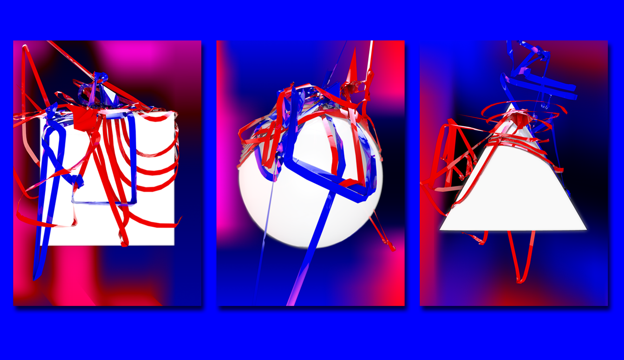
James Chae on his series, “Primaries”: “As a part of the Illustration Festa exhibition, I contributed a three-part poster series. Using primary shapes and 3D graphics I re-evaluated the form of three primary shapes.”
How much does history play into that?
History definitely plays a huge part into American design being driven by commerce. It is the particular lack of history in America that contributes to this singular focus. America doesn’t have a definite design culture, which is actually a great thing. However, it keeps it from having a foundational tradition to build upon and therefore the foundation ends up being it’s commercial application.
What do you feel are the most prominent MacGuffins in terms of design education today?
(I had to look up what a MacGuffin is). One major MacGuffin that gets bandied about today in design education discourse is to create a designer who is medium-agnostic. This means someone who can fluidly design a print book, website and mobile application. Some schools use different words to describe this Swiss-army knife of a designer, but the objective is the same, which is to be able to think of designs that can be manifest on multiple platforms. I think this is a noble goal because it advocates for a sort of foundational design thinking. However, I think the problem is that we haven’t really figured out what that foundation looks like. In some ways, we need a new foundation to be build out of the Bauhaus principles that have led us this far.
A goal that I think some educators, including myself, are trying to preserve is teaching expression and communication. What has always been important to me about graphic design is the ability to form voice and shape message. The focus of design education is starting to move away from these literary and artistic subjects, but I think they are central to design education simply because of how they influence a young person. I know it was world-changing for me when I became confident with my typography to really control how a paragraph of words was read linguistically and visually.
Lastly, I think there are some educators who are aiming to expand design education into the liberal arts. This sort of de-professionalization is an interesting development which sounds controversial but also makes a lot of sense. I think there are a lot of skills in design education that can be valuable in a general liberal arts education. On the other hand, I think there’s a real advantage to producing individuals who are technically competent and focused on their craft. Personally, I’m not sure how powerful this goal is but it is something really worth considering. At the least, I think it should encourage educators to become more interdisciplinary and work with their colleagues in different areas of academia.
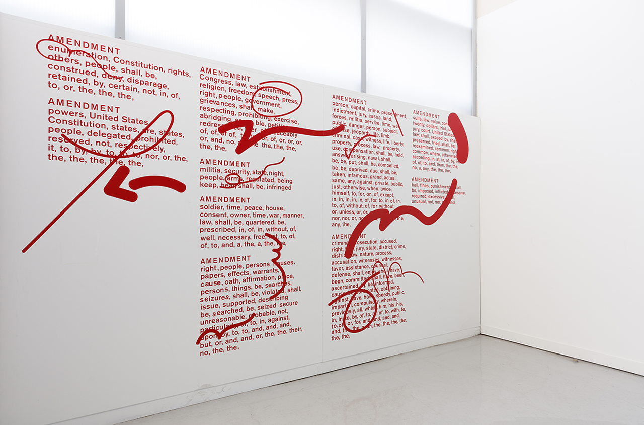
Chae on his installation “Marks on the Wall”: “The US Constitution was a grand experiment in democracy. With the election of the 41st President of the United States the Constitution was threatened by its very protector. This project was part of the group exhibition Ways of Reading held at the Lotus Gallery at the Youlhwadang Publishers in Paju, South Korea. The words in the US Constitution were re-arranged according to parts of speech. Marks similar to proofing marks obstruct the language.”
If you could curate a group exhibition with anyone—living or dead, but you could reanimate the dead folks (heck, even the living folks) to make new work—who would you invite?
This is a great question. I would love to curate a show provisionally titled “Sounds and Statements” with the following designers:
Barney Bubbles
Metahaven
Tristan Tzara
Berthold Brecht
Paul Elliman
Bruno Munari
Martin Venezky
Chris Ro
Foundland (Ghalia Elsrakbi and Lauren Alexander)
David Rudnick
Tomato
Lisa Maione
James, thank you so much for making the time to answer so thoughtfully—what an amazing interview!
So, folks, until next time!Authentic Sneakers | Nike
