The quickest of peeks at the detail-driven, incredibly rigorous work of VCFA MFA in Graphic Design candidate Marisa Ten Brink! Over the past year and a half, Marisa has created an expansive family of OpenType typefaces, a dizzying array of form-making, ferocious writing, subtle photographic explorations of wabi-sabi, and countless other projects. Read and weep.
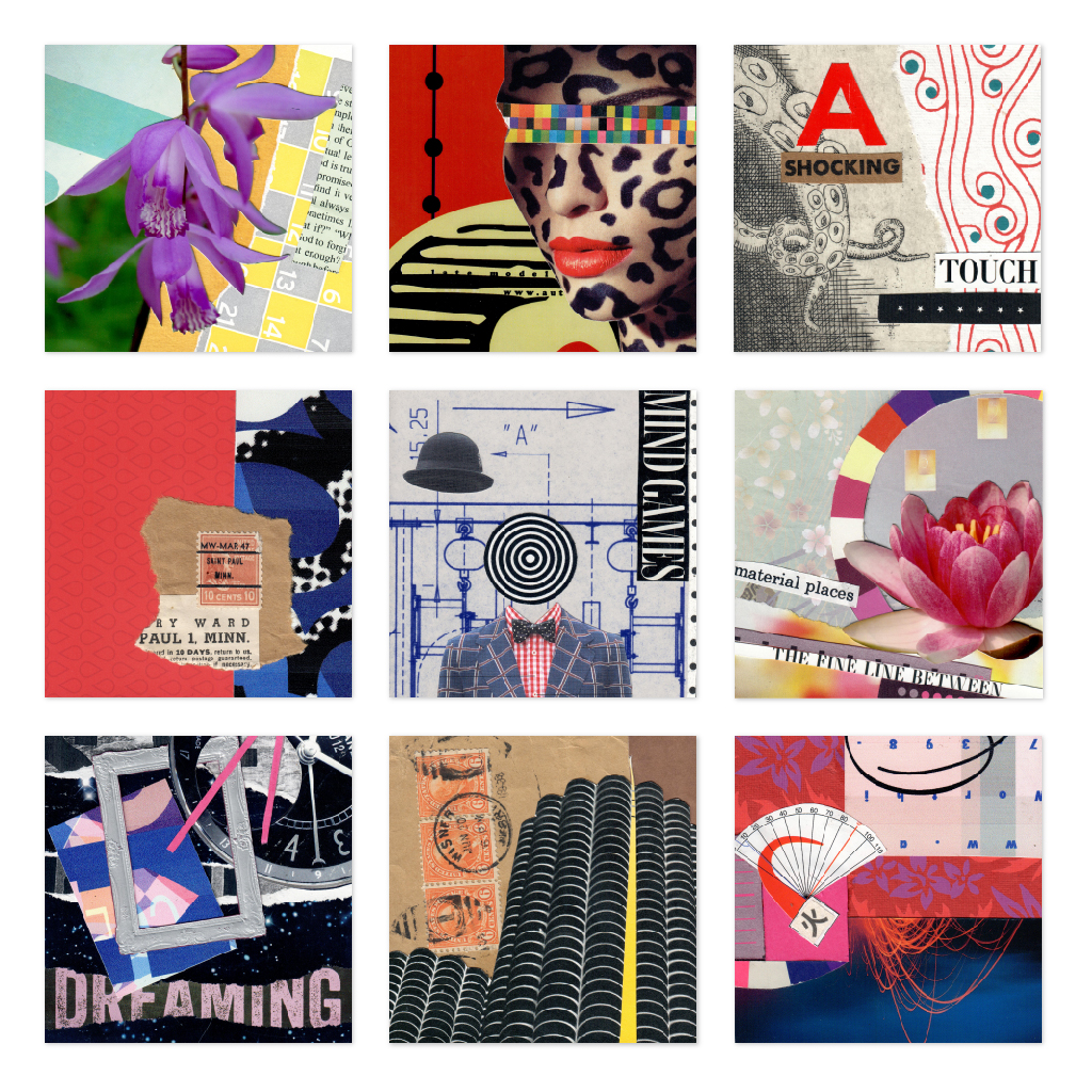
Selections from daily collage practice. Initially an exploration in intuitive making, these became a way to explore multiple meanings and semiotics.

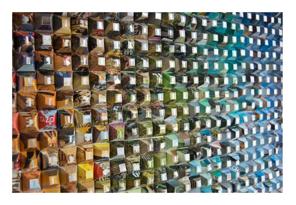
Paper pixels, pointless pyramids. 784 modules cut from old magazines, folded, glued and arranged into a spectrum.
Slipping from one grid into another, exchanging a miles-squared patchwork for luminous squares. What does it mean to be a fragment collector? Picking up the discards? Holding on too tightly to the past? Am I trying to make sense of the world in bits and bytes? In trying to see the whole, am I looking for order where there is none?
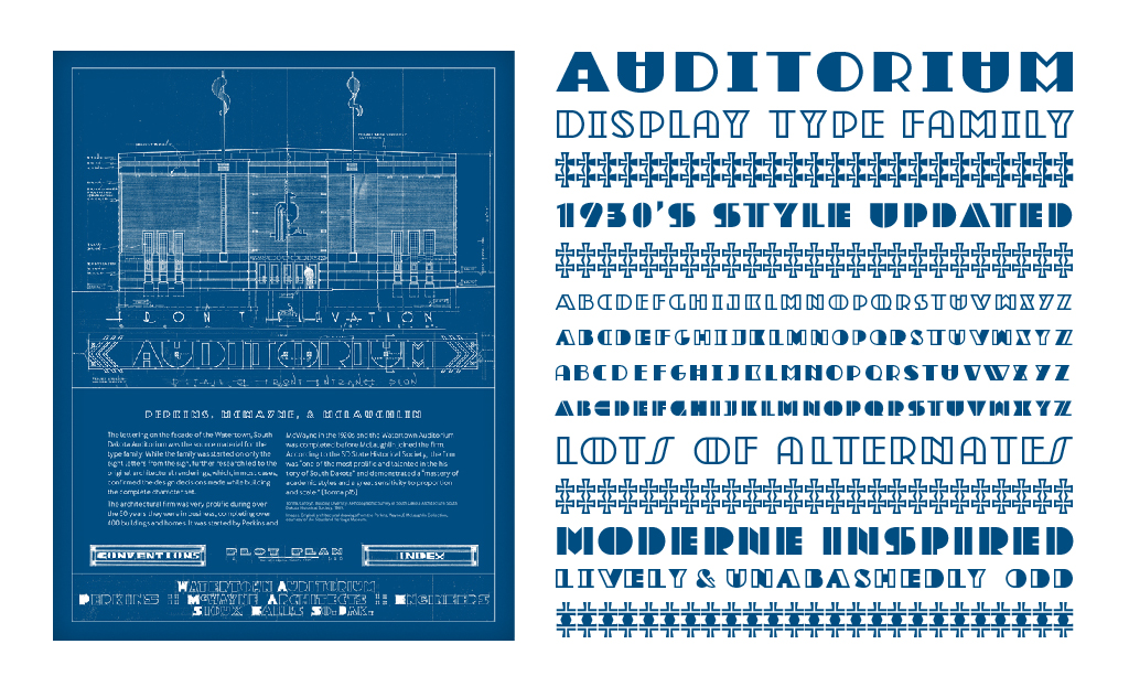
A type family based on architectural lettering from the community auditorium in Watertown, SD. The building was constructed as part of the WPA project during the late 1930’s. The typeface expanded into several styles that pulls design cues from the original building blueprints, facade lettering from other local buildings, and moderne style lettering.
