Edgar Bąk works in the field of visual communications, concentrating mainly on visual identifications and magazine layouts. He also works on smaller projects, illustrations, posters and music art. Bąk, together with Charlotte West, created Projekt: The Polish Journal of Visual Art and Design for the UK publisher Unit Editions.
Bak has received many awards in Poland and the magazine WAW, for which Edgar is the art director, has been recognized abroad, having received the “Merit Award” from the Society of Publishing Designers in New York.
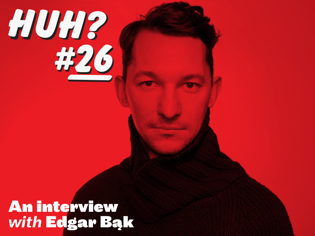
VCFA MFA in Graphic Design Chair Ian Lynam chats up Bąk about his practice, heroes, teleportation, and some difficult questions…

Kto ty jesteś (Who Are You?). A different, light and innovative take on patriotism. If patriotism is to become an internal imperative rather than an anniversary-driven ornament, it must grow from seemingly minor social solidarity impulses among kids. Joanna Olech’s book invokes the ideas of civil society, mutual trust, respect, concern for the environment, tolerance and engagement for the good of the country. The illustrations seek to inspire conversations between children and adults about patriotism and many other issues.
What are things that you think every design-minded person should read?
A designer should have at his or her disposal a comprehensive set of strategies to choose from. They should have a capacity, innate or trained, to take multiple points of view and then choose the best ones. Or simply take every route and learn from it. It is also good to combine many languages, or ways of seeing the world, because every language influences perception. In order to do this, we need a common ground from which different visual languages can be built. Adrian Frutiger writes compellingly about this in Der Mensch und seine Zeichen, his writing should be required reading for graphic designers. Frutiger shows the unique logic of visual language, which cannot be translated to literary language.
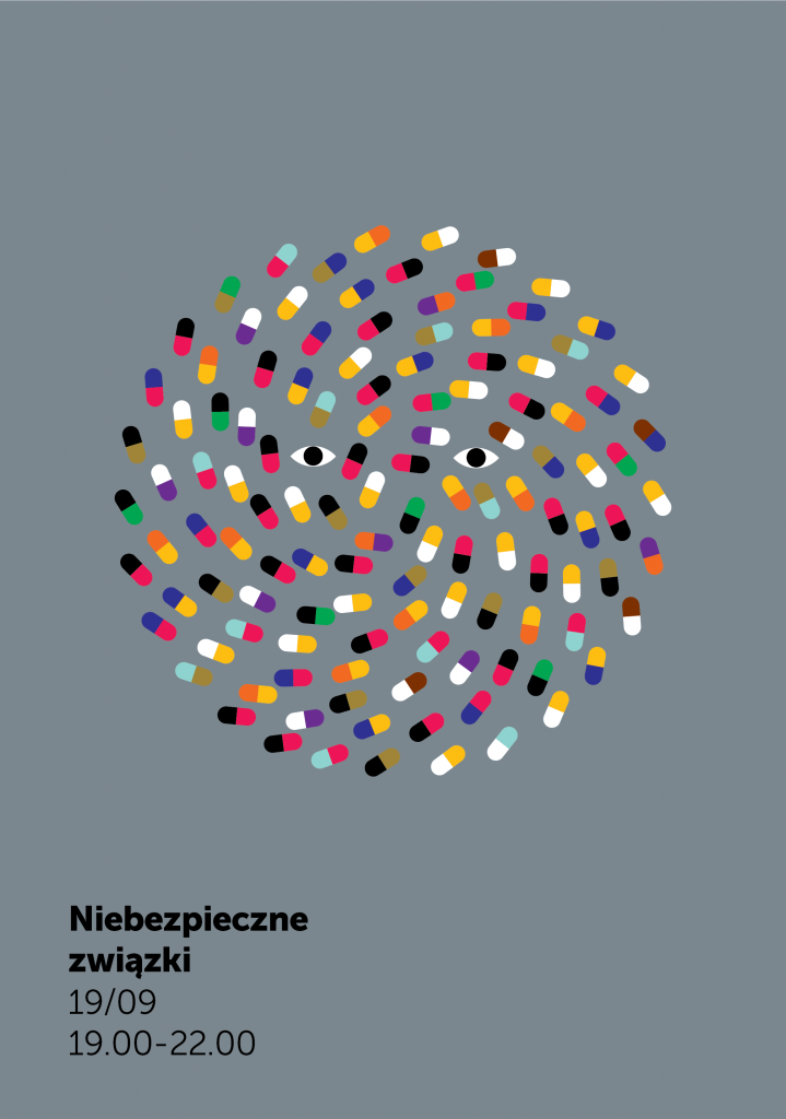
Centrum Nauki Kopernik
2013-2014
Centrum Nauki Kopernik (Copernicus Science Centre). After its regular opening hours, the Copernicus Centre, a hit with Warsaw’s children, shows its “adult face.” Each one of these evenings is a unique event focusing on a particular real-life subject like love and sex, food, or time perception. In addition to gallery tours, the Centre offers additional attractions such as workshops, movie screenings, performances, games, lectures, discussions with experts, concerts and adult beverages. The Heavens of Copernicus planetarium also changes its programming to reflect the evenings topic.
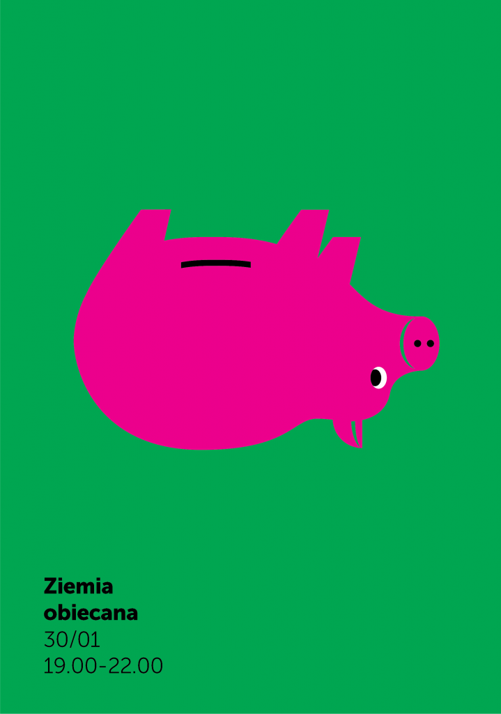
Centrum Nauki Kopernik
2013-2014
Centrum Nauki Kopernik (Copernicus Science Centre).
Your work stands out as wildly distinct in the contemporary landscape of graphic design—often minimal, but not typically ‘brutalist’ as so many folks’ work is nowadays. How is it that you arrived at making work the way that you do?
This language was formed at the beginning of my studies at the Academy of Fine Arts in Warsaw. I felt that in order to convey things in posters (that’s how we thought then) I need to do simple and communicative things. A limited color palette and an intuitive modernism were a functional choice, I could draw things, I had been drawing everyday for 7 years.
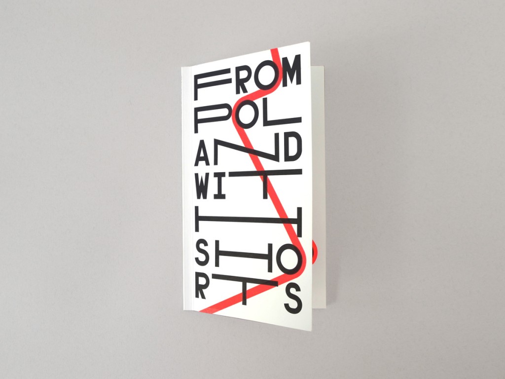
From Poland with Shorts
2011
A project of Munk Studio, which operates within the structure of the Polish Filmmakers Association, From Poland with Shorts aims to introduce international audiences to the works of Poland’s young filmmakers. Screenings were held in Moscow, Berlin, London and Paris. The audience will see short features, animated films and documentaries. The films include award-winners from various international film festivals.

A spread from From Poland with Shorts
At the same time, I was listening to music—a lot. I still do, but then it was almost religious. The 90s produced a great deal of good electronic music and I was trying to transpose it to my work with the computer. I was also interested in glitches, broadly speaking. Not just glitches that happen on their own but also deliberately using software “wrong”. Then I began to work with clients who wanted to meta-communicate that they were modern. My simple style worked for that and still does. It may be exhausting itself a bit, but it’s a good moment to generate a new kind of mainstream, one without sentimentality, on a that is communicative and ecological in its approach to legibility. It is nice to see the Polish visual landscape change, see the context respond to design.
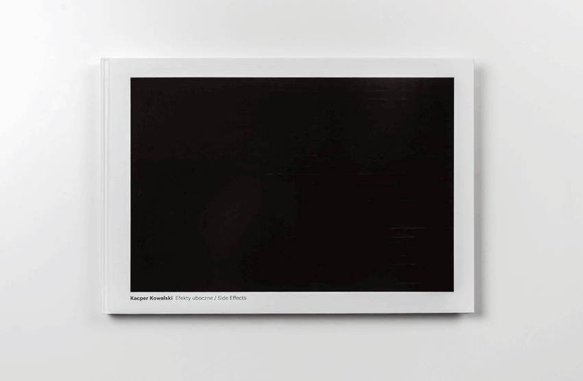
Kacper Kowalski – Side Effects
2013
Kacper Kowalski was trained as an architect, but his primary focus is aerial photography. As a photographer and pilot, he has complete control over the image and the vantage point, which allows him to present aerial photographs of usually inaccessible natural and urban landscapes. The resulting images seem almost unreal and have a painterly quality in presenting man-made and natural patterns, symmetries and asymmetries. Our design of his book uses GPS coordinates of his journeys. The album’s cover is coated with black thermochromic paint which only reveals a photo to the warmth of human touch.
You teach, as well as design? How does that fit into what you do?
I guess that’s common to all designers: it’s good to learn something new, get to know those who do what you do, talk with them about that work. That’s what I do when I teach. I think I have created a solid workflow: I work fast, quite efficiently and I know what to do for results to be good. Sharing these skills is like a game, gives me a lot of satisfaction. Some people have to make such discoveries on their own in order to grow. Not everything that works for me works for others–that’s been my lesson.
The interns in my studio come from the School of Form where I teach. It’s good to see them work both at school and in the studio. I think these two environments complement their experience well. And when you get along better and better with someone in everyday studio work, it then becomes easier to communicate in the classroom.
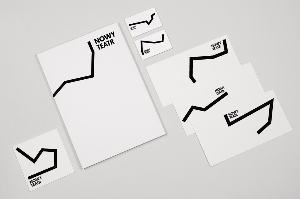
Nowy Teatr
2011-2014
Warsaw’s Nowy Teatr did not have a permanent home for many years, but remained active and provocative in engaging its audience. This ephemeral quality combined with the wide scope of activities constitute the theatre’s DNA and are reflected in the visual brand identity we designed for it as it moved into a multi-functional cultural center in a 1927 repair garage in Mokotów. The logo represents an annexed space, a stage and a place. It is an object that only becomes loaded with meaning once it has been marked. It is constantly being re-built and re-broken, and the black line is what allows these elements to reconnect.
Who are your heroes?
The market tends to reward narrow specialization. That’s why I’m impressed by versatility and a certain degree of freedom in creating one’s own style. Among Polish graphic designers I would single out here Hubert Hilscher, whose work is currently shown at the Poster Museum at Wilanow. There are moments when I discover a phenomenon about which I had no idea, as was the case with Karl Gerstner. I knew the combinatorial works by Ryszard Winiarski, but was not aware that people have been transposing these ideas to graphic design.
Who are your anti-heroes?
No one in particular, as far as graphic design is concerned. But I guess it would be the opposite of my previous definition; there exists a type of graphic designers who for too long keep on relying on early solutions that received positive feedback.
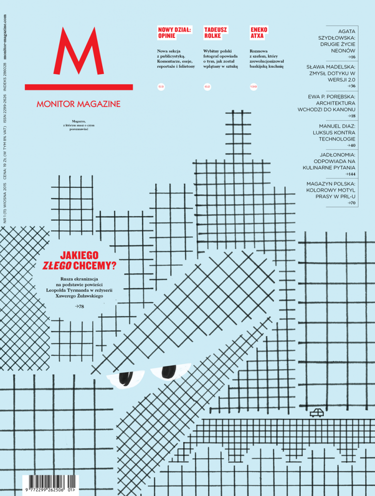
Monitor Magazine
2012-2014
“Monitor” is a lifestyle magazine covering the latest in design, business, culture, style, travel and cuisine. Every issue contains 132 pages of essays, articles and commentary.
If you were teleported to the wilds of Alaska uninhabited by humans and were offered a choice of either a magnifying glass or a knife as your only tool, which would you choose and why?
If I am to treat this question as a dilemma between an analytical approach and action, it’s hard to answer. In design practice these are inseparable. I take great pleasure in the possibility of choosing a strategy. With some projects it’s better to start with a thorough analysis. With some other projects it’s better to go with the flow, intuitively carve out some forms and only then analyze what has come out.
Our studio is turning five this year. From this perspective I can say that I’m choosing the knife, but only because I’ve had a fair share of the magnifying glass already.
Sounds like a good choice, Edgar. Thank you so much for taking the time to do this interview!
And that, dear readers, sums up the latest edition of “Huh?”. Stay tuned for more soon!Nike sneakers | Autres
