Andrea Tinnes, the designer and educator recently featured here for the “Huh?” series of interviews, recently held an exhibition in Germany at Volkspark Halle which we think may be of keen interest to Perpetual Beta readers.
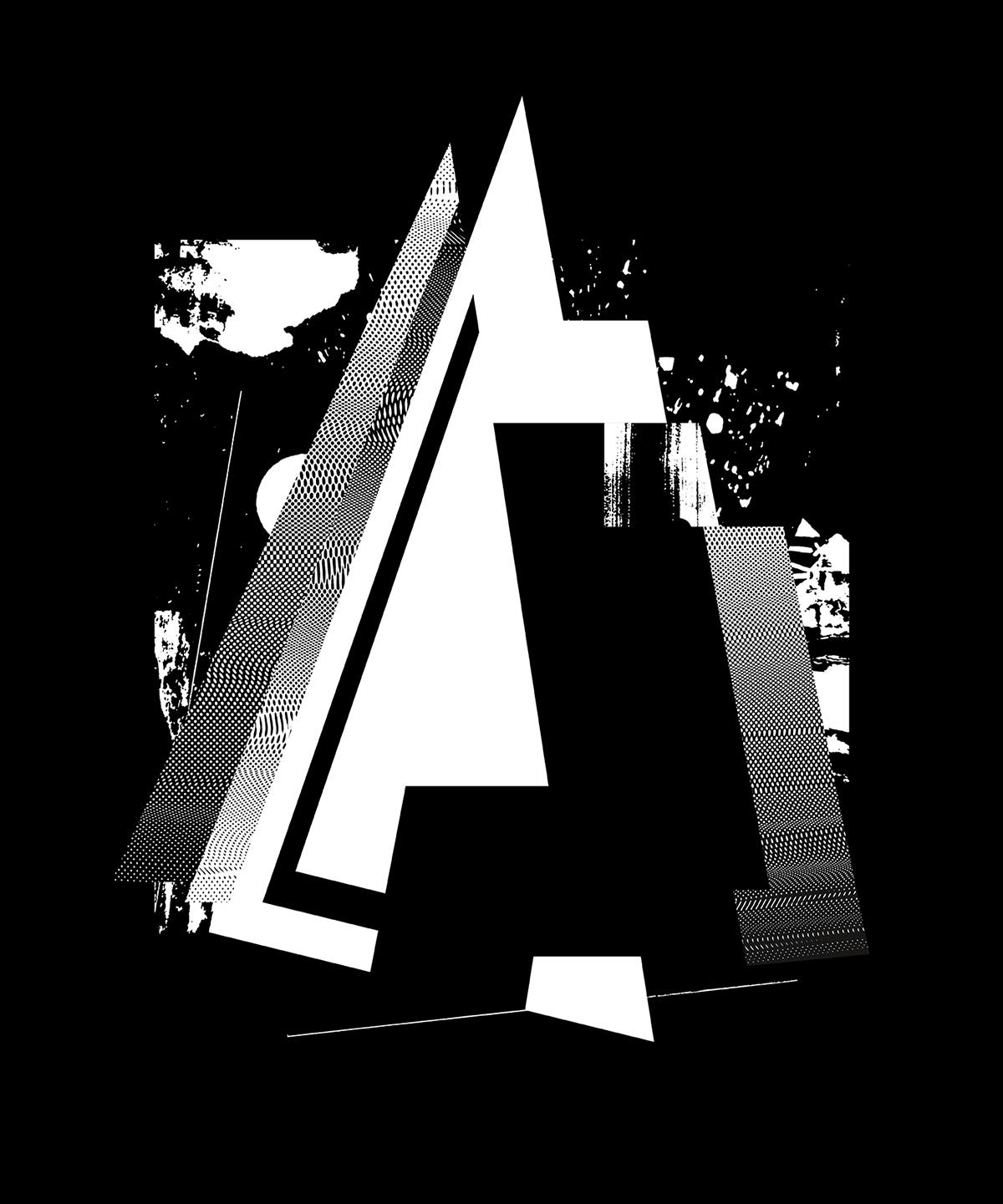
A-Initial: Collage, combining alphabetic fragments and graphic images with screen structures
In Andrea’s words:
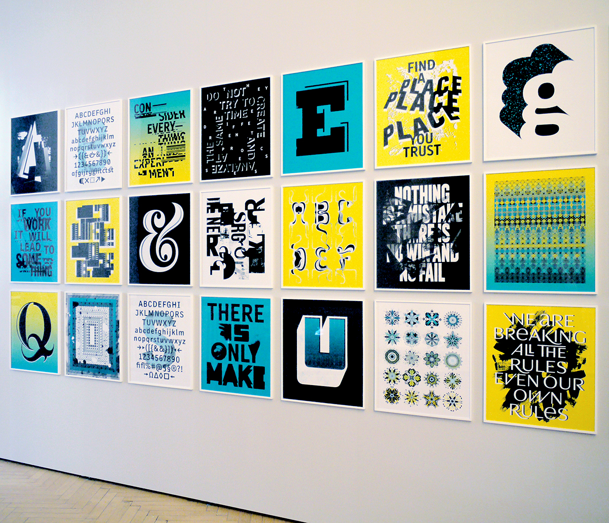
For the exhibition “BURG Professors of Art and Design …” I created “Abecedarium”, a large-seized artwork consisting of 24 typographic and alphabetic posters, exploring various analogue and digital techniques to remix a variety of alphabetic and typographic works of mine.
Abecedarium functions as a wall-sized type specimen, working its way from A to Z in an alphabetic series of initial caps, typeface designs, experimental typography and ornamental patterns.

There is only make: typographic interpretation of Rule Nº 6, from Sister Corita Kent’s 10 Rules for Students and Teachers (1967).
Typefaces: Burg Grotesk, Switch
The quotes used in the posters come from Sister Corita Kent’s manifesto “10 Rules for Students and Teachers”, referencing my work as a type and typography Professor. Modified letters and typefaces include: Burg Grotesk, Fette Tiflis, Mimesis, Roletta, Repeat Pattern, Skopex, Switch, Type Jockey, Viceroy, Volvox and Wedding Sans.
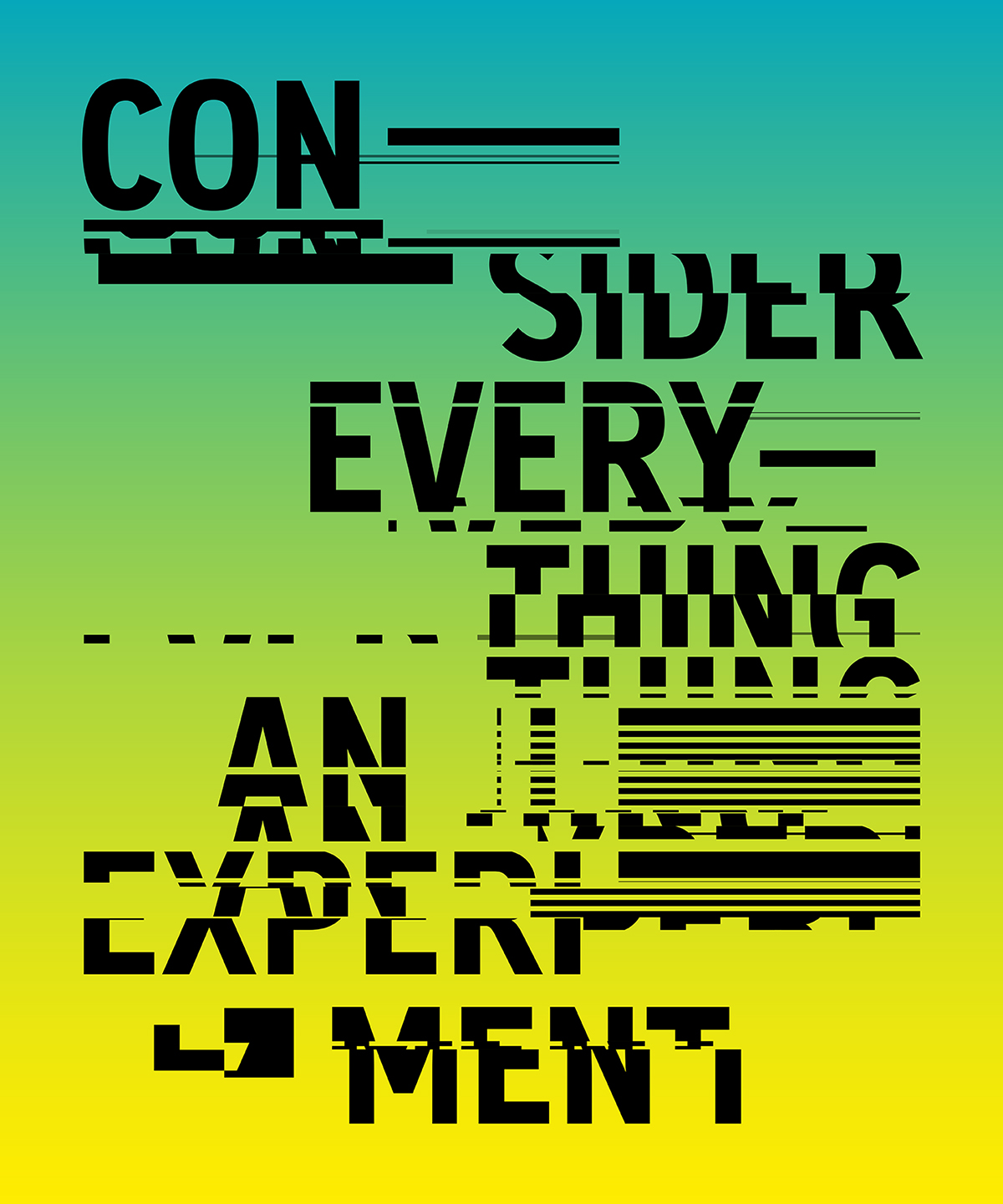
Consider everything an experiment: typographic interpretation of Rule Nº 4, from Sister Corita Kent’s 10 Rules for Students and Teachers (1967).
Typeface: Burg Grotesk Bold Condensed
Andrea’s inspiration from the work of Sister Corita Kent is neatly mirrored in the teaching practices, philosophies, and methodologies utilized at VCFA.

Find a place you trust: typographic interpretation of Rule Nº 1, from Sister Corita Kent’s 10 Rules for Students and Teachers (1967).
Typefaces: Fette Tiflis, Burg Grotesk Bold Condensed
In short, we couldn’t have said it better ourselves!Running Sneakers | Men’s shoes
