VCFA Chair Ian Lynam sits down with super-designer Corey Holms to talk about design, aesthetics, and protein.
Corey Holms
Corey Holms studied graphic design at the California Institute of the Arts, and has been practicing for almost 20 years through his firm, Studio FPO. He has worked with a wide range of clients from multinational corporations to local boutiques. Although primarily working in entertainment design, he also specializes in type and identity design. He is currently on the board of the Society of Typographic Aficionados, and heads the Graphics Committee for TypeCon.
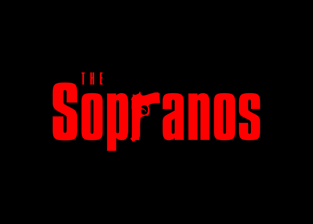
The Sopranos logo, designed by Corey Holms
His work can be seen internationally in books and design magazines, for which he also writes articles on typography and type history.
Corey’s commercially available typefaces are distributed through YouWorkForThem and MyFonts.
Corey’s commercially available photography is distributed through Getty.
1. You’ve always had a really vibrant practice—what are the current constituent parts?
The primary focus of my practice is entertainment design (movie and television posters and key art), logo design (not branding, which I think is pretty different), a small amount of motion work, and regular design (just general purpose design, don’t know what to call it). I’m also on the SOTA board, which is the organization that organizes and runs TypeCon. My primary role is to be responsible for the TypeCon identity refresh each year, which is amazing fun as I get to work with some really phenomenal designers. In fact, Michael Place of Build just won a D&AD award for his work on last year’s TypeCon identity.
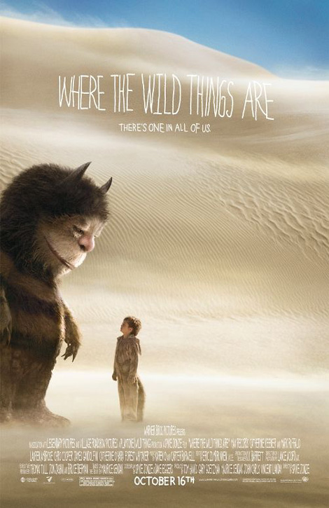
Corey Holms’ poster design for Spike Jonze’s “Where The Wild Things Are”
A note on the type from Corey: “The lettering on Where The Wild Things Are was done by Akiko Stehrenberger, and then I digitized it and made it into a typeface. I programmed a set of OTF features that would watch as you typed and if two letters ended up being the same next to each other (for example oo), it would swap one of them out for an alternate. I had three subsets of each letter that could be swapped out by the font itself as you typed. I love getting to do little things like that, so much fun and rare that the client is willing to go for it”.
2. Do you have any secrets to how to create a “good” movie poster?
Hahaha, no. 99.9% of what I do gets thrown away, I wish I knew how to create a good poster.
What I try to do is be true to the movie, the client doesn’t always want that, but it’s what I try to do. I try to not have my own voice, but rather what is appropriate for the project. What I tend to like doesn’t fit well with movie posters anyhow (international style). That’s something I try to carry over to all of my work.
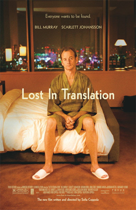
One of Corey’s multiple posters for “Lost In Translation”
Instead of bringing me to the project, I try to be context appropriate. And it kinda makes it more fun that way, I mean, how many times can you set Akzidenz Grotesk on a grid before you want to use a broken paint brush to do your type? I’m lucky that way as each project is pretty different from the last — in terms of style, typography, everything.
Ne10 is a stencil typeface inspired by a neon “cerveza” sign at Corey’s local pizzeria.
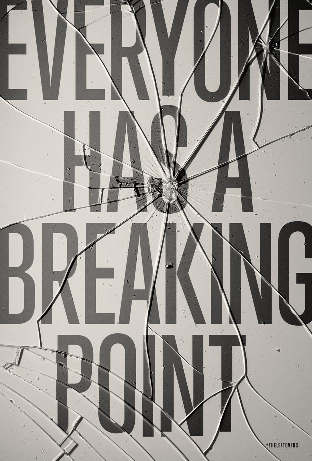
“The is a rejected concept for HBO’s The Leftovers series. The idea being that people were so upset, they’d broken the poster frame or bus shelter that held the poster. The image they went with was the moment of the person hitting the wall, as opposed to the aftermath that I proposed.”
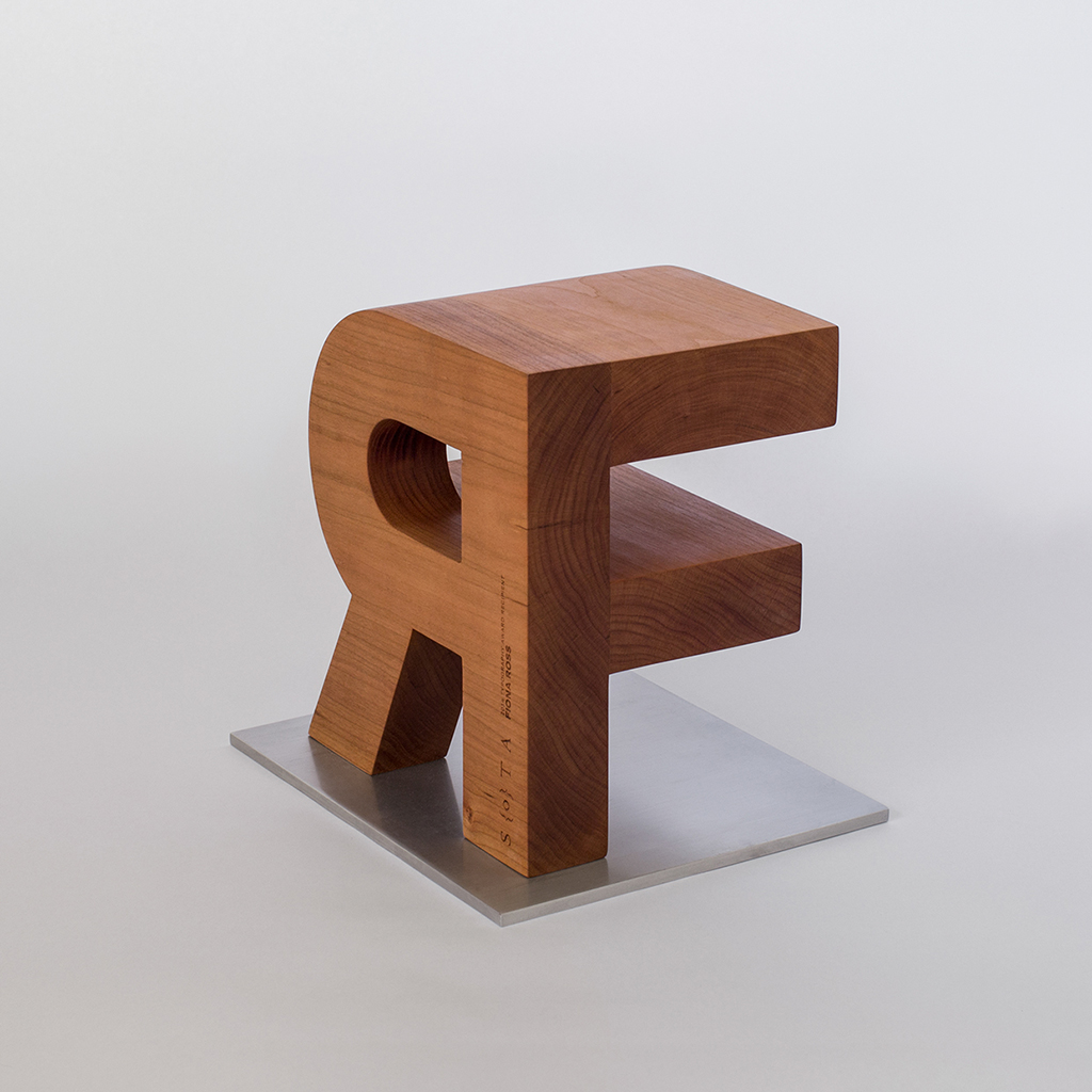
“Every year SOTA gives out the SOTA award at TypeCon. It is an acknowledgement of a person’s life long devotion to typography and a celebration of their contribution to the art. Starting last year, I decided to try to make the award something special and a little different than the usual plaque, or brass statue. I design the impossible ligature in Cinema 4D, and then sent the files to Nathan Trembley of Palette Industries to manufacture.”
3. Much of your work seems to take inspiration from late-stage Modernism, particularly in the Netherlands and the UK—am I way off base with this understanding? What moments from history inspire you most?
Spot on. I love the idea of clarity, and the ready made. High quality items, mass produced for the hoi polloi is wonderful. I do believe there is a nobility in making things at an affordable price so that you improve the life of regular people. And the design in the Netherlands at that time was so exciting as the world was getting ready for the biggest change it’s ever faced, as machines started to replace people. So there is this amazing subset of type design that is the ground work for optical character recognition that we have now.
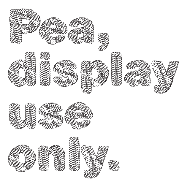
Taking an almost banal, ubiquitous letter shape – the geometric sans-serif – Pea gleefully plays with contradictions by rendering it using elaborate calligraphic swashes. Both worlds are given equal prominence, the overly ornate special occasion and the everyday.
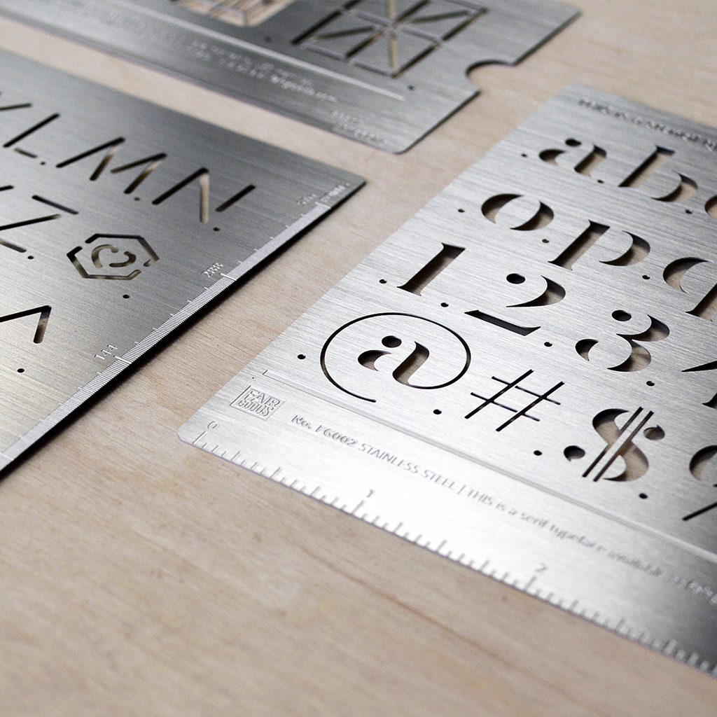
“All three of those are stencil fonts that I designed, and approached FairGoods to make into actual metal stencils. It came out pretty nice, they really did a phenomenal job, in my opinion. You can order them here.”
But the experiments they were doing feel so modern, even now. But it’s because it wasn’t a style that was applied to something, it was working hand in hand with engineers on solving a problem. And they were methodical – look at the work of Wim Crouwel in particular during that period. It’s like he was from the future, stuck in the past. All the advances in technology we have now, and we’re not even close to what he was doing. Such an amazing futurist. It’s both inspirational and demoralizing at the same time. Oh, and the color palettes were wonderful as well, as the world had crawled out of war and technology was advancing, so the future was optimistic. Anything was possible. Especially since the cynicism of the late 60s and 70s hadn’t happened yet.
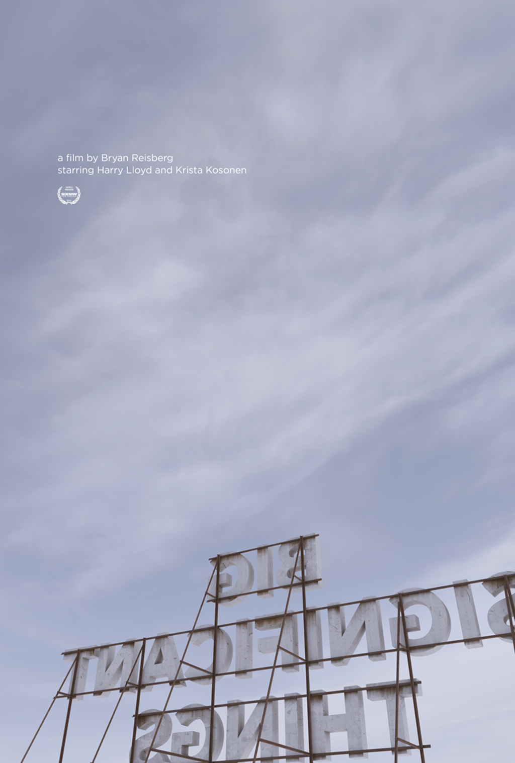
Poster design for the film “Big Significant Things”
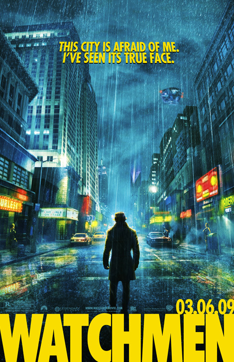
One of Corey’s many posters for The Watchmen, about which he relates, “The director wanted to stay true to the comic, and there isn’t a digital version of that specific cut of Futura available (for the logo). So I figured out the phototype version and redrew it. It’s the only time I can remember where a director thanked us for the attention to detail spent on the choice of typeface”.
4. You’re already the king of the Hollywood poster at present—what are dream projects that you want to undertake in the future?
I think that’s a fairly hyperbolic statement, there are a lot of other designers much more prolific than I am. I just have a little niche I’m operating within is all. But to answer your question… ever since I started in design my dream has been to do album covers. Still is. I’d love to have the trust of a music client like the Mike Cina/Ghostly relationship. That would be a true dream. And if I could be even more specific, I’d love for it to be for a Berlin School/Ambient style label like DIN Records. I’ve recently become obsessed with modular synthesis, and have started building my own modular synthesizer, so I’d like to see my love of design and my love of music come together.
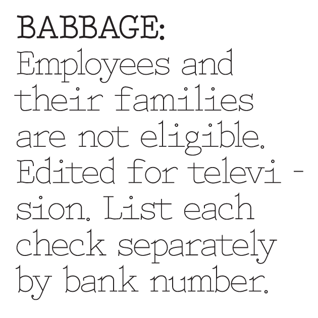
Babbage — Corey’s design for a more humanistic typewriter typeface
5. What are you most critical of in graphic design as a cultural undertaking at present?
It would be a tie between two ideas — the first being that graphic design is going to change the world. It sadly isn’t. It will make it slightly better for varying amounts of people (depending on the job), and that’s enough for me. I don’t like the notion of people trying to make it into something noble, which feels like a narcissistic endeavor to me. There is nothing wrong with commercial art, nor in getting paid to create something. But I don’t like the term commercial artist either. I think what we do as designers is really more of a cultural translator. You have a group of people that are trying to tell another group how good their product/service is; but they don’t know how to talk to them because their skill set is aligned elsewhere. We are the translator, we facilitate the communication between these two groups of people. That plays into my idea of being contextually appropriate. If you are speaking Swahili to the Klallam, you are doing a piss poor job of translating. The same holds true for design, if you put too much of yourself into the design (when it’s not appropriate), you’re communicating the wrong message.
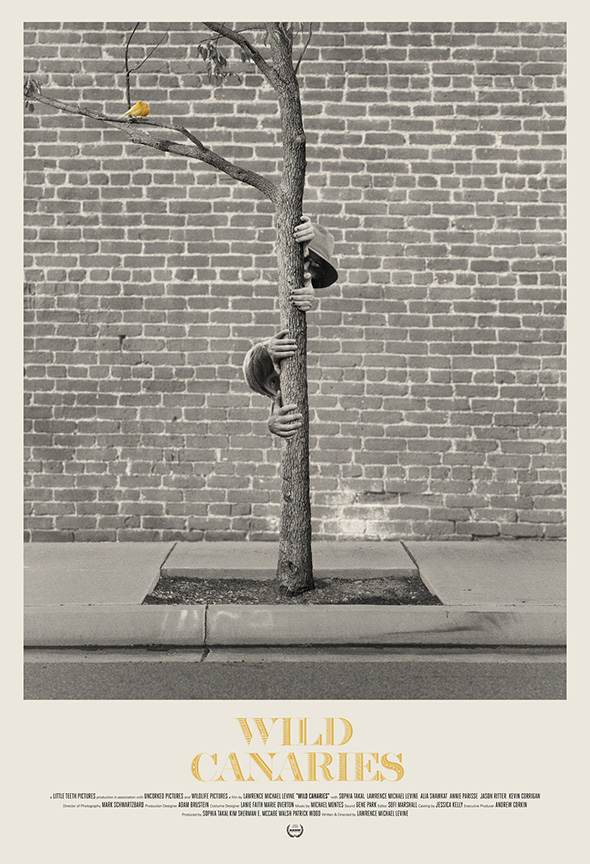
Poster design for the film “Wild Canaries”
The other thing is a problem I have with some art schools, where they do not prepare students for actual jobs. So you have these people that have paid ungodly sums of money to be taught how to be a designer, but have the wrong expectations of what the job is, and then 5 years later move on to something else. That is a gross disservice the school is giving the student and they should be brought to task for that. I can think of one school in particular that seems to really only train up educators. And there is nothing wrong with that, but you need to let people know that by going there you won’t be working in the field of design, but instead you’ll be teaching it.
“Stolen Music was a club I started with fellow designer Adam Faja. We would gather together a group of 12 people from all creative fields (writers, illustrators, designers, typographers, photographers, etc.) and each person would be assigned a month. When that month came, you had to compile a compilation, design the packaging, and then send it out so that it hit the mailbox sometime in that month. There were some amazingly elaborate packaging that came out, one was a hollowed out floppy disc, one was laser etched, hand made and illustrated each copy — that sort of thing. Super fun and an amazing collection of design artifacts.”
6. Hamburgers or hot dogs?
Not even a question, it’s hamburger all the way — unless you mean sausages, then it’s sausages über alles.
Thanks, Corey!
Stay tuned for the next installation of “HUH?”, coming soon!latest Nike release | 2021 New adidas YEEZY BOOST 350 V2 “Ash Stone” GW0089 , Ietp
