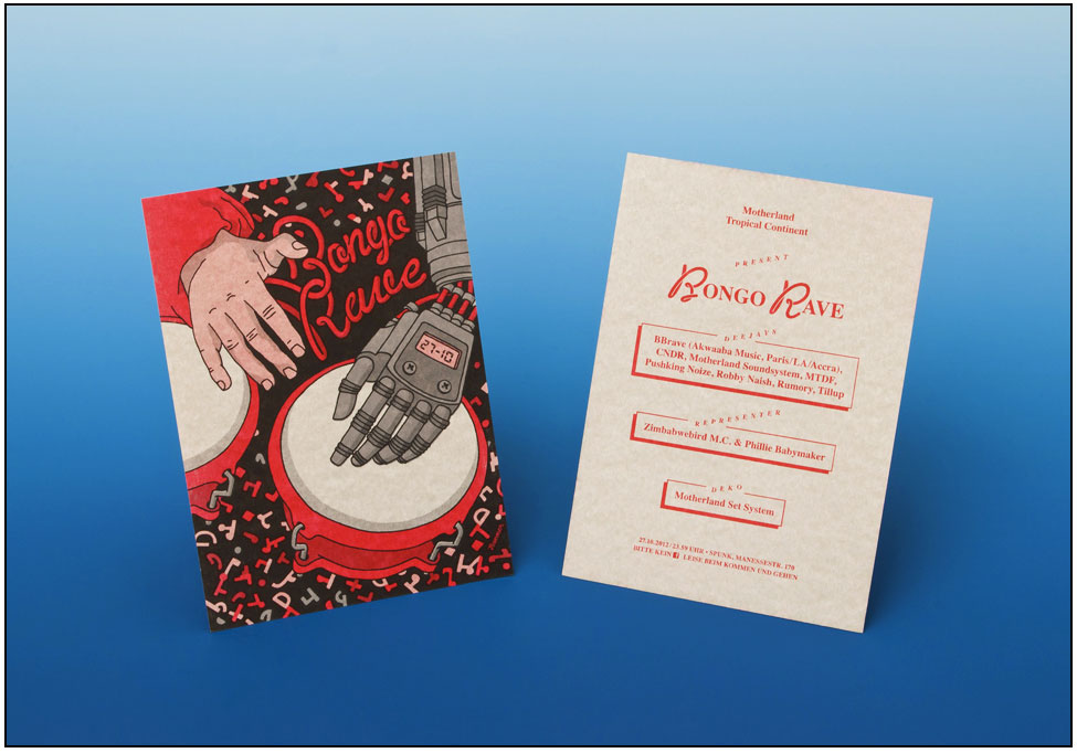
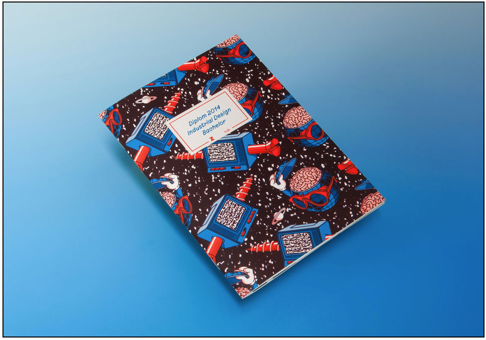
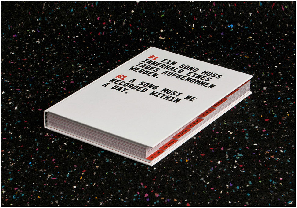
VCFA Chair Ian Lynam chops it up with Sereina Rothenberger and David Schatz of HAMMER, an amazing design studio based in Zurich, Switzerland. Working across graphic design, identity design, editorial design, illustration, type design and design education, we exhibited a small showcase of the work of HAMMER at VCFA’s April residency and we are proud to announce that they will be joining our October residency (October 11–17) as guests, giving a public lecture, leading a workshop, and participating as invited critics. David and Sereina are some of the smartest, funniest, nicest, most insightful, and flat-out nicest folks working in design today making obsessively authored work.
In the second of this series of micro-interviews with important figures in visual culture, we find out the things that matter!
1. What graphic designers did you like during your school days that you still like now?
The work of amateurs was – and still is – more important to us. We are more influenced by Garfield, Metallica or African* fabrics than by other graphic designers, but to name a few Max Bill, Richard Paul Lohse, Hans-Rudolf Lutz, Memphis, Ernst & Ursula Hiestand, Stephan “Pronto” Müller and Cornel Windlin, Flag.
2. What dream projects do you guys want to work on, but have not yet?
We’d love to produce our patterns on real things, in real life, not just printed on paper, but also in the technique of African wax prints, maybe with a company like Vlisco, or on high pressure laminates for furniture, as well as manufacture tiles for lining public spaces like autobahn-restrooms or swimming pools. It would be fantastic, in general, to be able to work abroad more often, either collaborating with artists from other fields or for international clients.
3. What do you really, really hate?
When clients conduct a survey about a design instead of trusting their gut: You ask a bunch a people for their opinion, and you’ll always find someone who loves or hates what you’ve come up with–if your design incorporates all the feedback, you’ll end up with a grey porridge. Good design never lends itself to consensus.
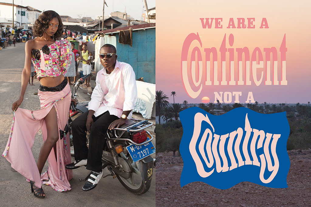
I love to dress like I am coming from somewhere and I have a place to go by Flurina Rothenberger in collaboration with Hammer, Edition Patrick Frey
4. Where do you see yourselves in the continuum of Swiss graphic design history?
Concerning the actual craftsmanship, yes, we consider ourselves “Swiss.” As a result of living and working in Switzerland, surrounded by the same old repetition of that rigid idea of design every day we decided to take a different position. We have started to strive towards exotiscism, esoterism and humor, embracing confusing imperfections. Marilyn Monroe once said: “It’s better to be absolutely ridiculous than absolutely boring.”
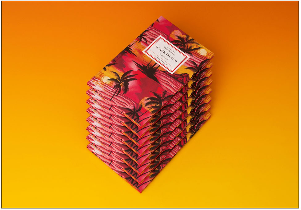
Black Island
by Thomas Ott, designed and published by HAMMER5. Vampires or zombies?
Unicorns!
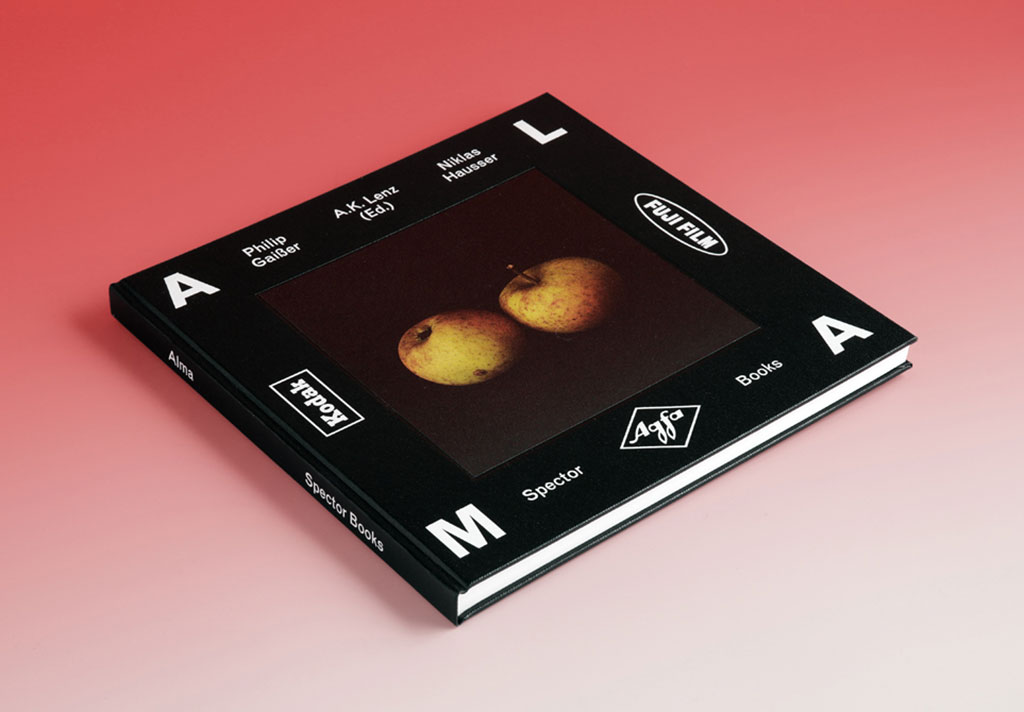
Alma by Philipp Gaißer and Niklas Hausser, designed by Hammer, Spector Books
That’s it! Thank you so much!
Gern gescheh’n! (a.k.a “You’re welcome!”)
Stay tuned for the next installment of “Huh?”! Coming soon!Nike Sneakers Store | Nike
