Chris Ro is a designer and educator at Hongik University in Seoul, South Korea. Formerly a very heavily practice based designer, Chris now divides his time between design education, practice and the exploration of some of the peripheral areas of design. He previously studied Architecture at UC Berkeley and later Graphic Design at the Rhode Island School of Design.
Chris was a visiting designer, along with Yunim Kim and Eddie Opara at VCFA’s October 2014 residency. Chris and Yunim did an amazing presentation about their observations about graphic design, Korea, and the liminality of aspects of culture, much of which was culled from this amazing essay which Chris wrote a few years ago and which we are happy to share with you.
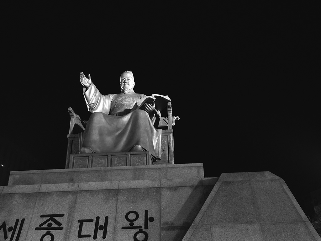
The statue dedicated to King Sejong in Gwanghamun, Seoul, South Korea. King Sejong was the inventor of Hangul.
EYES WITHOUT EARS
EYES WITHOUT A VOICE
Reflections of a Semi-Foreigner on Design/Life in Seoul
by Chris Ro
Arrived. But still not really here. At least that’s how I feel some or most of the time as a semi-foreigner currently residing in Seoul. And I say semi-foreigner because this is in some ways, the easiest way to put my position here. I am not a complete foreigner. Yet I am not a local either. I am for the first time in my life, truly in-between. I am for the first time in my life, truly in a grey zone. Neither here, nor there.
My parents were originally from here. Or kind of here. My father from Seoul and my mother from Inchon. And even further back, Jeonju and Ahndong respectively. But myself, I happen to be born in Seattle. A non-stop flight away. Yet far enough away to again, not really be here.
So I am back now. But back is a funny word because again, I never was really here to begin with. But something with me. Something within me. Something about me was here. Lives here. Comes from here. But what is this something? How can I have never lived in a place and yet be so familiar with it? How can I be so far from home and yet feel at home? How can I have troubles with the language and yet understand the unstated?
So I am here now. The reasons are plenty. For one thing, I have long felt that if I do not see what here is. If I do not know what here is. I can never pass here on, to anybody, to anything, to anyplace. Finishing my life in the United States, what could I give to another generation? What could I tell to anyone that wanted to listen? At my best, this was very little. Far too little. And this, along with many more reasons, is the reason, I am here. Here to see, what my parents saw. Here to hear, what my parents heard. For I think the labors of my parents were far too substantial, to let here disappear.
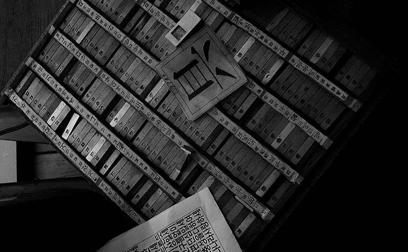
Hangul letterpress case boxes from Paju, the book publishing city, just outside of Seoul.
And so how do I experience here? With a functional but also quite dysfunctional clasp of the local language, my experience of here has somehow become one dimensional. For in some ways, I’ve been reduced to optics. An intake of here that has and is in some ways purely visual. I can see. But I cannot hear. I can observe. But I cannot speak.
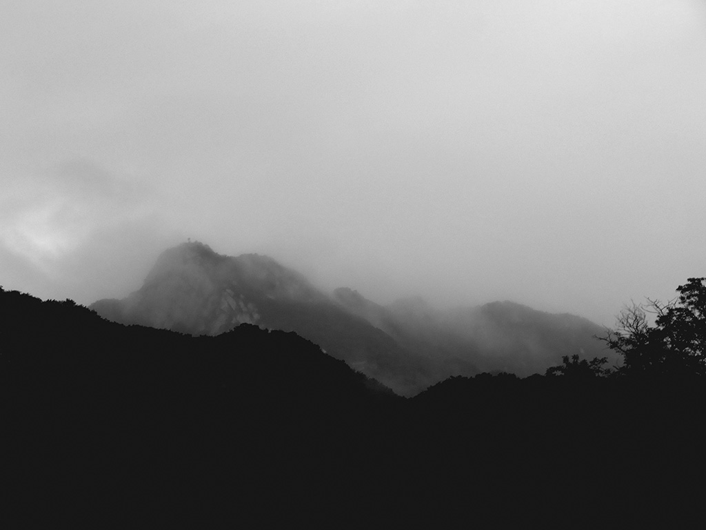
One of the lovelier views of being based in a school located in the mountains. On any given day when looking up, beauty can be found.
And this somehow is fitting because I am and have been for quite some time, a designer. A visual designer. One who creates experiences for the eye. One who creates stories for the eye. Somebody who must communicate and be communicated to through a visual process. So it is fitting, this means of which I absorb information. And now by a similar means, I will begin to expound upon some of these observations or in this instance, absorbations. These moments, these instances, these situations that have all lodged themselves within my experience here. And this will be done again, visually. Purely through the written word and some careful use of typography.
So I arrived in February, 2010. Not too long ago now, but long enough to have felt like a very long time. And it has passed by in a rather lightning-ridden manner that both is overwhelming and yet somehow underwhelming at the same time. I knew I needed to come here. I knew I needed to experience here yet at that time I was not quite sure how. And when the opportunity presented itself to teach graphic design here, it was one that I could not help but to jump on at a heartbeat. For another of the many reasons I am here is to experience design. To see design perhaps in its most purest state and even in its most filtered states. For in the States and abroad, the exposure, the access to Korean design is non-existant. I am purely left to guess, to ponder, what goes on over yonder? What goes on over there? I’ve stated this a number of times but it still remains unfortunately so true to this day. In graphic design history class, we get a small taste at the beginning of our course. The invention of movable type by Koreans is the first morsel. The first dinner appetizer we get. But after that? An entreé? Not quite. We are often left yearning for a bit more. Wondering. Pondering. For at one point, we do encounter the wonderful work of Mr. Ahn Sang-Soo. This often provides a nice bit of punctuation. But what happened in between? What lead up to this punctuation? Where is this rich visual world that has taken place between these bookends? One has to wonder. I have to wonder. And this is yet another reason why here has become so important to me.
So this is how I found myself in school. Both a wonderful place and an intriguing place to observe graphic design both professionally and academically. For it is here that we can see sort of an unfettered graphic design. No clients, no restraints, no budgets, no demands, no brand guidelines. And the absorbtions I have had so far, seem to only be the tip of the iceberg. The beginnings of an even longer journey. But so far, so good. It has been just as rewarding as perplexing at times. But all in all, I could not have asked for a better situation to simply, observe.
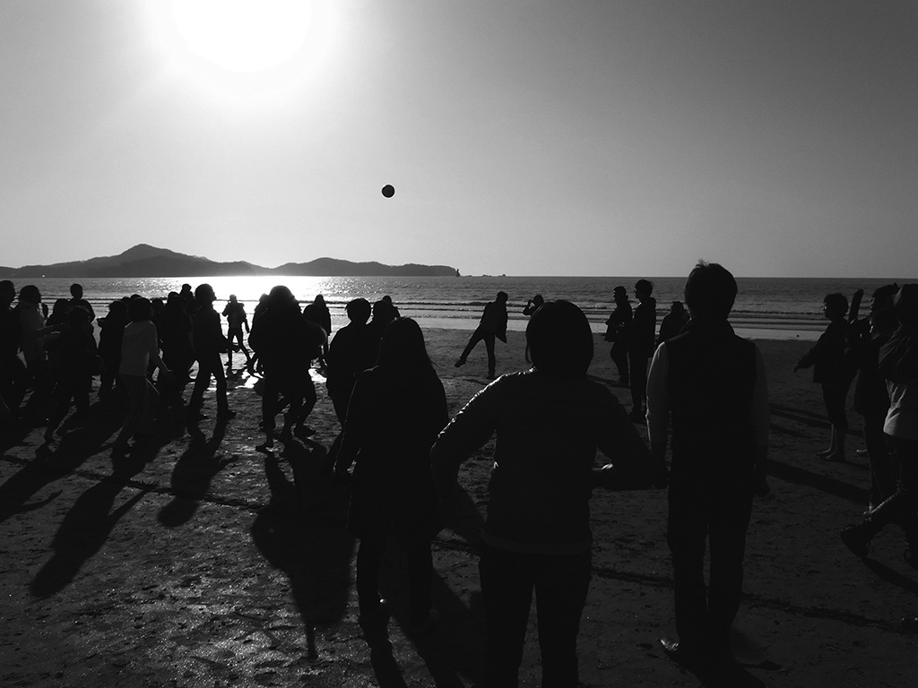
The Korean event “Membership Training” includes a bit of dodgeball, or something similar to that taking place on a brisk winter day at the beach.
School here seems like nowhere else in the world. Truly. And this is not in the typical sense. Or the surface sense. The classes are similar. The professors are similar. The subjects are similar. This is all true. But I think what truly embodies the unique of the unique here, is that school here is heaven. Really, it is. Really, truly it is. The opposite of hell. And here, in this situation, hell is embodied by the lifestyles one absorbs as a growing child and then after the lifestyles one absorbs as a working adult. For in my brief time here, I see these both as hell.
To further elaborate, it seems that life here, exists as a giant pyramid. Or mountain. With the apex coming during this time in college. For life up until and before college, truly is hell. And from what I can ascertain, life after college, truly is hell. When working towards college, the 12 hour day, the 15-hour day, the 20-hour day, all are game. All are possible. And in many cases, all happen. When not in school, one is in some sort of after school program, getting better at this, getting better at that, cramming for this, cramming for that. It seems that up until college, life is one big scramble. Everybody is competing for that last drop of academia. All are uncertain what academia tastes like but they just know, they have to get there. They have to have it. There is no fun. There are no games. Life is learning. And life is hell.
And what exists after school? Yep, you might have guessed, yet again, another fiery hot warm ergonomic chair in hell. Ergonomic chair? This might be one option if you are lucky. For after school, we again, have the 12 hour day, the 15 hour day, the 20 hour day. And again, all are completely possible. For landing that job. Landing that imagined perfect job. That dream job that is going to pay for that car. Pay for that dream. Complete that picture. That job, is indeed, hell. Long hours. Little pay. Lots of alcohol consumption. This is not always the case. But as I understand it, this is often very much the case. And I have only begun to see this ever so slightly and more clearly. Working life equals hell.
So in my short time here, I have at least gathered this much. And it truly is palpable. School, for what it is, is bliss. A time to actually take a breath, and absorb life. Yes, there are deadlines. Yes, there are long hours. But for a brief moment, it is a pause. A break in the wave. A time to eat. A time to digest. And I have been fortunate enough to see this and to experience it. There is a phenomenon here, called “MT”. I guess it is based off of some english terminology known as ‘membership training.’ And I am still not clear on the exact methods and practices of this event. But what I do know is it too, is unlike anything that I have experienced. A chance to escape for a bit and just bond. And yes, there are some strange, uncomfortably forced moments. But for the most part, its aim is pure and simple. Just escape and just let the walls come down.
So “MT” typically is constructed as some sort of a retreat of sorts. A chance to get a way and just talk with folks you normally never would talk with. There typically is alcohol involved towards the end. With the amount consumed varying amongst the participants. The alcohol seems to aid here and there to this process of the walls coming down. And for all the strangeness of this, I somehow think it works. To the point that I wonder how such an event would be perceived in the United States. Or how it might work there? And in all honesty, I think it just might do some good. For the moments to openly chat with professors, from what I can remember, were very few and far between. Rare at best. And there were also often times, scarcely an opportunity for one to truly get to know their department. Both faculty and student alike. For these are the ones they will and have been studying with. But who knows, perhaps I am missing some of the nuances or intricacies of such an event. And perhaps there is just as much negative as tied with positive here. But I can only again, gather with my eyes, that this type of thing, is truly not so bad. And again, it adds very much, to this notion that school is bliss. School is heaven.
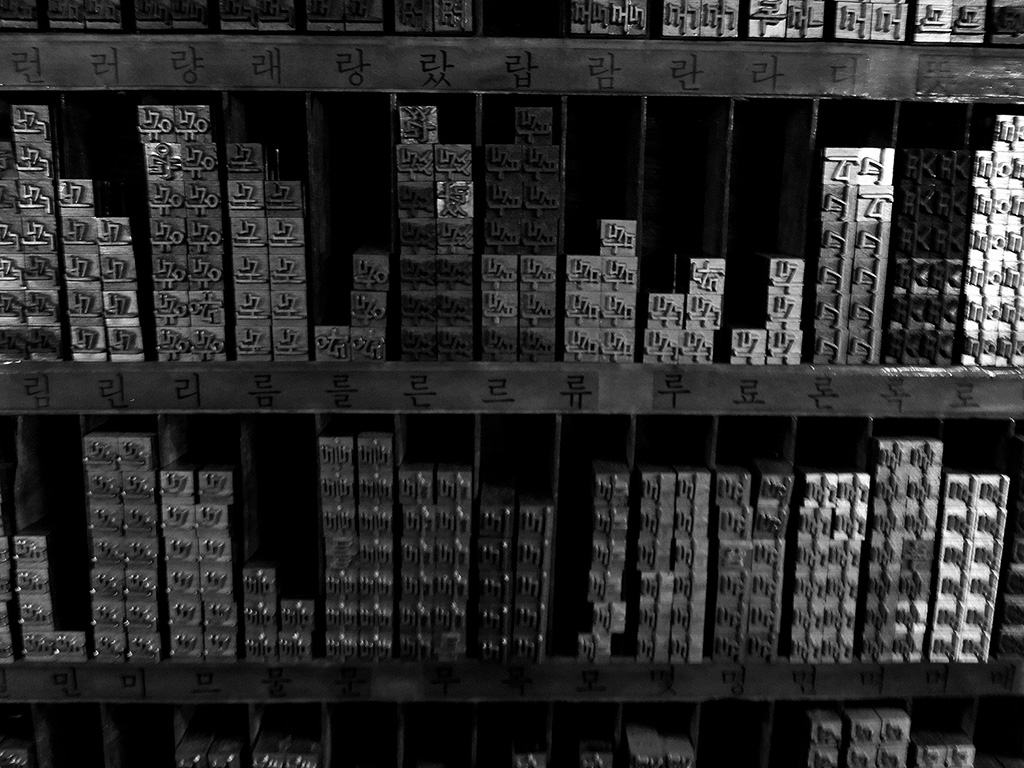
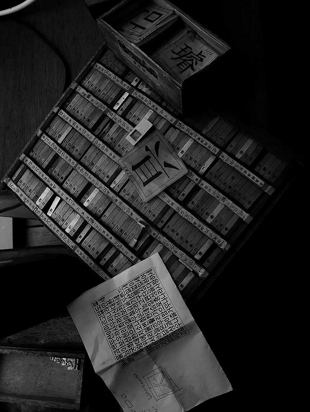
The ridiculous amount of characters and character combinations in Korean typography. Here, more from the letterpress shop in Paju.
But what is this heaven like? And even more so, what is it like through the eyes of a design professor? The first unconcealed observation is the word ‘try’. I do not think the word ‘effort’ somehow, translates properly here. I would say the word ‘try’ is better. For these students try harder than one can imagine. I think there is a very palpable difference in comparison to the States. Here, if they are not trying hard enough, they just try harder and harder. Granted, this is not always the case. There is plenty of lazy here. As is with anywhere. But regardless, this amount of try is very visible and perhaps, is a direct result of what I spoke about earlier. Every year, every day leading up to this special place known as academia, is truly hell. There is no alternative. There is no other way out. There is only try and try harder.
And this is a big difference. Every student here seems to not know pain. They just keep moving. Keep churning. Whether the output is conceivably better from this approach is still questionable. But their notion of try, is not. They just keep trying. But I wonder somehow, is this limitless effort a larger result of something else? I have often from a distance and sometimes more closely perceived some sort of inferiority complex. My perception is that some of the students here feel less up to date on design than their western counterparts. Or lacking of something. And although my teaching experience to date exists purely in the United States and here, I really wonder if it is all that necessary. This inferiority feeling that is. Objectively speaking, the differences are far less perceptible than one might imagine. Although I see some lacking in typographic nuances, I think there is a lot made up for again, through effort, but more importantly through some of their conceptual thinking. I think at heart, in essence, a lot of the project work is as conceptually daring or more so than their western counterparts. I have also noticed a heftier proficiency outside of the computer. Some projects and some ideas thrive outside of the realms of the keyboard and mouse. It is as if the hand truly speaks.
The big “Mr. Strange” seems to be typography. And this is something I imagine, I will continue to learn of more so as time goes on. For in the academic setting here, many a student gravitate towards English in their projects as opposed to Hangul. Which strikes me as again, Mr. Strange. Granted, it seems Korea is becoming ever more international and yes, the number of folks who can read english here are great and many. But still, I have to wonder why not Hangul? For in all honesty, the one thing that I often see as being somewhat deficient here is typography, both in Hangul and roman characters. And perhaps that is the basis of it. A designer base that specifically chooses to work typographically with a language they read little of, use little of, and practice little of? A language they are familiar with yet not intimate with.
I have also noticed what can be discerned as not a disdain for Hangul typography. But perhaps a certain lack of interest in the use or development of it. This is a gross generalization on my part but one that I think many might find some agreement with. And this may be attributed to many things. I know that the development of a typeface in Hangul is a longer than long process. I understand it to be a minimum of 2 to 3 years in development time. I understand that the character requirement trumps Roman type design by a ridiculous number. Something in the 25,000 character range? Something even more? And so the effort required for type design is far more than the typical attention span of a young Korean designer. Is 2 to 3 years really worth such an effort? So what kind of situation does this leave? I cannot say for certain but the math only adds up. With some of the most talented and most dedicated students fleeing convict style from type design, what is left? We can only guess.
So where does this leave us then? I think this kind of situation has and continues to spread. And the result leaves typography in the precarious situation that I perceive it to be in here. There are some great movements from what I can understand in experimental typography. Which I can and always will appreciate. But if at the basis, type design and type experimentation are lacking and only attracting but a very few extremely patient students, then is this the type of situation that can be foundational? Future conscious? Future worthy? Granted, Roman type design has not attracted a great number of folks either. The typical type design class at any school is not the most popular class. But there is and always has been some keen interest. And the numbers are many. If at all possible, I know most students would love to take a type design class just to gain access to some of the nuances. To be able to observe and look at type more closely. But here, in Korea, it seems these types of classes are even fewer and farther in between.
Again, back to the character count. I can see this as being a huge drawback to the development and interest in type design. I am not a type designer myself. I do not claim to be. But in my short experience, and with my limited knowledge, I have been able to quickly and efficiently generate some display faces in some applications devoted to type design such as Fontlab. And these display typefaces work. You can bring them into any type manipulating application and look at the spacing. Look at the way the characters react to each other. Look at the way the characters work against each other. And this can be done with a little effort. Sometimes, literally, in a day you may have some rough stuff that you could work with. Maybe even a few hours. But this kind of situation seems non-existent in Hangul type design. It is just impossible. The amount of time investment is beyond control. It is out of control.
The other thing I have noticed is the way that Hangul is set up. With these character clusters, it is difficult to focus on spacing. Focus on the way characters react to one another. And it is even more difficult to control these at a multitude of sizes. So this often leaves for undesirable typographic situations. For example, in my observation of Hangul set type in books, some of it just looks gigantic. Monstrous. And the reason for this is that some of these character clusters need to be rendered at that size purely for legibility sake. So for the sake of a handful of character clusters, the whole typeface must be rendered at a size comfortable for viewing from great distances. No insult or offense to those who might need such services, but I am and have been okay with type rendered at a variety of sizes. Especially where aesthetics are concerned. It is nice to have that flexibility and that control.
So as I wander the streets of Seoul and see the literal blitz of signage and typography, I cannot help but wonder what could have been. The other typical utterance I hear here, as a result of this complex situation is the phrase, “it’ll do” or “it’ll be just fine” or “it’s not ideal, but it’ll work out alright.” And this often is in response to the existing typography set here. Some people are not happy with a typeface such as Yoon Gothic(a popular Korean sans serif typeface). But they again say, “it’s not ideal for the job, but you know, it’ll do just fine.”
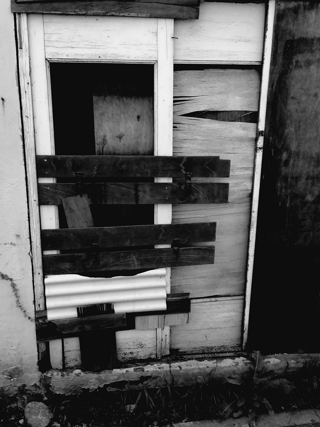
Things just seem to happen naturally here in Korea. There is not much resistance but more acceptance. Here a frequent example of fixing an existing situation with existing materials.
So what does this mean? I can honestly say this type of thinking also extends beyond just the normal thinking for type design. It seems to be something that has been a part of, or infiltrated many parts of Korean culture. This attitude of “it’ll do just fine”. Again, this is a gross generalization on my part, but again, I think many Koreans may agree with me. Here is the land of “balhee balhee,” which basically means “quickly, quickly” or as I understand it, “quicker, quicker”! People here have no patience for anything. And this contributes to much of what I see is not desirable here in Korea. People want things immediately. There is no care for a finely groomed product. They want a working product and they want it quickly. From experiences past and present, I have never felt this was good for design nor was this good for life. Quality suffers. The long working hours I spoke of before? This all seems to be a result of that as well. Clients wanting things faster. Immediately? Designers wanting to do things just as fast or immediately. Where is the effort? The care? And most importantly the time allotted to fully develop a proper product? A well crafted product? A meaningful project? I just have to wonder.
So in a culture of speed, both in school and in the working place, is there any space for quality anymore? I think I cannot fully comment on this quite yet. But I am still looking more and more. Still seeking. Still looking for answers. For it seems that in this culture of speed, anything goes. As long as it works. But I do not know that one can change this. For it seems deeply rooted in everything that is done here. The cabbage has fermented. Well, that’s fine, let’s do something with it. The soybeans have fermented. Well, that’s fine as well, let’s do something with it. I have to wonder about this type of mindset in terms of design. For I think our traditional understanding of the design process is a situation where through thinking and through exploration seem to provide a thoroughly good result. And although, I too, am of that mindset, I have to wonder, is there a way to embrace this culture of ‘it will do just fine’? And I think from what I have seen, there are some moments, some instances, some glimpses, where this is both very real, very palpable and very integral to a visual design experience. I think so. But what that exactly is yet, I’m only beginning to slowly discover.
One of the newer words I’ve learned so far is this word “daechoong, daechoong”. And although here, it has some negative connotations, for the most part, I find this to be quite charming. For “daechoong, daechoong” is the embodiment of this ‘it will do just fine’ mentality. I am not sure how to translate it literally, but perhaps “daechoong, daechoong” means something along the similar lines of ‘just make it work’. Fit it in there so that it will get the job done. It is not quite perfect but as long as it works, it is totally fine. And again, the perception I am sure, is that this is not a good thing.
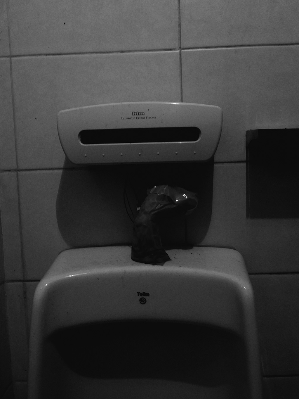
Another example of “daechoong, daechoong,” the frequent use of tape, everywhere! Here, one of the popular drinking spots around school and its wonderful tape usage in the bathroom.
But yet, the longer I am here, the more of it I see, the more convinced I am that it is somehow quite charming. There is something special in imperfection. And so I wonder now, is there a way to embrace this imperfection? Utilize it further in design somehow? Is there a method for holding or keeping some of these charming qualities for just a bit longer. So that others can experience this?
In past studies of asian aesthetics, I remember reading about a Japanese philosopher named Rikyu and his interest in Korean tea pottery. There was something ultimately very “daechoong, daechoong” about the pottery that was coming from here and it was at that time discovered to be quite wonderful. Quite natural. Very much coming naturally from within. This actually was, from what I understand, the makings and formings of what is more popularly known now as “wabi” aesthetics, or “wabi sabi”. A way to again, embrace this imperfection. The slightly cracked tea kettle being that is much more charming than the fully intact one. The slightly hidden, cloud obscured moon being that much more interesting than a fully visible moon on a clear night. It is moments like these, and my personal encounters here that lead me to think, perhaps if there is further research into this phenomenon, there might be something that will aid in this identifying of what Korean design is.
And this leads me to my temporary conclusion. I’ll say very much temporary now because as I’ve mentioned, I feel I’ve only just begun. But this question, this wondering, of what Korean design is, has and probably will continue to fuel my adventures here. For in the process of knowing here, or discovering here, it seems that my path is very much entwined with design. It is who I am. It is who I will be. It is how I see. So my hope is, as the months go on, as the days go on, that where I once was only able to see, or to perceive through my eyes. I can only hope that this can slowly be supplemented by my ears. And eventually, beyond that, my throat. For it seems that day by day, I am slowly beginning to uncover what here is. What here is about. And what here means to me. I am quite thankful of this time and this opportunity to be here. And I can only hope that I will continue to make the best of it.
Stay tuned.bridgemedia | Nike
